AG Lakeside & Properties Website Redesign

AG Lakeside & Properties Website Redesign

My Role

Co-Lead the design process from start to product launch as a UI/UX Designer

Scope

I was conducting interviews, paper and digital wireframing, low and high-fidelity prototyping, conducting usability studies, accounting for accessibility, and iterating on designs. Helped ship the product collaborating with developers and other project stakeholders.

Project Summary

Affinity Gaming, the parent company of Lakeside, wanted us to redesign their Lakeside property site along with their other property sites: Silver Sevens, Primm Valley, St. Joe, Mark Twain, and Rail City. The brand is dedicated to providing a superior experience for the gambler that values a welcoming environment with a focus on great slots, satisfying food, & the utmost fun.

User Goal

Ability to navigate the sites to easily find information on the hotels, casinos, and restaurants to enjoy the night.

Key Performance Indicator (KPI)

Ability to navigate the sites to easily find information on the hotels, casinos, and restaurants to enjoy the night.

DISCOVER

DISCOVER

UX Questionaire

We started the design process by sending out a questionnaire that would help us understand what types of users we were dealing with and what kind of frustrations they were having while using the site. After doing so, we understood that our primary user not only is middle-aged but also has a non-technical background.

Domain Research

While we browsed through the competitor's websites that provided similar services, we looked for patterns, colors, and shape language, to help shape Lakeside's experience to fit this user group. After further understanding, came up with a site map that kept our user's needs front and center. Furthermore, after conducting a heuristic evaluation of STRAT (our client's key competitor) we came up with a modular design approach to help make our process efficient.

Project Summary

Affinity Gaming, the parent company of Lakeside, wanted us to redesign their Lakeside property site along with their other property sites: Silver Sevens, Primm Valley, St. Joe, Mark Twain, and Rail City. The brand is dedicated to providing a superior experience for the gambler that values a welcoming environment with a focus on great slots, satisfying food, & the utmost fun.

User Goal

Ability to navigate the sites to easily find information on the hotels, casinos, and restaurants to enjoy the night.

Key Performance Indicator (KPI)

Ability to navigate the sites to easily find information on the hotels, casinos, and restaurants to enjoy the night.

DISCOVER

UX Questionaire

We started the design process by sending out a questionnaire that would help us understand what types of users we were dealing with and what kind of frustrations they were having while using the site. After doing so, we understood that our primary user not only is middle-aged but also has a non-technical background.

Domain Research

While we browsed through the competitor's websites that provided similar services, we looked for patterns, colors, and shape language, to help shape Lakeside's experience to fit this user group. After further understanding, came up with a site map that kept our user's needs front and center. Furthermore, after conducting a heuristic evaluation of STRAT (our client's key competitor) we came up with a modular design approach to help make our process efficient.

DEFINE

DEFINE

DEFINE

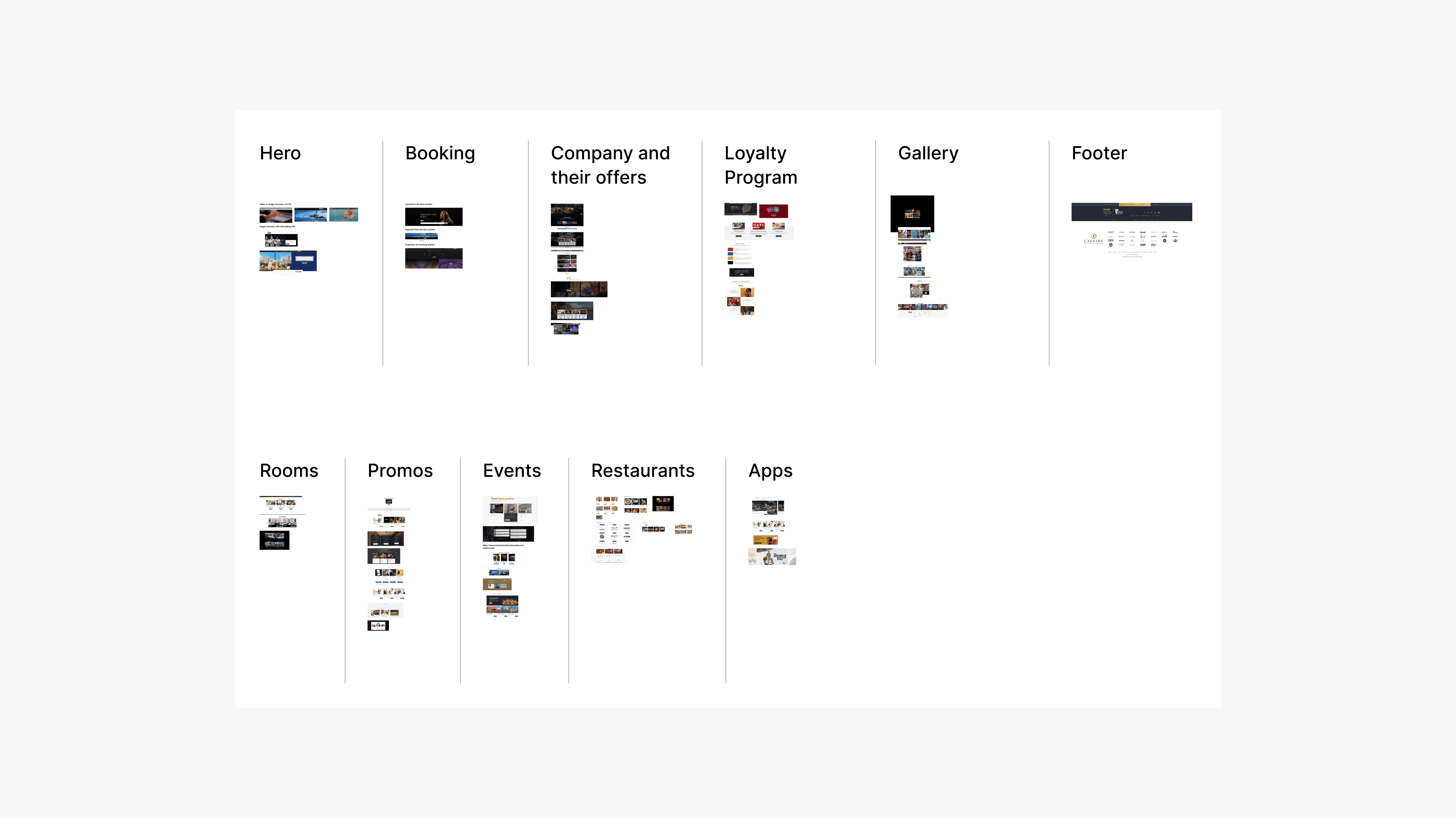
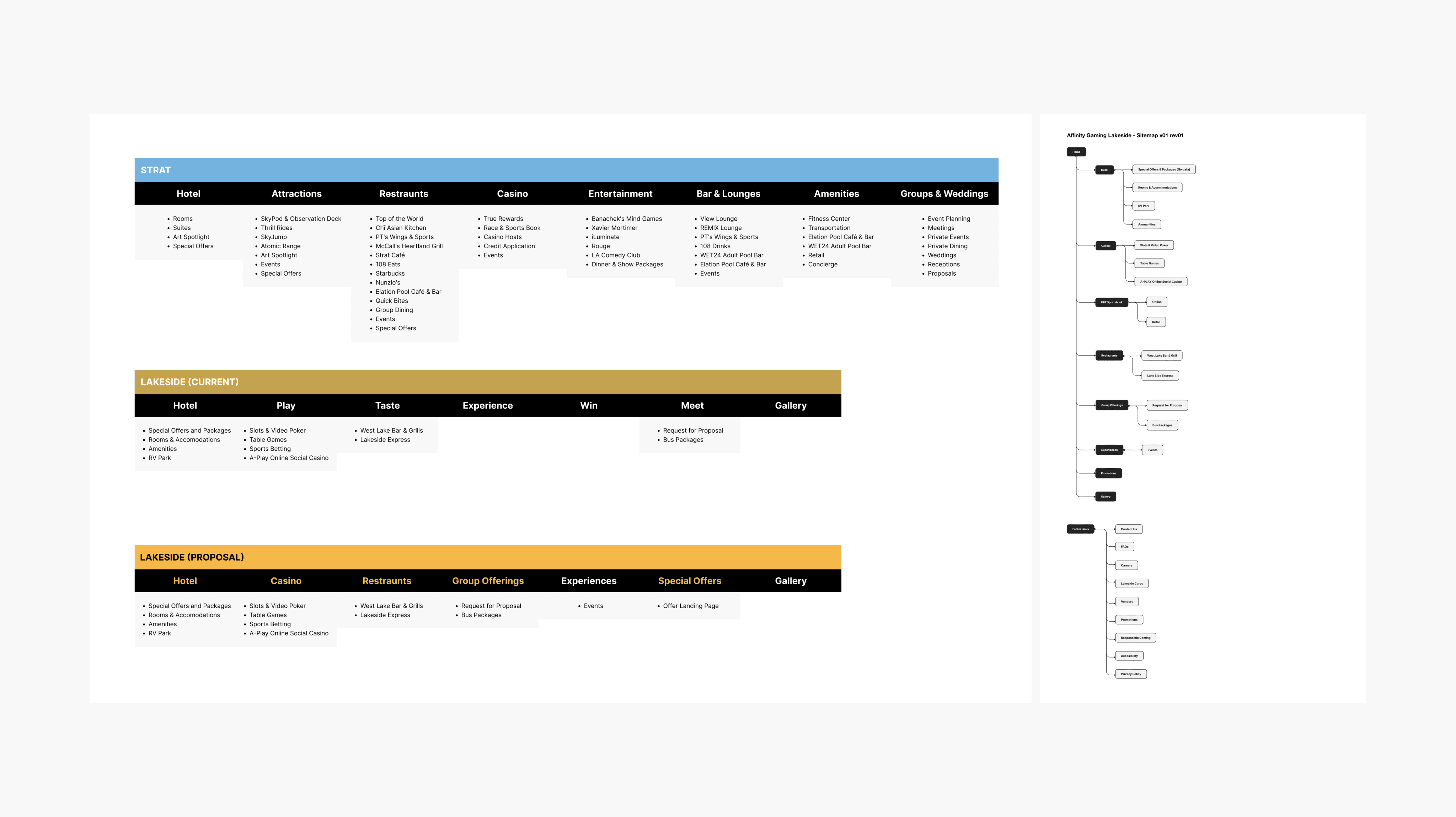
Information Architecture & Wireframes

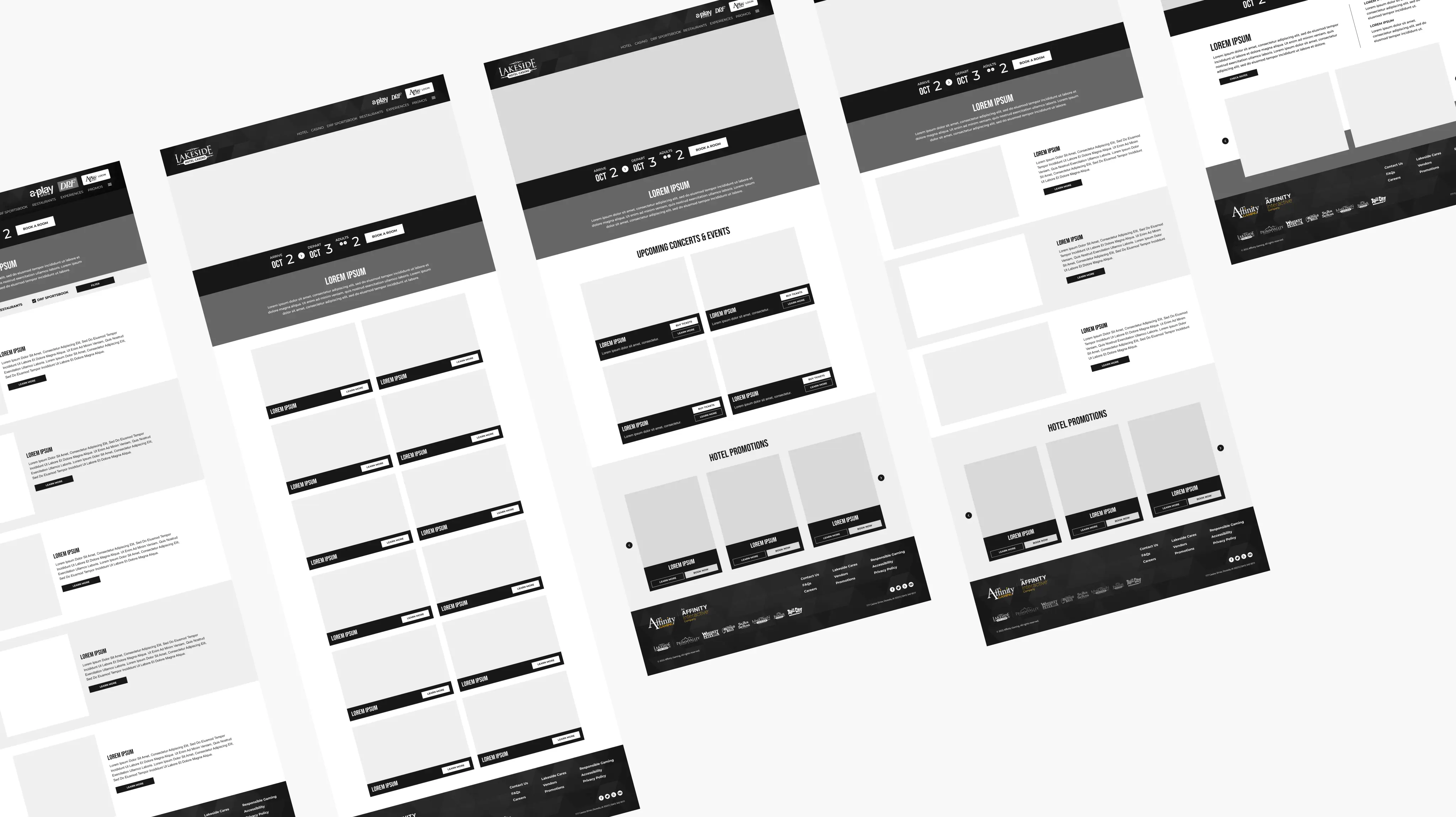
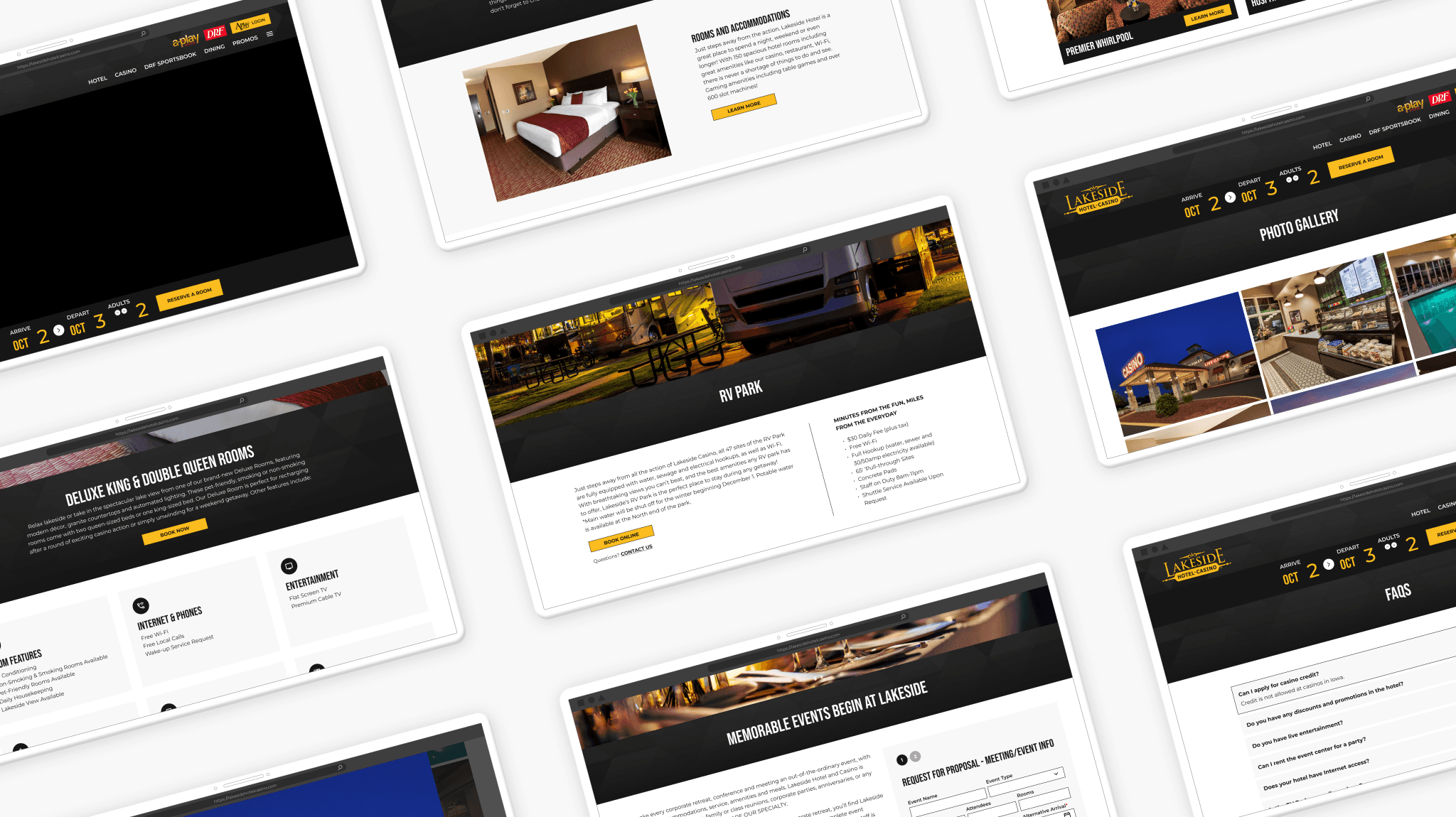
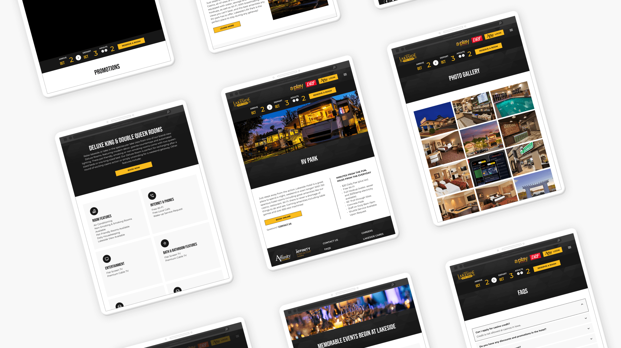
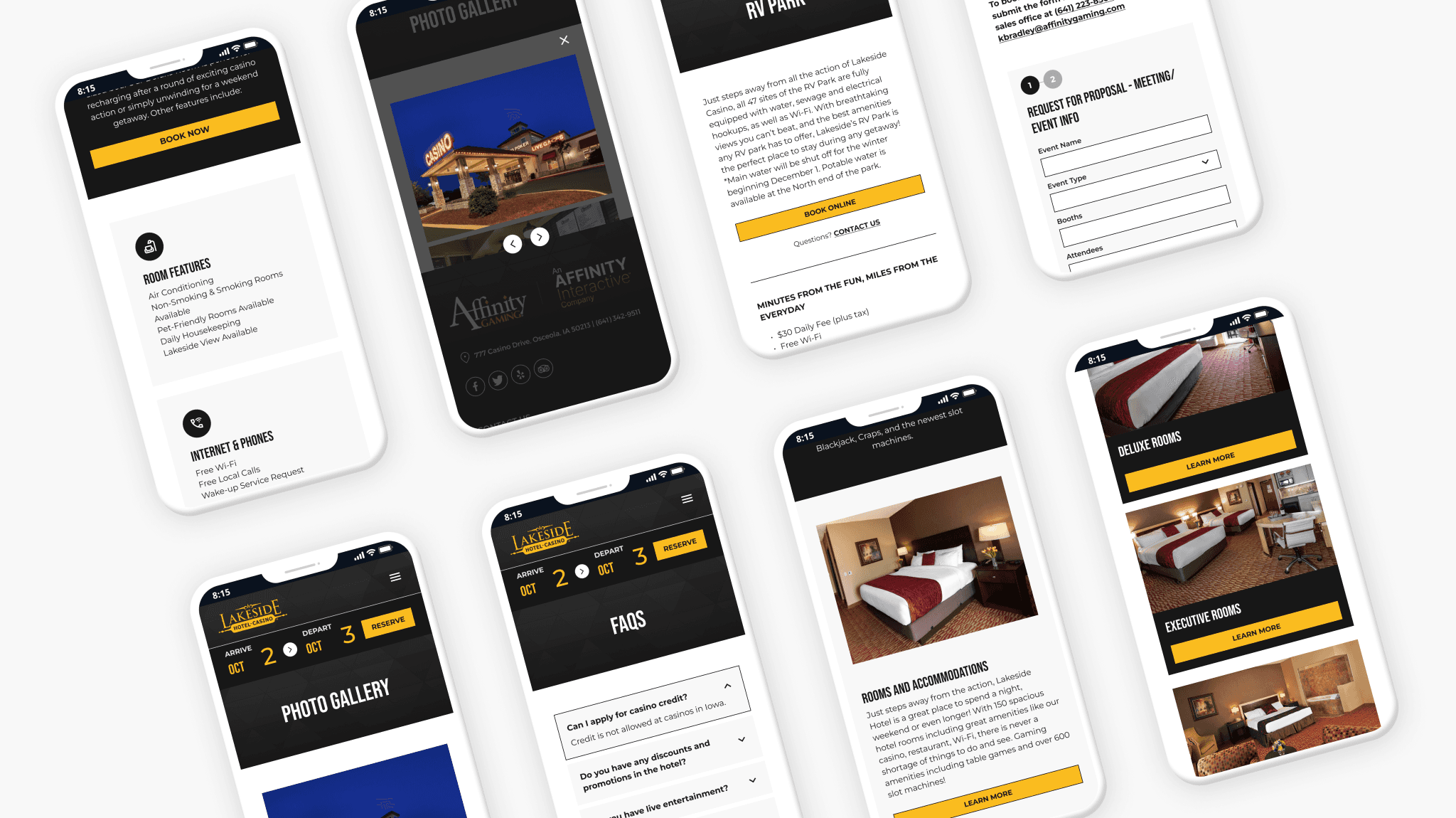
After our initial interviews, domain research, and competitive analysis, we mapped out the information architecture of their site. This gave us clarity on the scope of the work. We went through a lot of wireframe revisions to nail down the visual hierarchy that would allow these users from a non-technical background to have an intuitive experience. realized that using various principles such as proximity, continuation, Jacob's law, etc.

DEVELOP

DEVELOP

DEVELOP

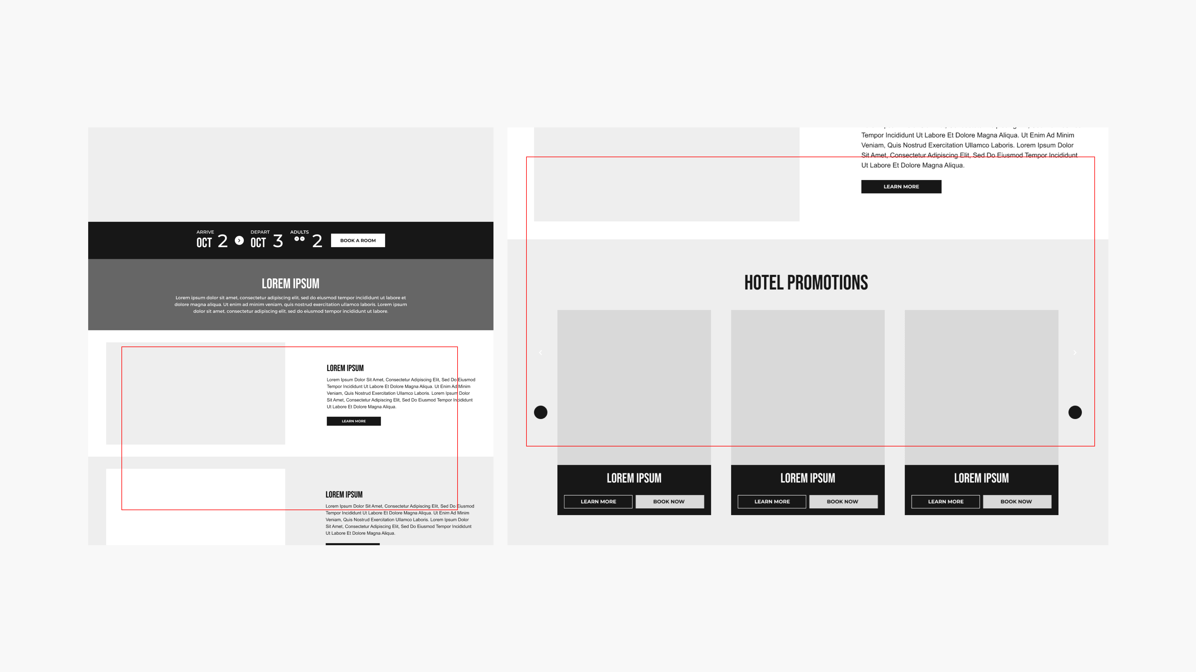
Heuristic Evaluation

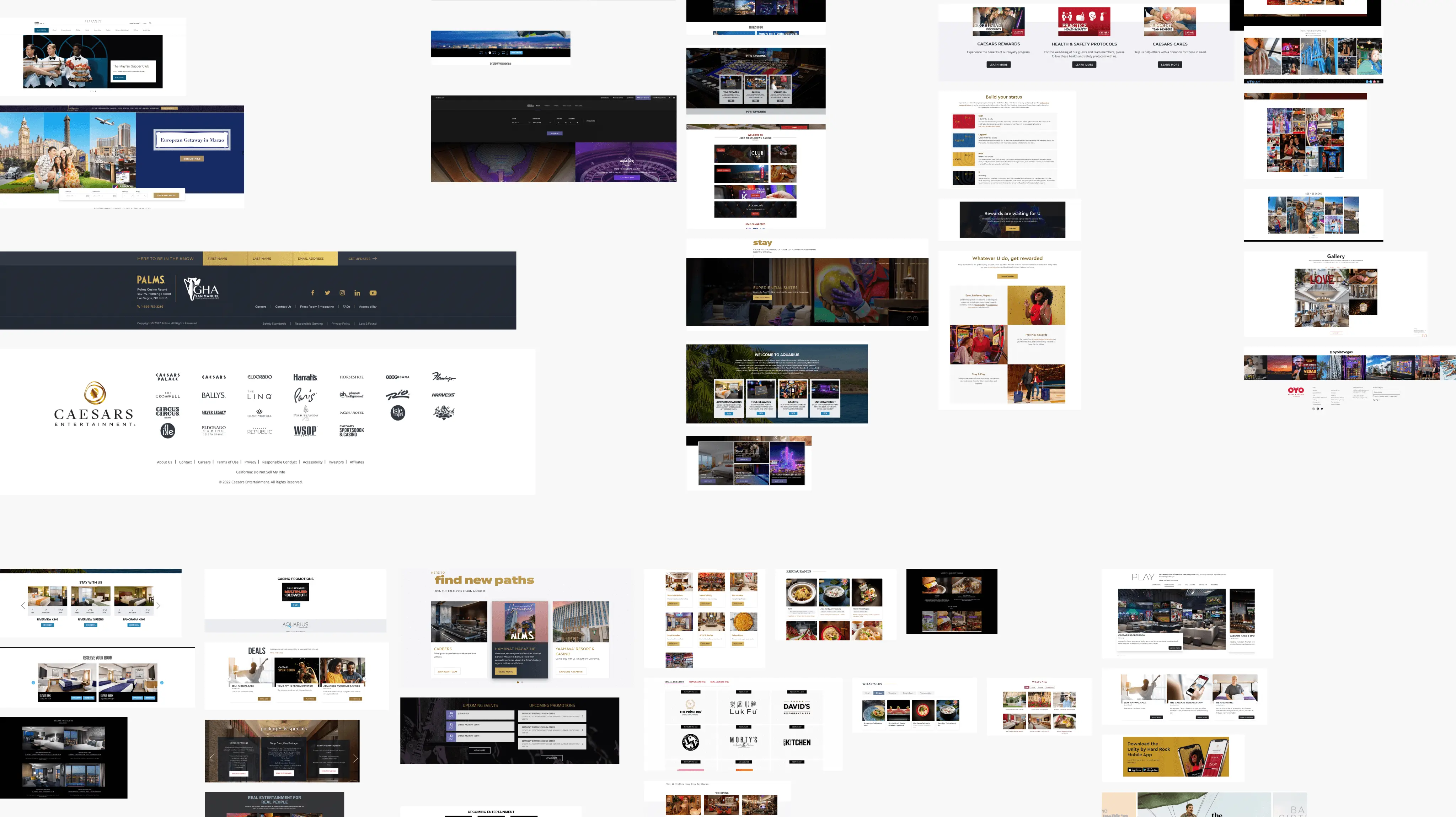
We've used the familiar slider concept to present different promos, events, etc. so the user would immediately know how to use it, without having to learn something new. We've also alternated between two background colors in the (left) example to allow users to easily read the information.

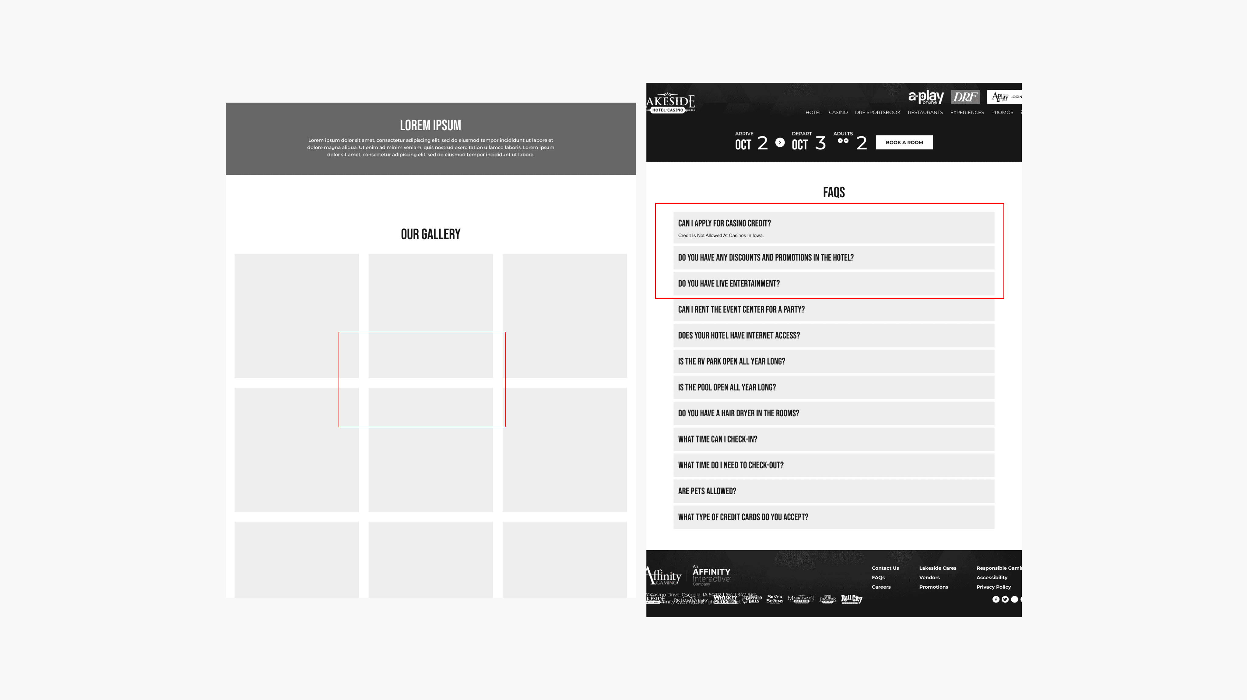
Minimalistic Approach

Keeping the design clean by showing only the relevant and most important information to the user was our goal here.

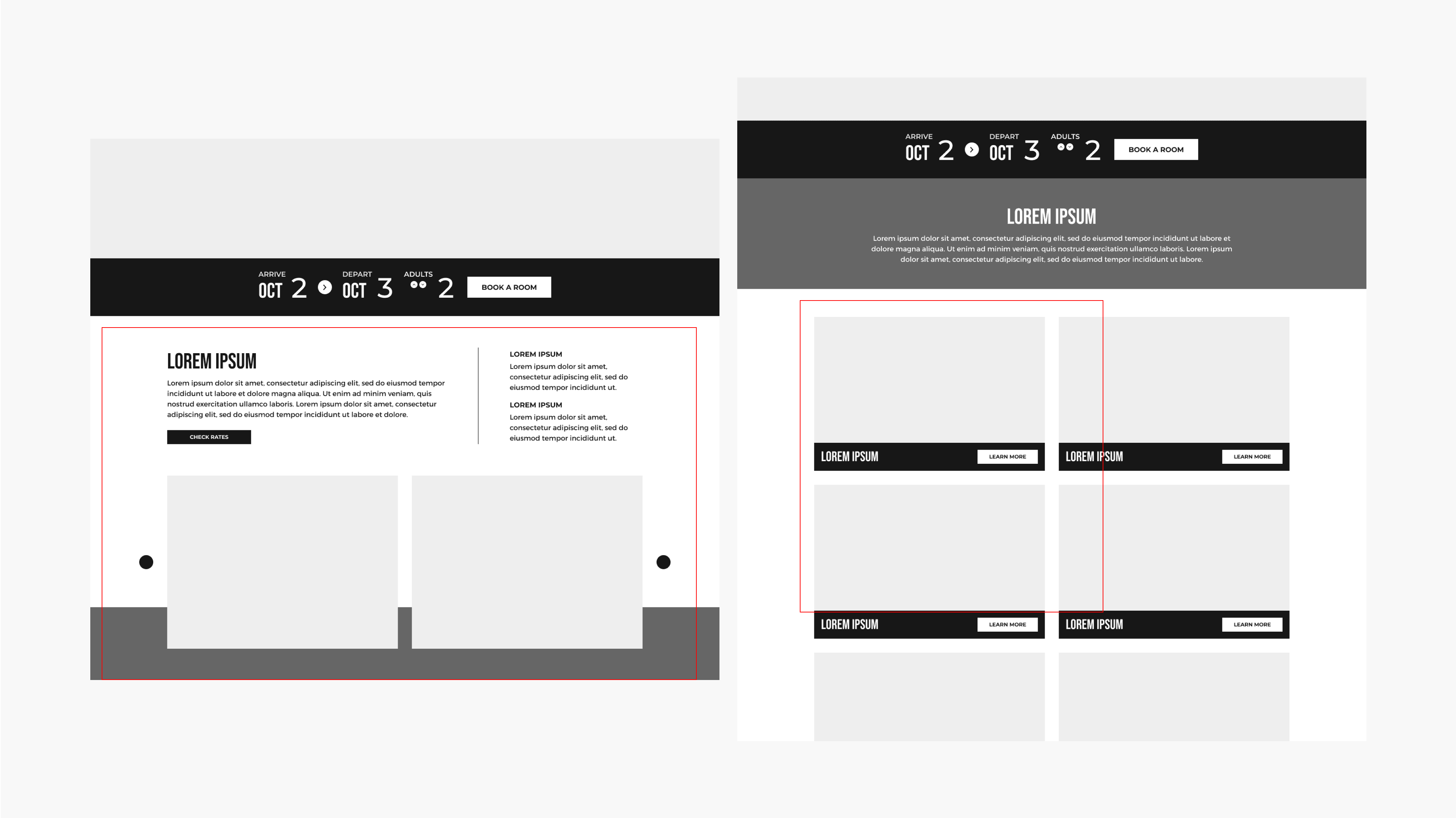
Heatmap Analysis & Changes

After we ran this through a usability study, we analyzed the heatmap. We found that users were clicking more on the right side of the page, so we learned that having the form here would help the business get more people to sign up.
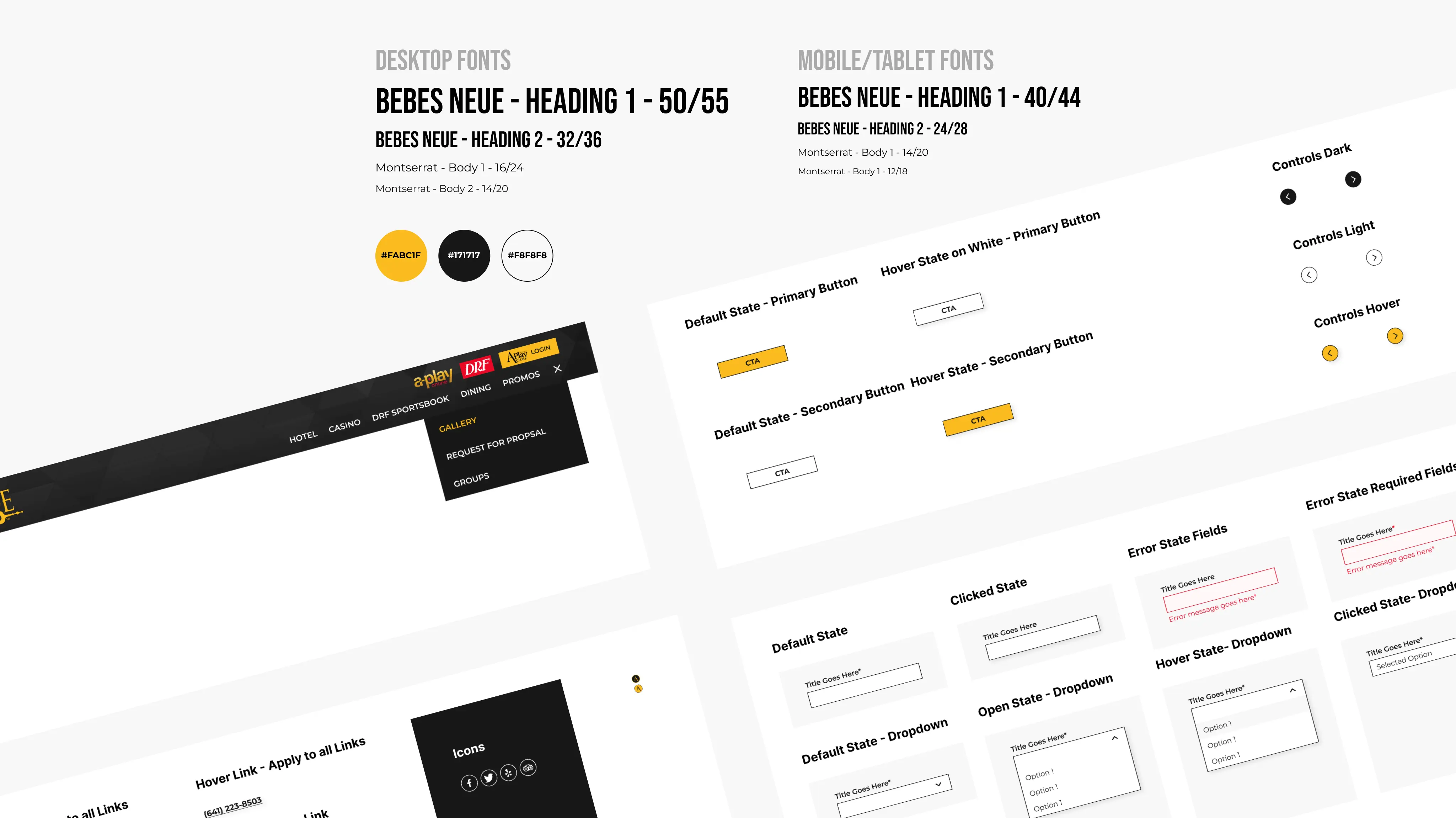
Stylesheet

Creating a stylesheet helped us define the color palette, typography, and interactions for each element within the design.

DELIVER

DELIVER

DELIVER

OUTCOME

Helped lead the creation of a scalable design system for 7 gaming and hospitality websites, fostering collaboration within the design team.


Designed and tested 250+ responsive accessible screens, ensuring user-centered, developer-friendly products.


Contributed to increasing customer engagement and growth through modern CMS WordPress design layouts.

What I've Learnt

I noticed that having the right images for the site, along with a layout that was easy to sift through the information was key to providing an intuitive user experience.

© Abhinav Maroju 2024

© Abhinav Maroju 2024

© Abhinav Maroju 2024

Create a free website with Framer, the website builder loved by startups, designers and agencies.