
My Role
Solo UX designer designing an app for Plated from conception to delivery.
Scope
I was conducting interviews, paper and digital wireframing, low and high-fidelity prototyping, conducting usability studies, accounting for accessibility, and iterating on designs.
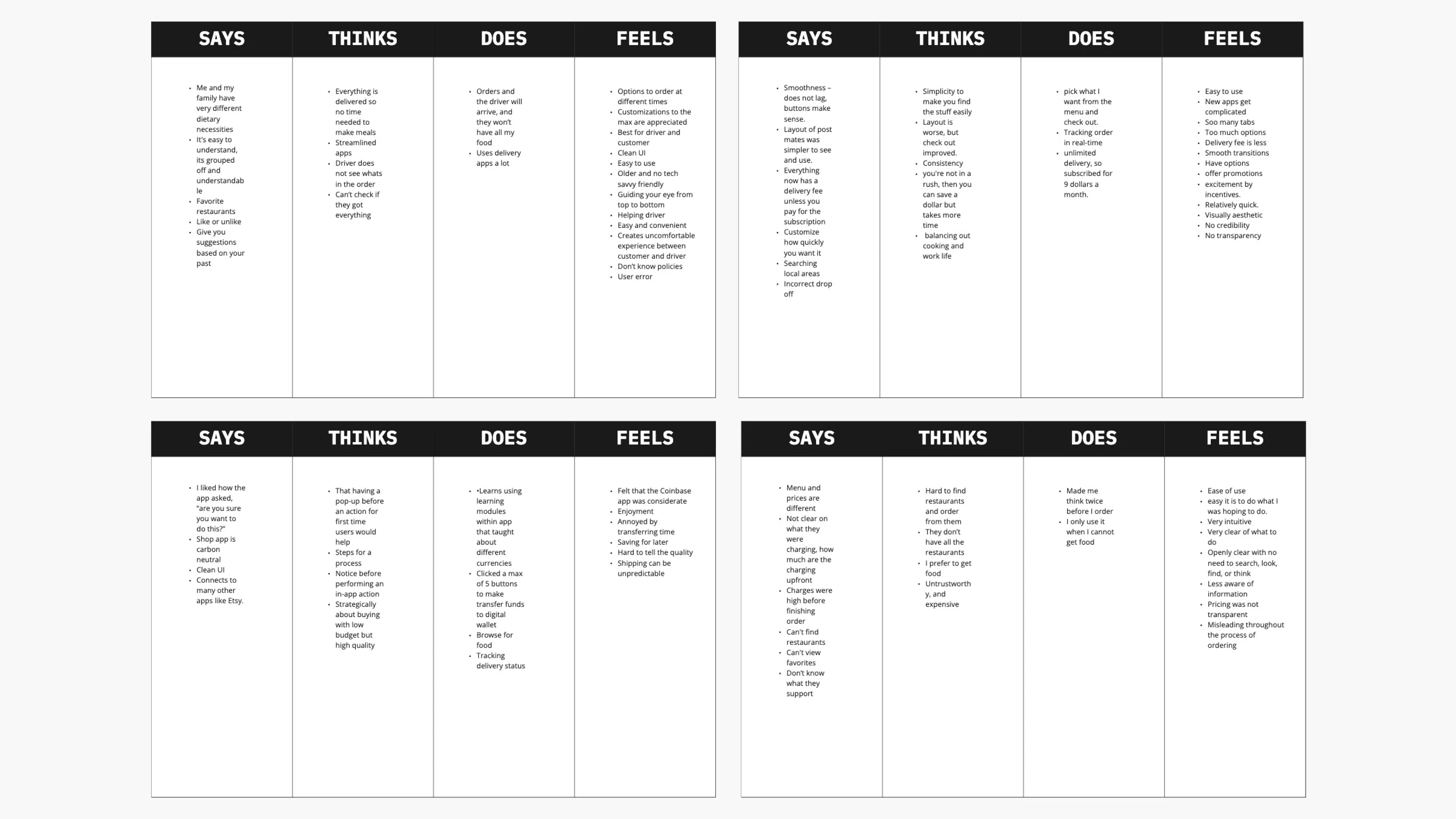
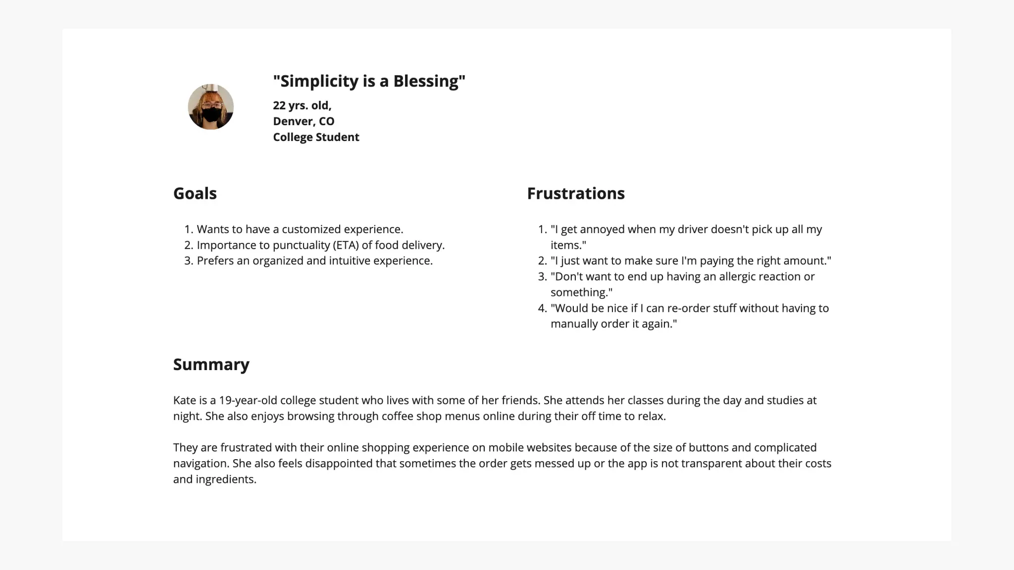
User Persona, Pain Points, & Journey Map
The main pain points I've discovered were:
Transparency: Busy college students didn't have time to prep their meals to begin with, so they expect the app to show the costs clearly
Flexibility: Platforms normally don't have shortcuts for experienced users, and make it hard to customize orders.
IA: Text-heavy menus in apps are often difficult to read and order from, along with readability because of low contrast.
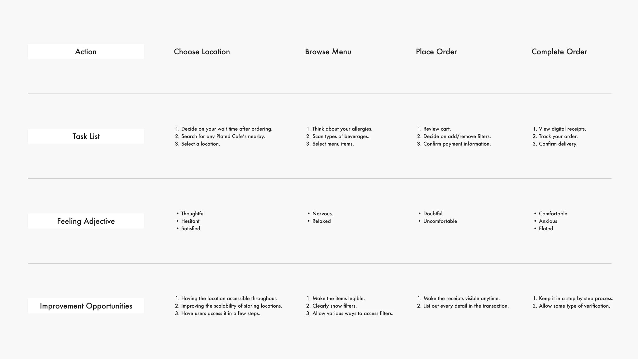
Kate's user journey map revealed how helpful it would be for users to have a faster ordering experience.
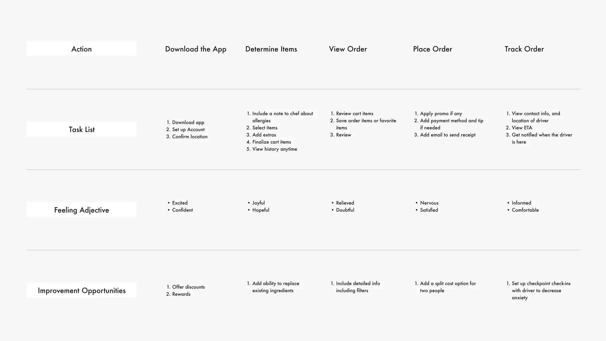
This was the first user journey map, later it was changed to the one below after further research.
The finalized user journey map
Competitive Audit
For the competitive audit, I’ve chosen Starbucks, Viva Chicken, Sweetwaters Coffee & Tea, and Chick-fil-A, as my apps to evaluate, since these were providing a similar service that this app, Plated, provides.
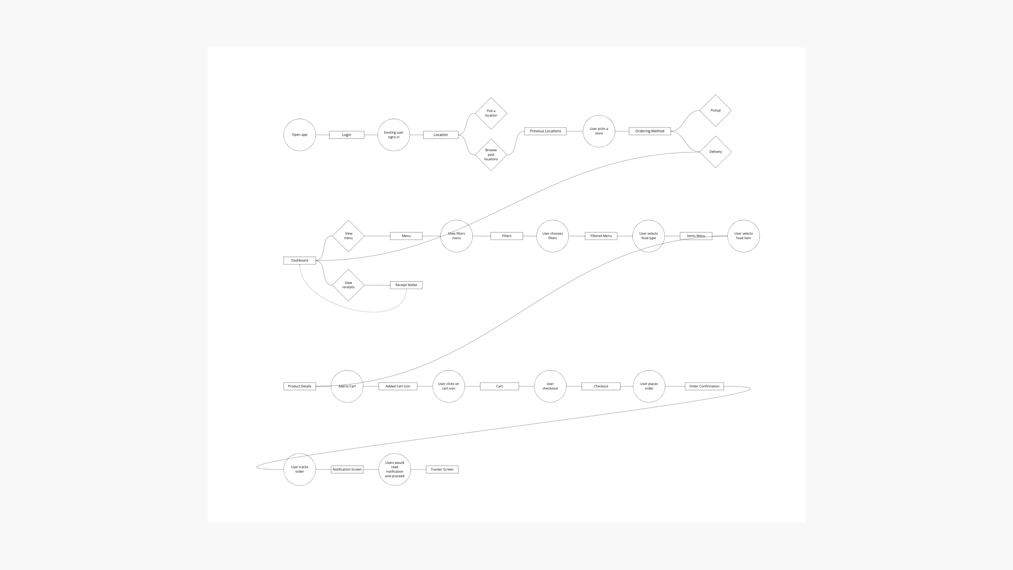
User flow
Creating the user flow chart helped me understand how the user would navigate through my app.
Storyboards
The issue description and objective statements assisted me in establishing the narrative for my users, and these storyboards aided in illustrating the ways my users would engage with Plated.
The overarching storyboard allowed me to comprehend the user's journey from a wider perspective, providing insight into their emotions and actions throughout the process. The close-up storyboard offered a more in-depth view of the user's interaction with the application.
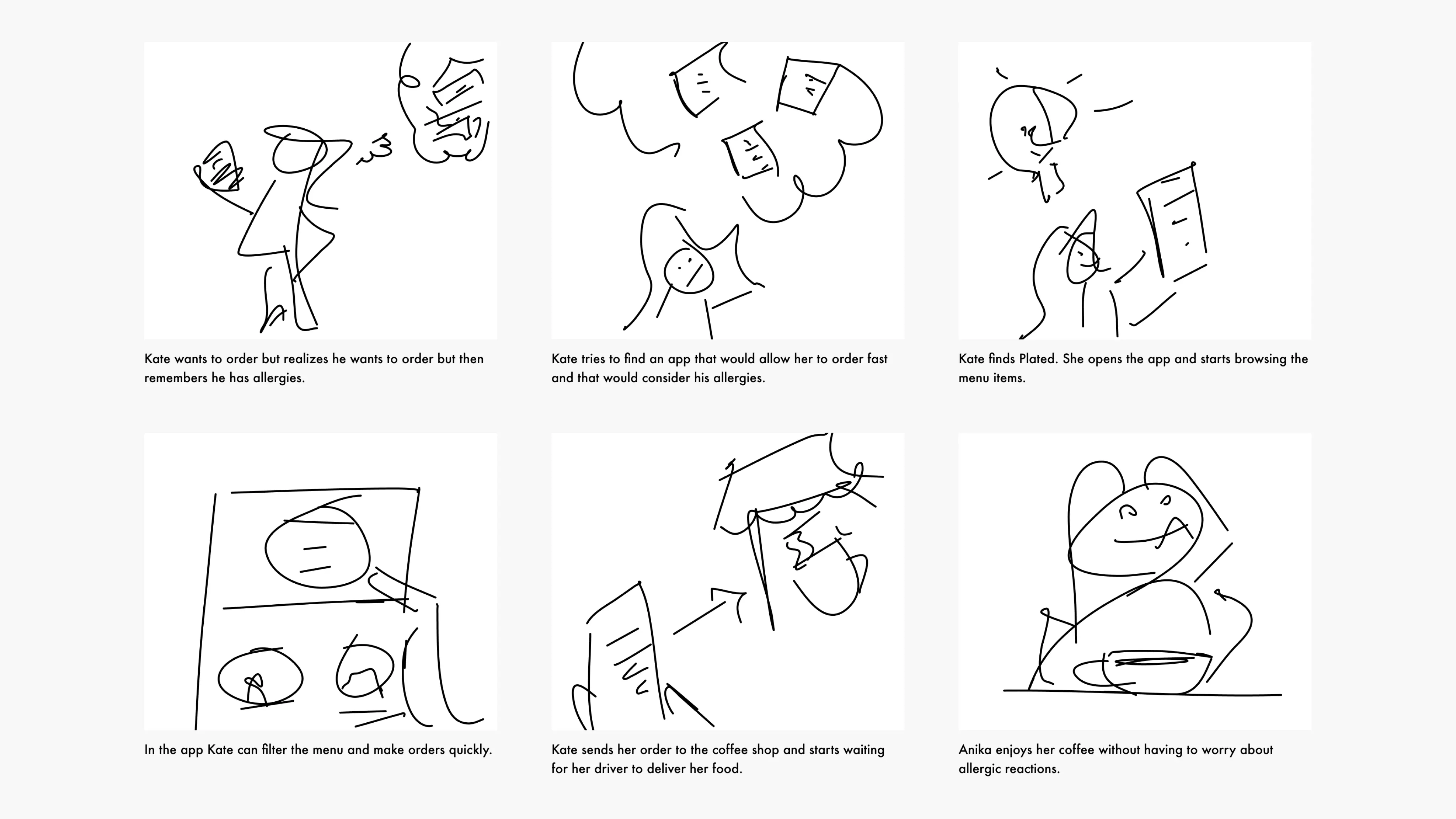
Big Picture Storyboard
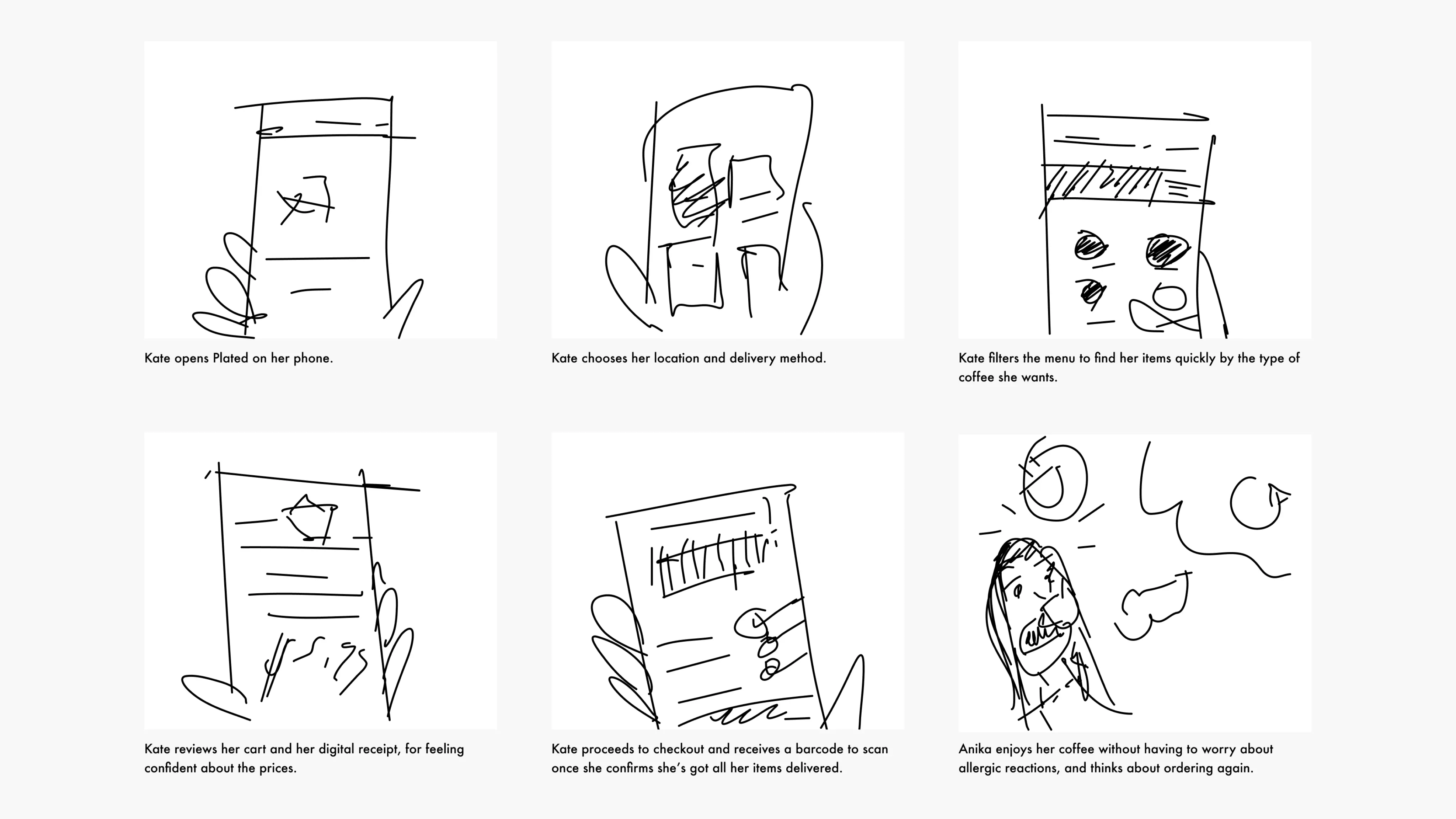
Close Up Storyboard
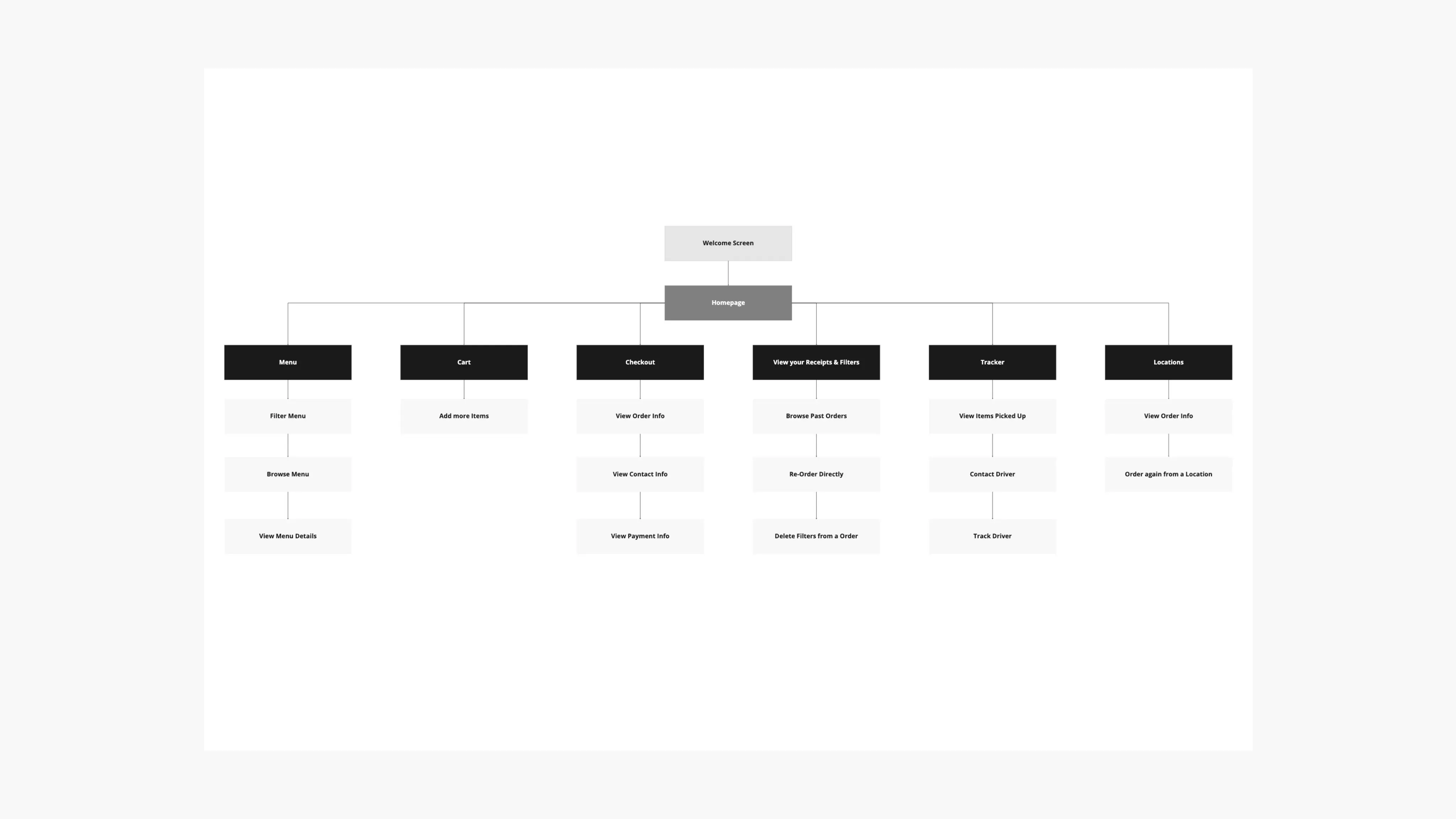
Information Architecture
After understanding who would be using my app, and its purpose, I've carved out the structure for a mobile app sitemap that constitutes the high-level entry points. While doing so, I've learned that it is also important for me to keep only the essential content and eliminate the rest.
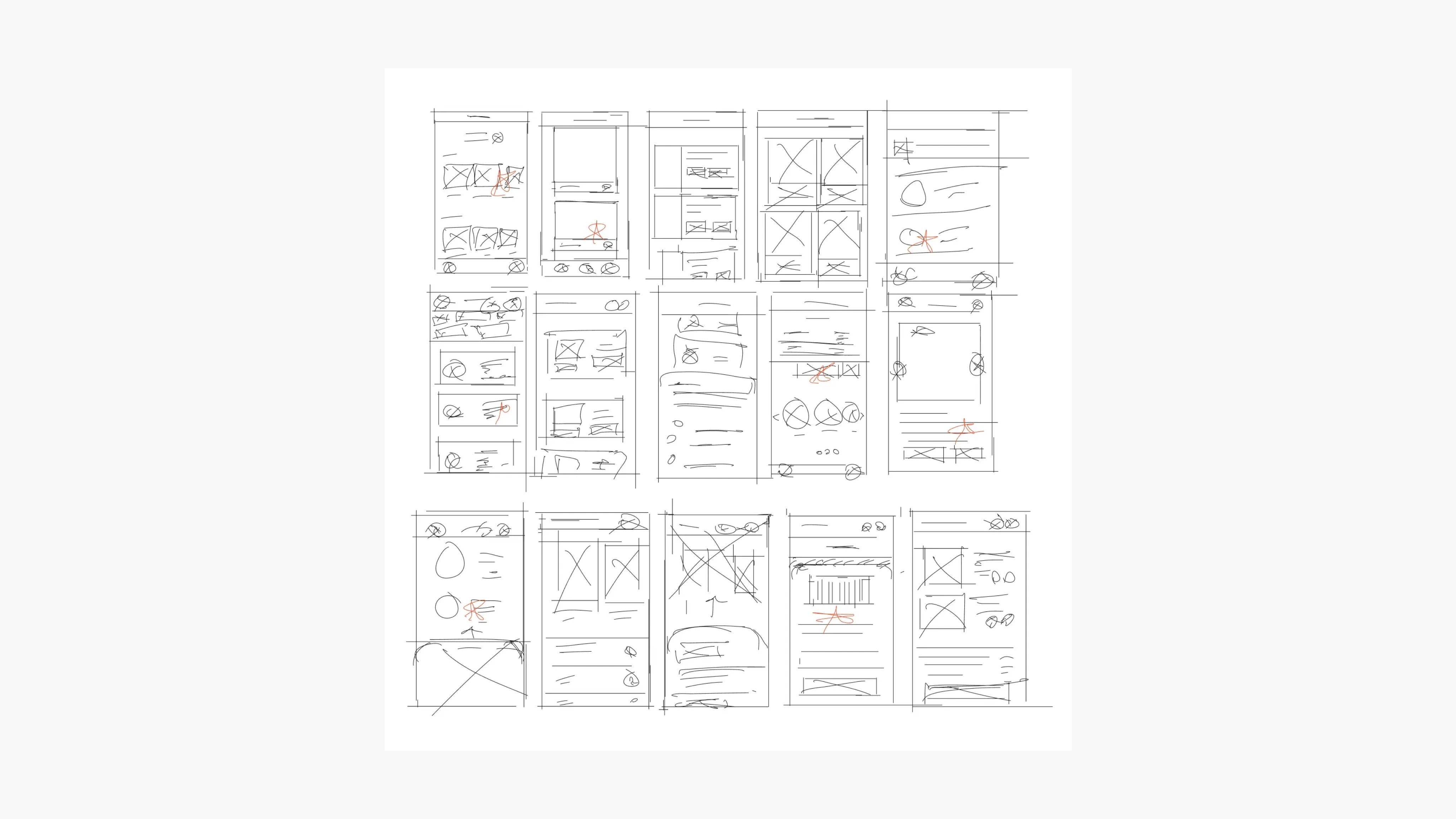
Paper Wireframes
Devoting time to create multiple drafts for every app screen on paper guaranteed that the components transitioning into digital wireframes would effectively tackle user issues. For the home screen, I focused on streamlining the ordering procedure to help users save time.
Digital Wireframes
As the initial design phase continued, I made sure to base screen designs on feedback and findings from user research.
Showing some customization options, and multiple items on a menu could speed up the ordering process.
Including a progressive disclosure technique for the checkout process could reduce the cognitive load.
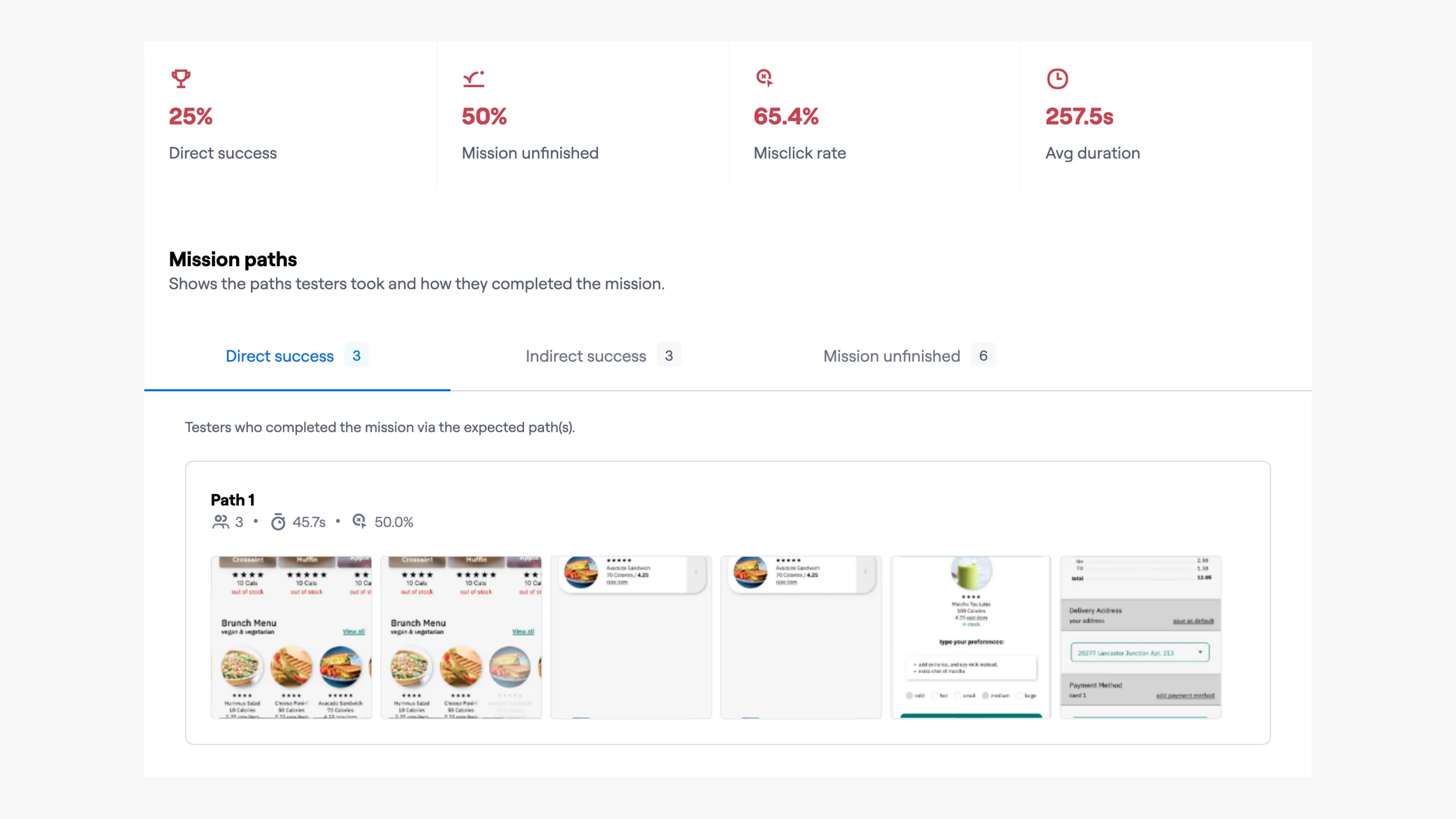
Using the completed set of digital wireframes, I created a low-fidelity prototype. The primary user flow I connected with was customizing and ordering a menu item, so the prototype could be used in a usability study.
Affinity Map & Value Proposition
During my usability studies, I found that participants had a hard time viewing the product's details for ingredients and navigating the app in general. After conducting these studies, I've made an interface that solves both these needs by displaying information up front and sticking with the common way of navigating users are used to.
Usability Testing
I conducted two rounds of usability studies. Findings from the first study helped guide the designs from wireframes to mockups. The second study used a high-fidelity prototype and revealed what aspects of the mockups needed refining.
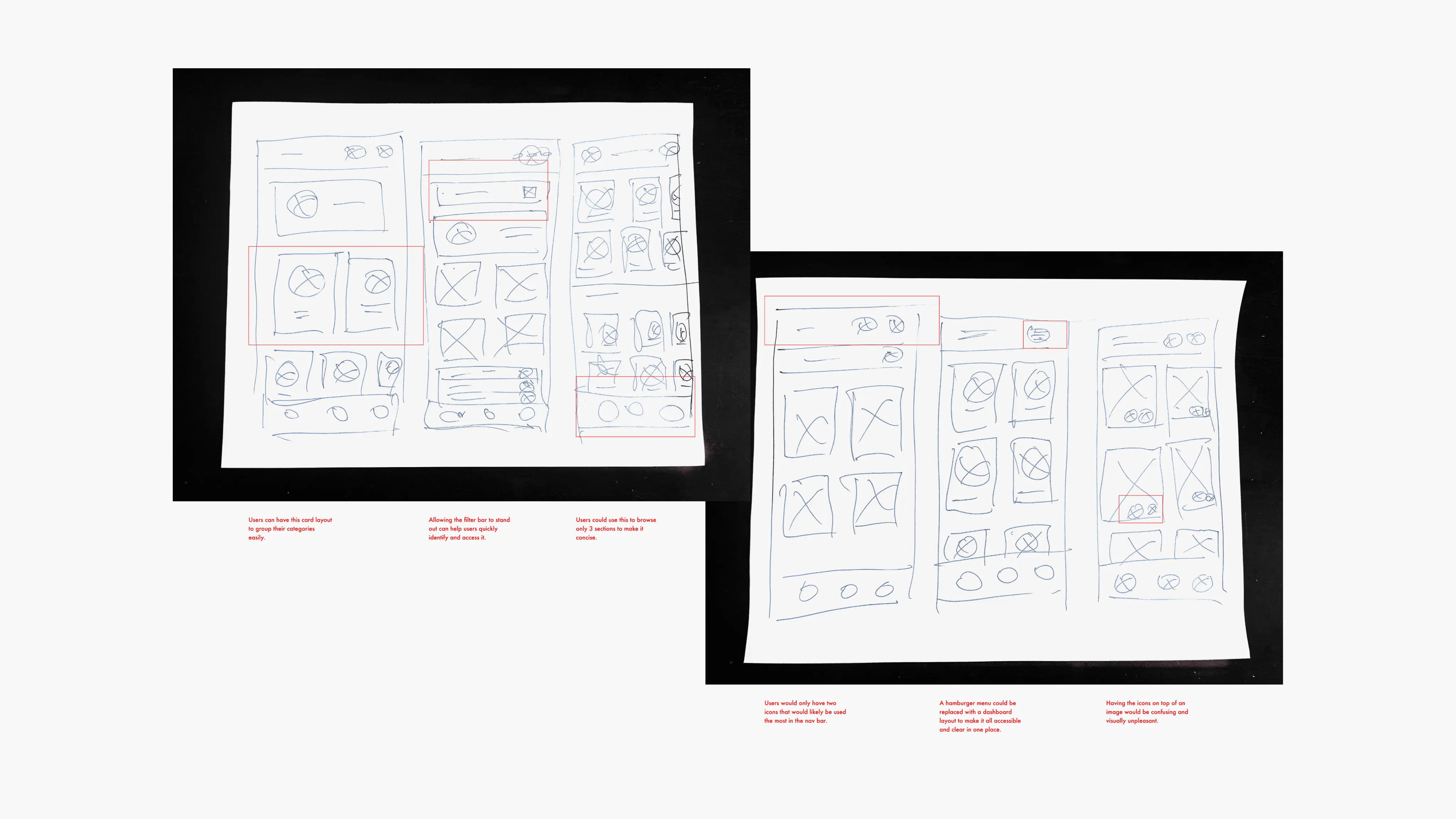
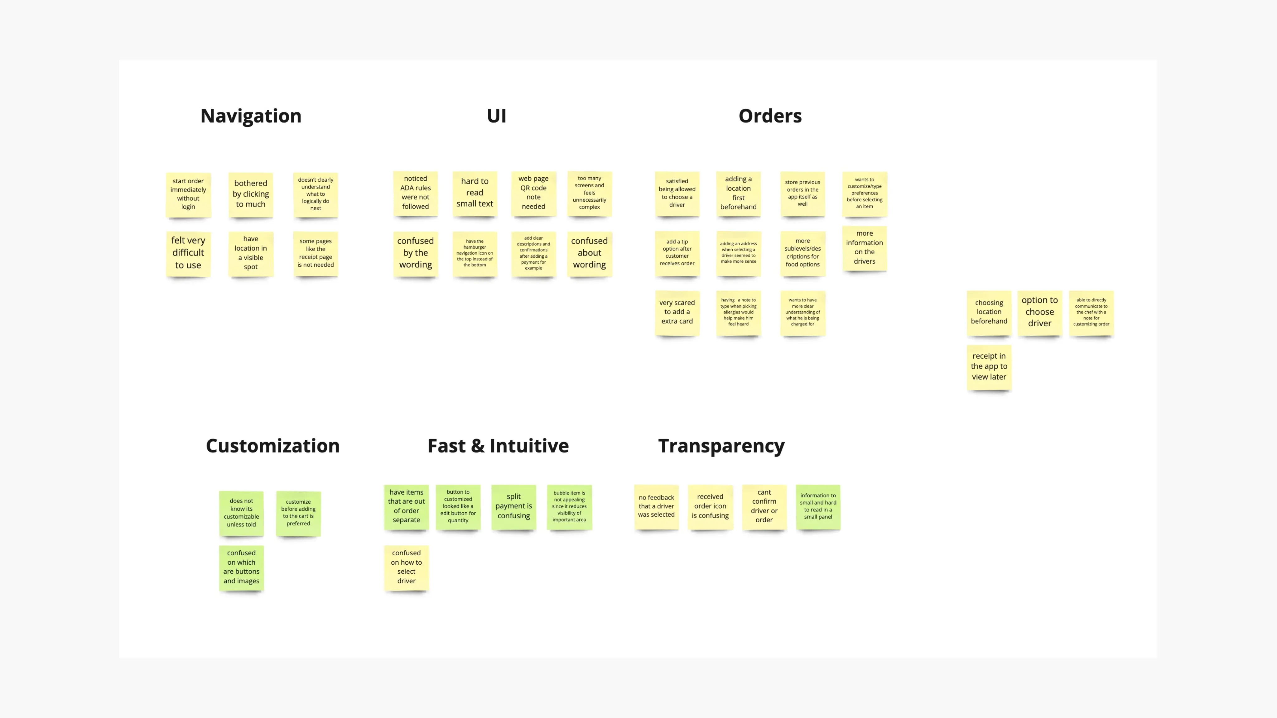
Round 1 Findings
Users do not want to feel limited by how much they can customize their order.
Users are hesitant while selecting items on the menu without knowing the location beforehand.
Users said they'd like to have some sort of delivery control over their placed order.
Users said they'd feel safe if they could have some sort of proof for all the previous orders.
Filter updates, and search bar updates.
Big Picture Storyboard
Changes Made
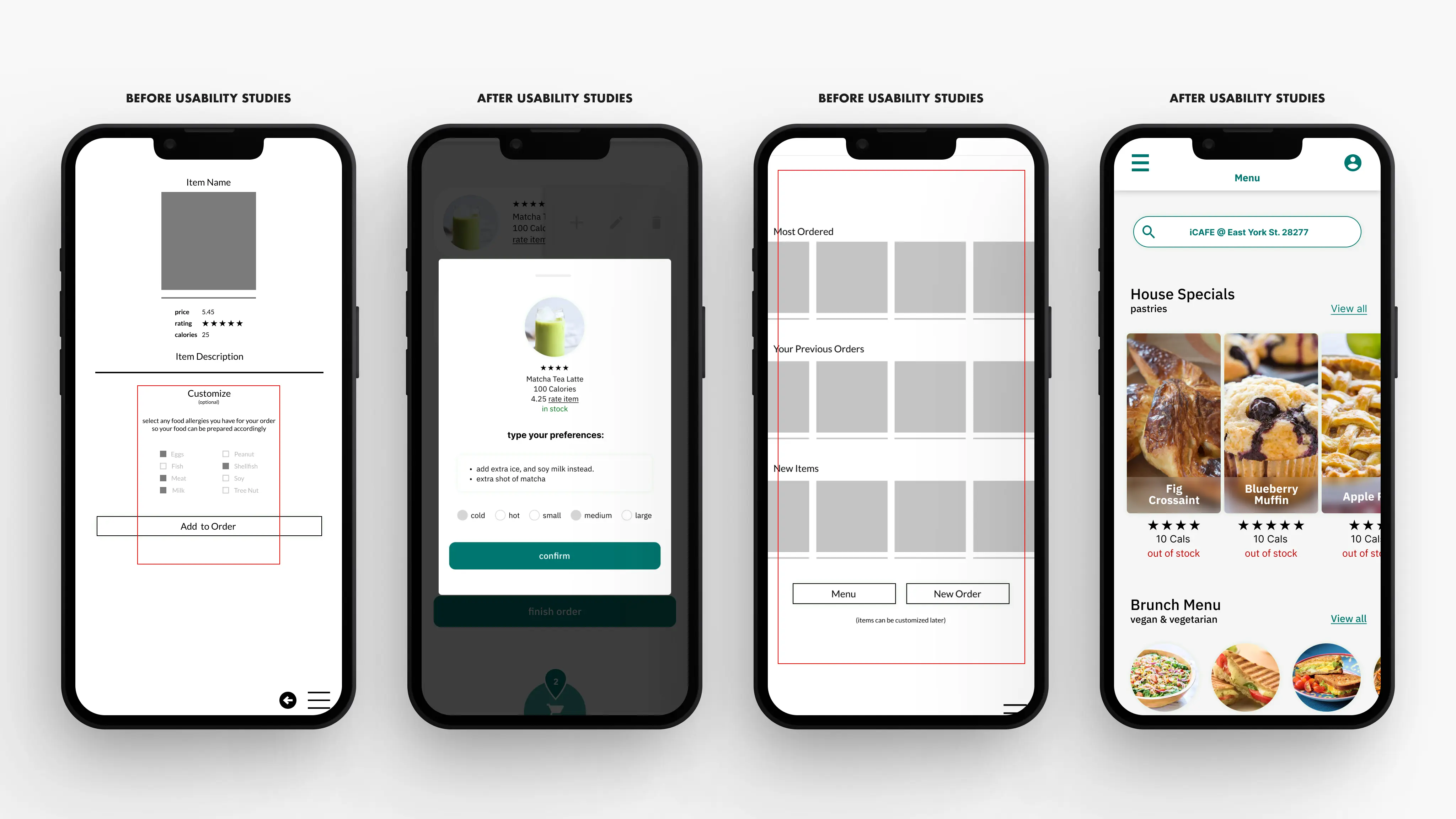
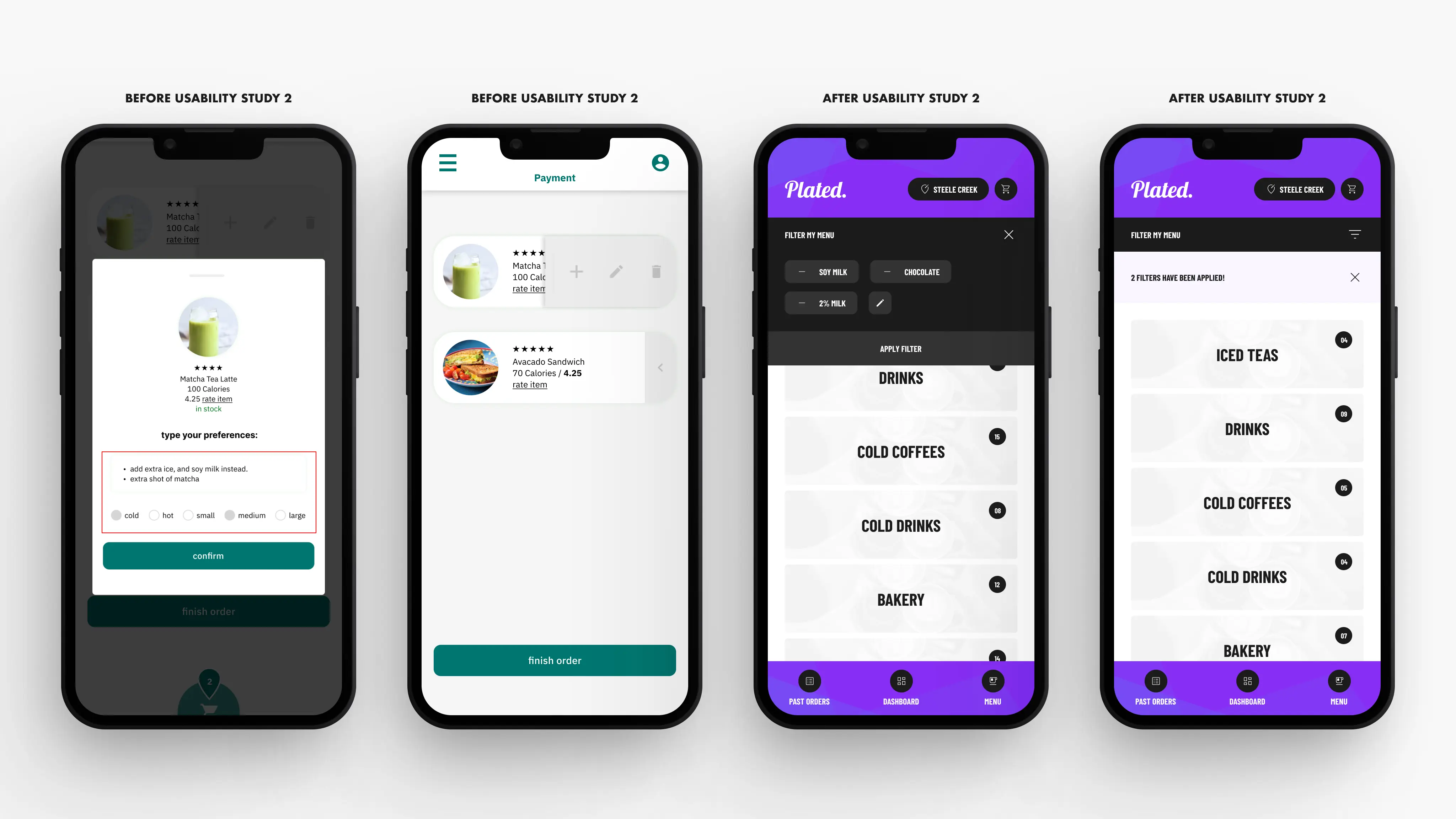
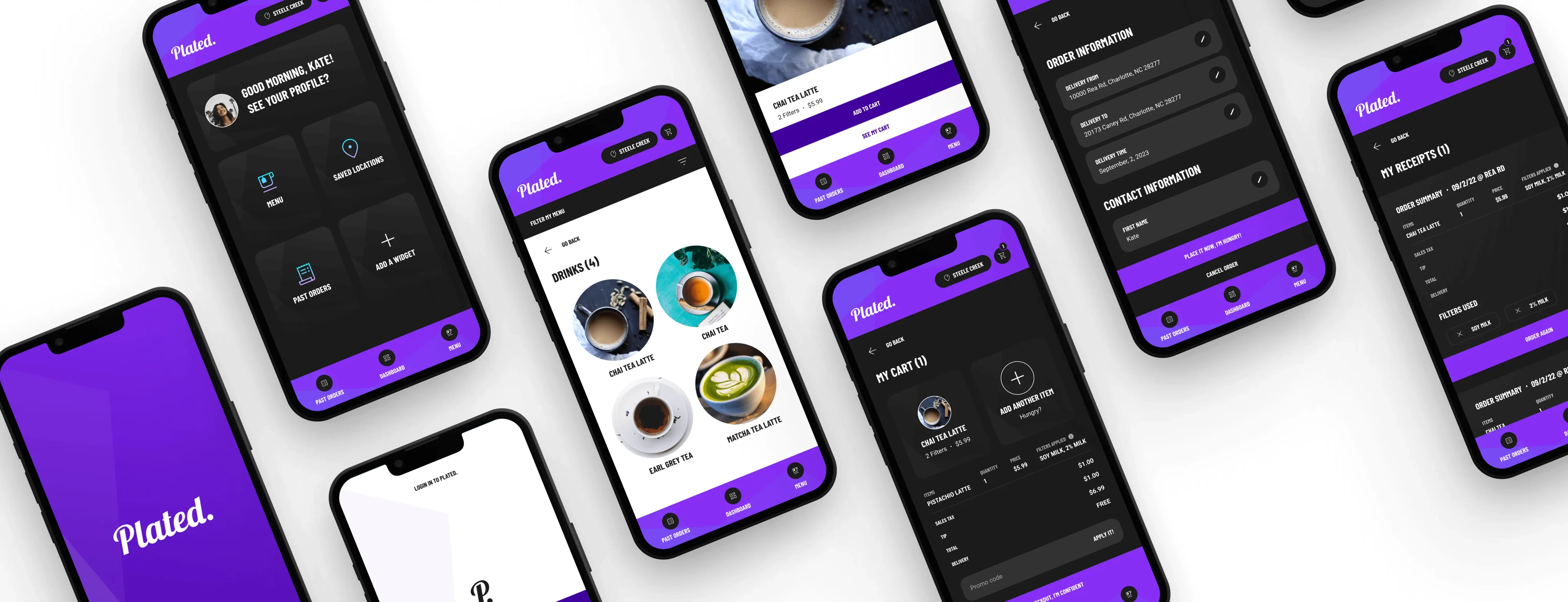
To give users some flexibility with their customizations, I've added a small preferences box for users to type whatever dietary concerns they have (shown in the second image from the left, on the first set of 4).
The CTA at the bottom was for users to place an order after they got a glimpse of their previous and popular orders. I've changed this by adding a location bar at the top (shown in the last image from the left, on the first set of 4)
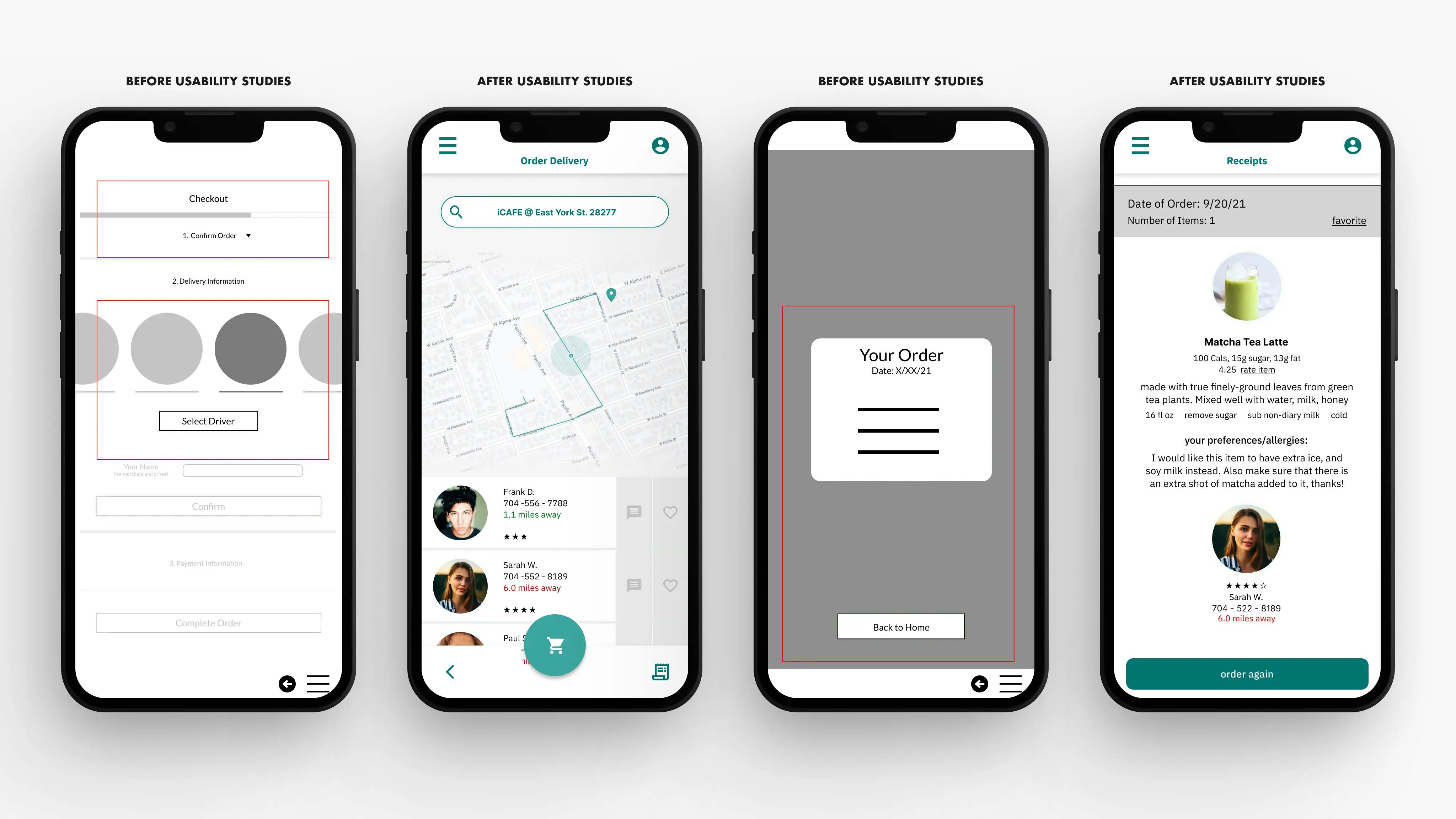
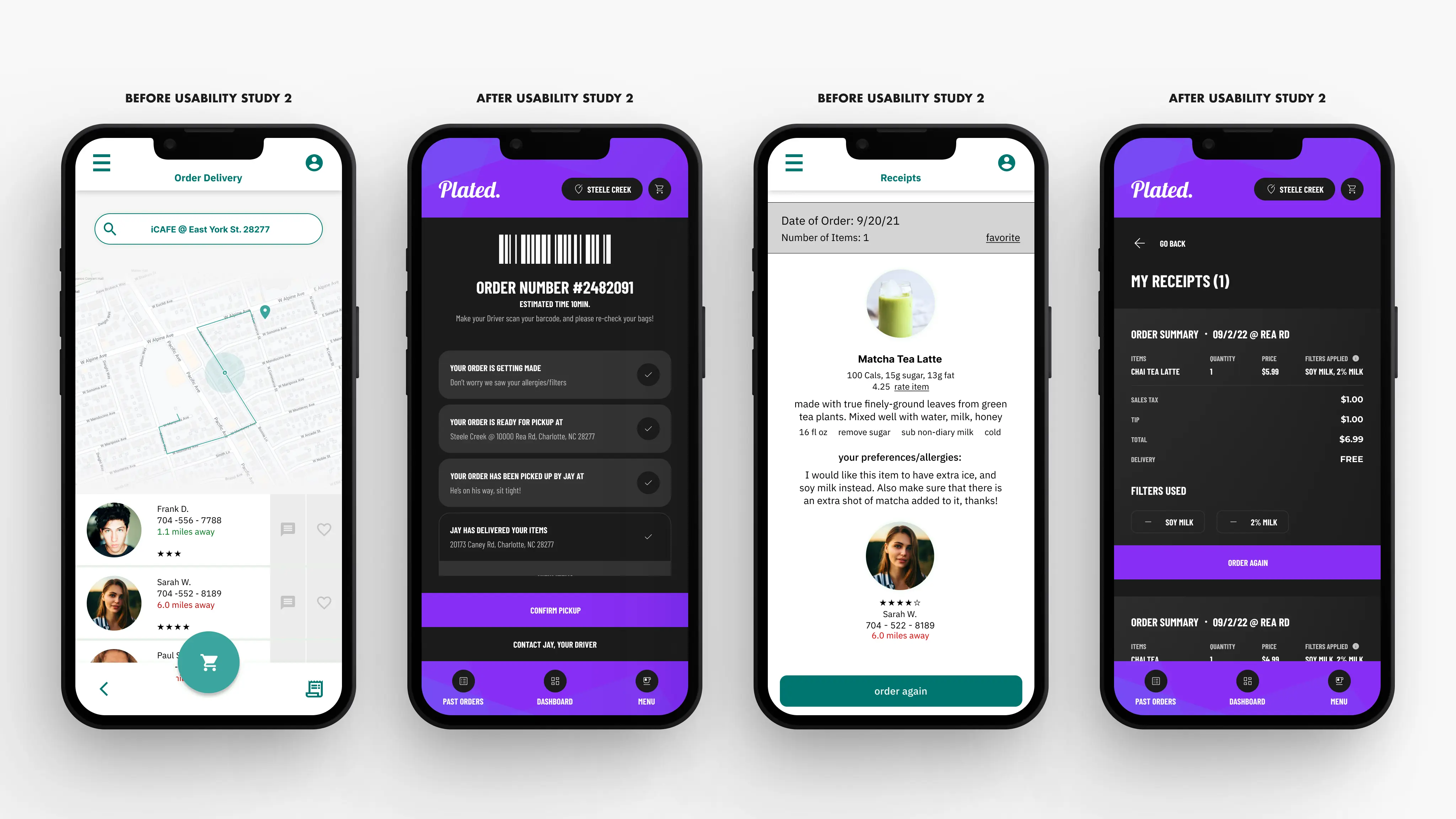
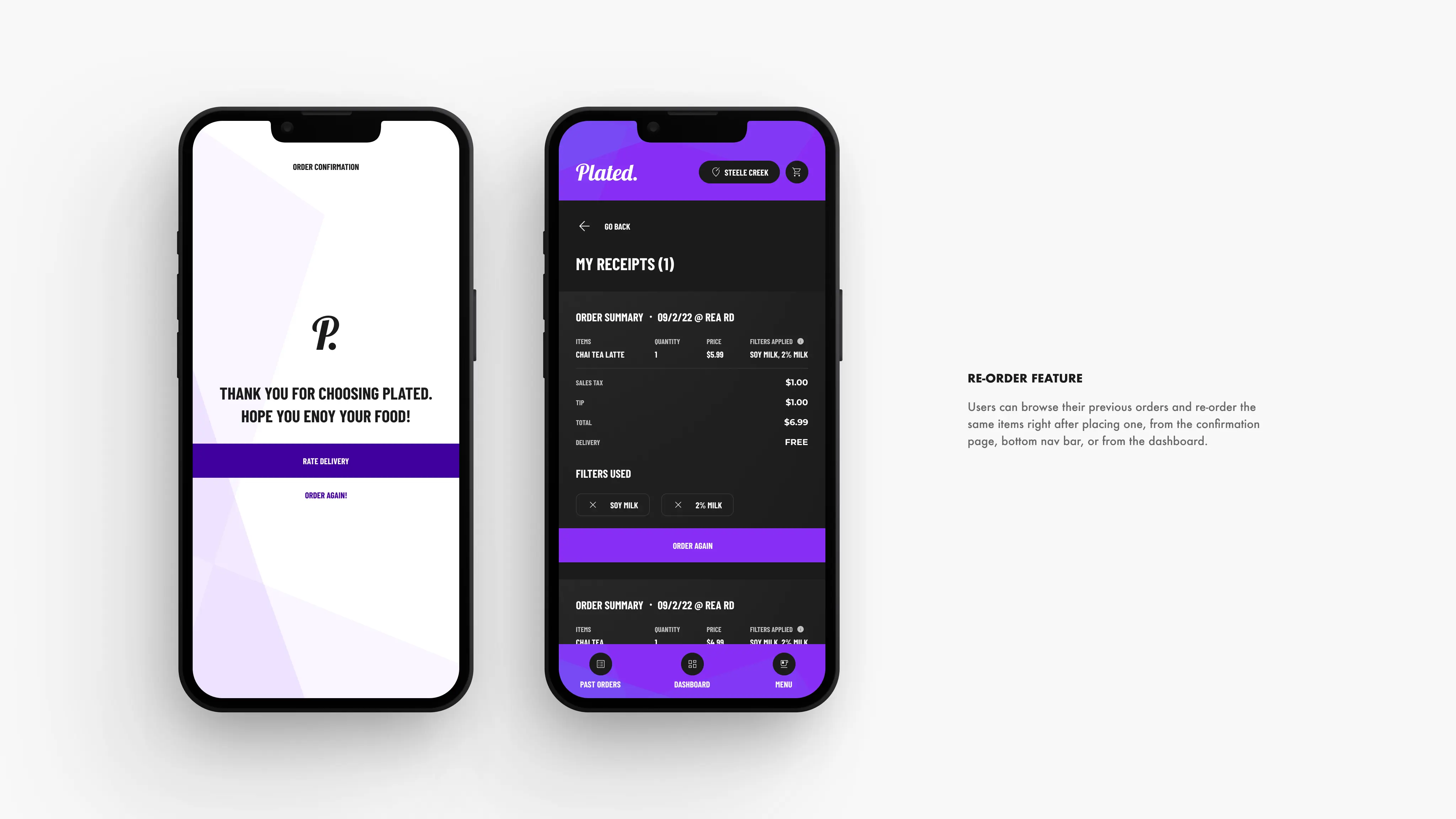
To add a more controlled delivery experience, I've added a messaging feature. (shown in the second image from the left, on the second set of 4). I've also included a receipt or previous order page with a re-order feature for an instant re-order to prevent users from having to select their options all over again. (shown in the last image from the left, on the second set of 4).
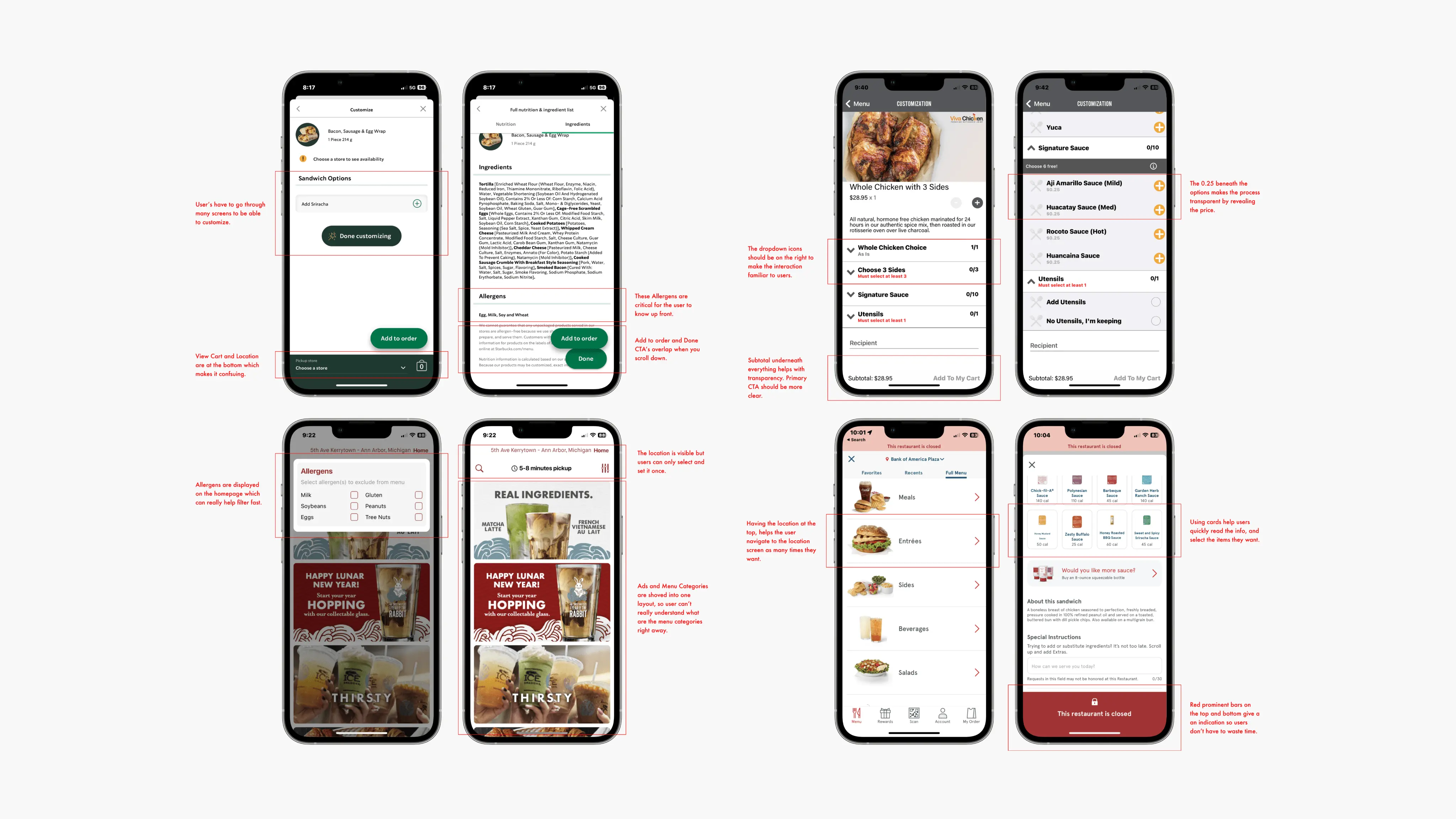
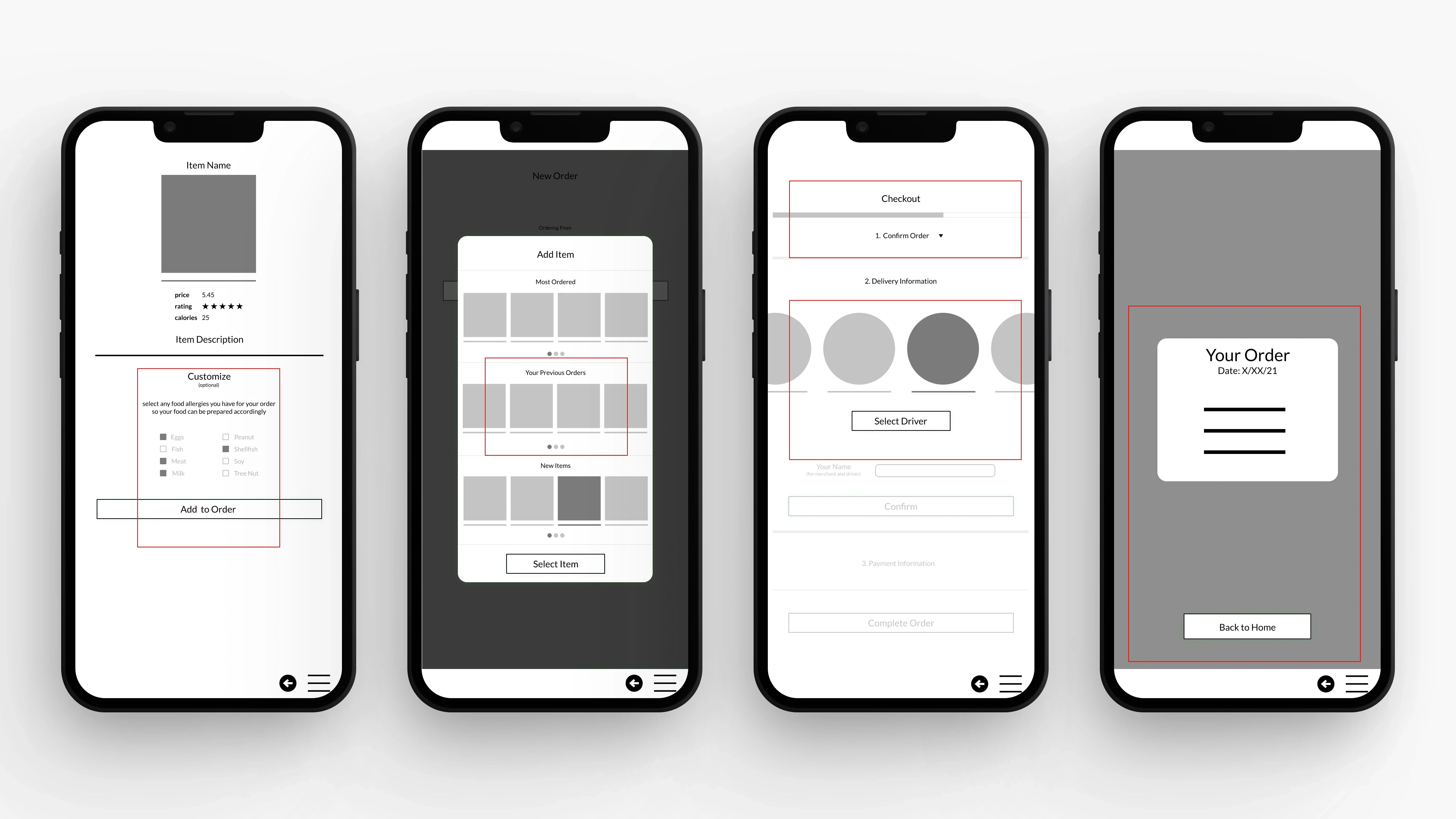
Round 2 Findings
Users had a hard time understanding what was a button, and what were images.
Many users couldn't identify the customize button right away.
Some users thought that the edit icon was to edit the quantity, and not the item itself.
Users do not want to feel limited by how much they can customize their order.
The checkout process has too many unnecessary steps
Users said that selecting a driver wasn't something they had seen before, and seemed confused on how to use the feature.
After conducting a unmoderated usability study on Maze, I've gathered this crucial feedback on my designs. Based on the data I've rearranged the visual hierarchy of the entire app, more particularly the respective pages that needed work.
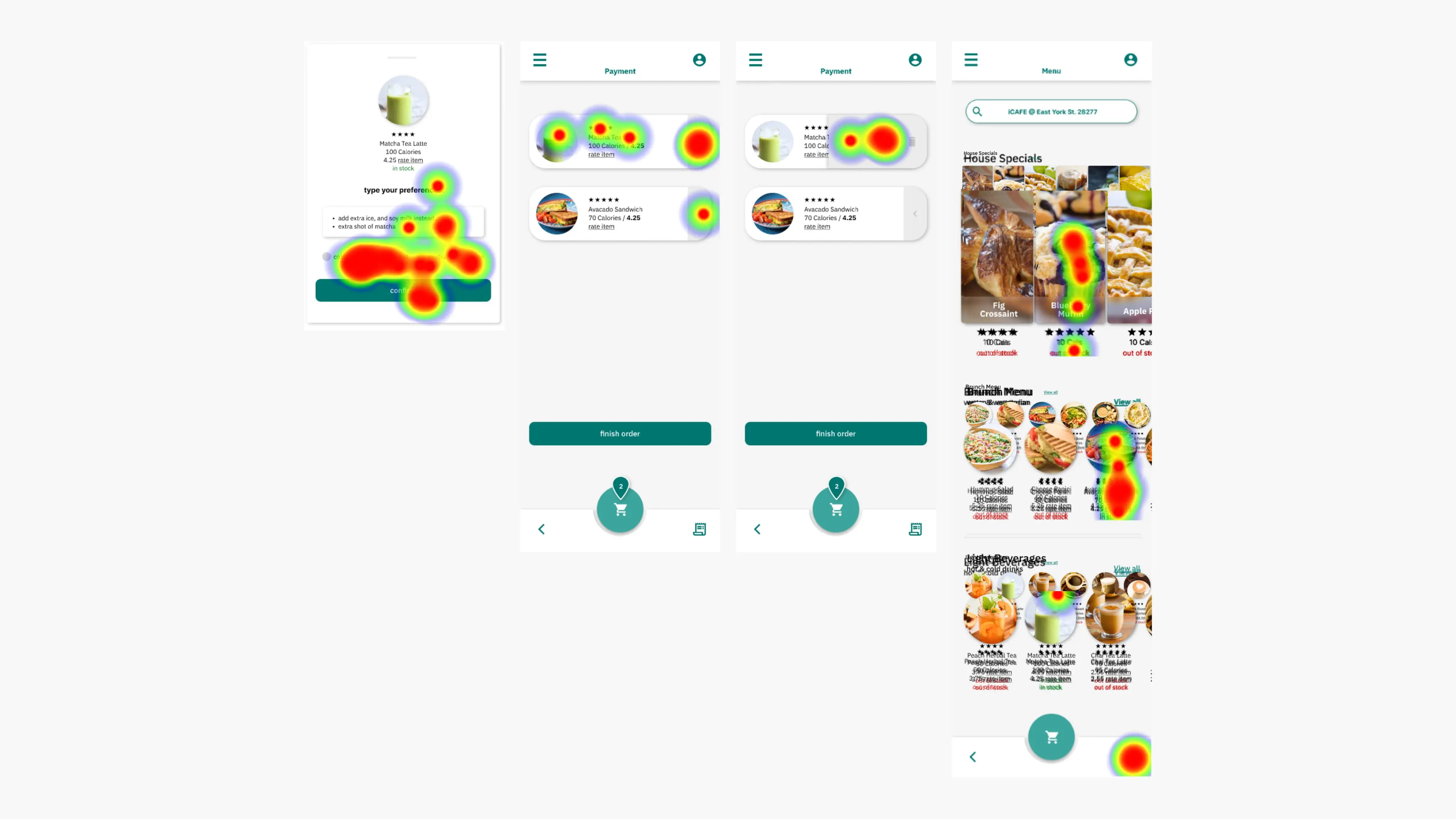
This heat map showed me areas where the visual design could improve, and I've made changes accordingly.
Changes Made
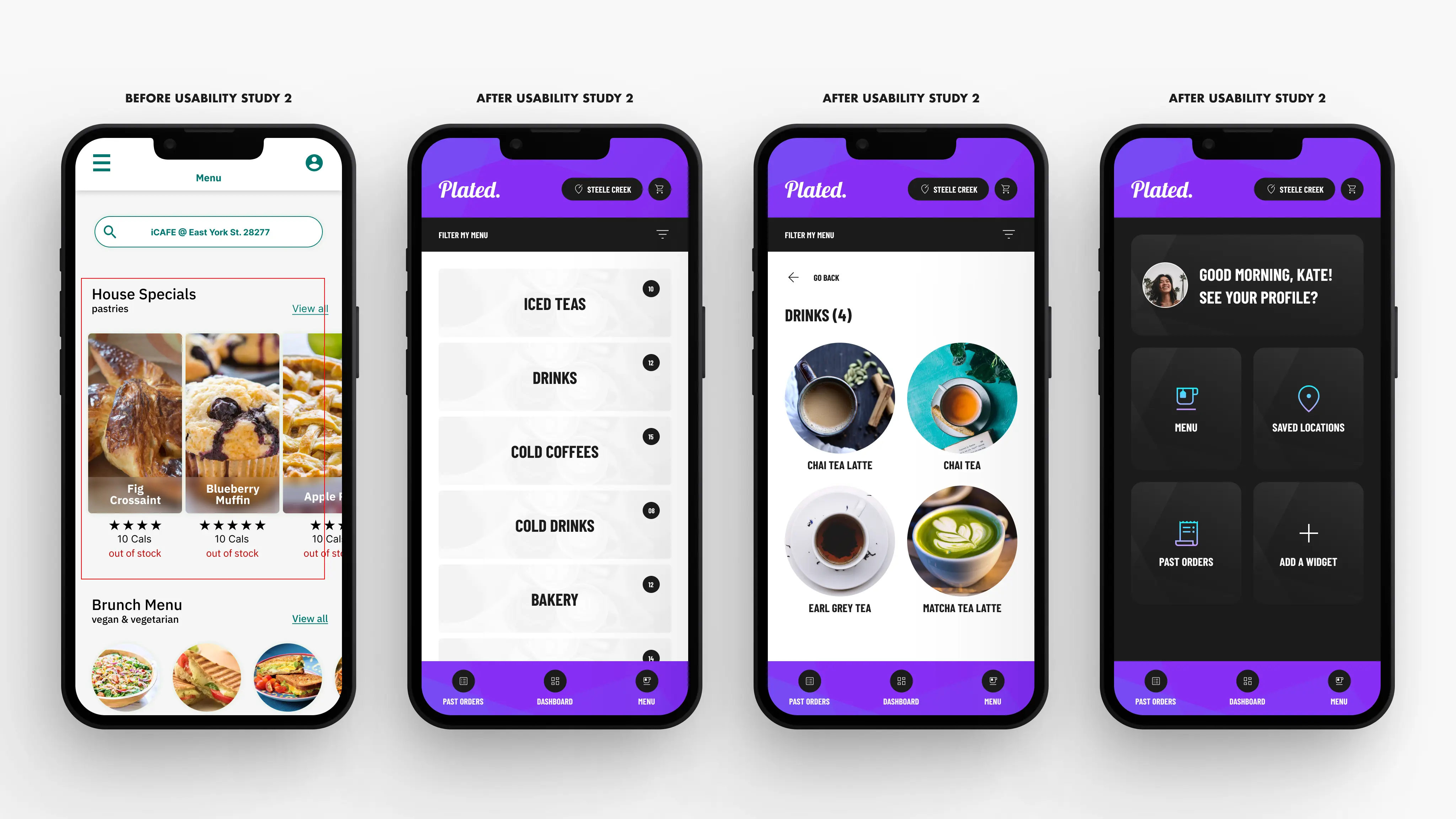
To establish a distinct visual hierarchy in the app, I have altered designs to accentuate elements that demand greater attention than others (featured in all images within the first set of four).
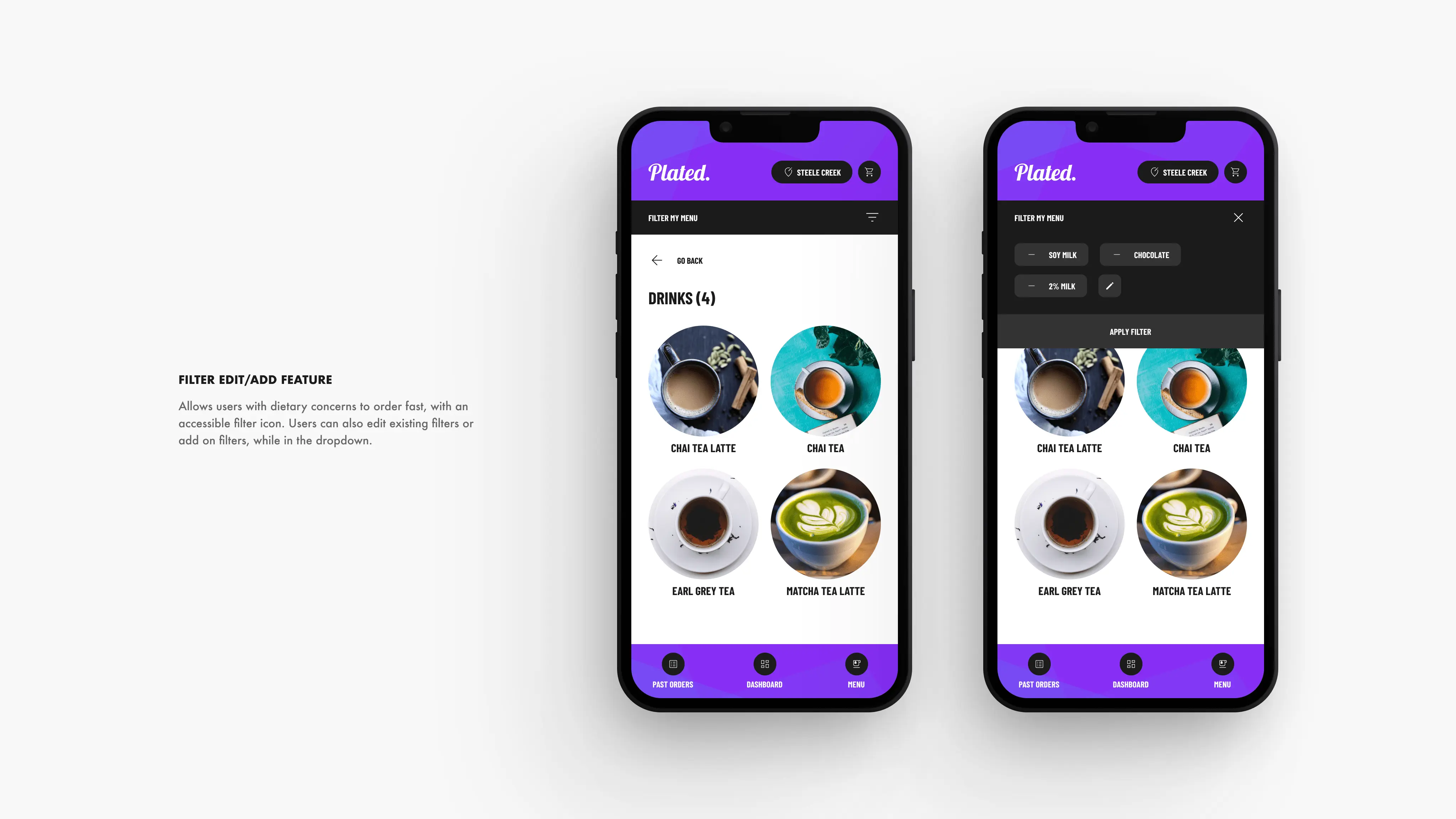
To offer users versatility in their customizations, I have transformed the text box into a more general filter method. This employs Jakob's UX law and permits users to develop their custom filters for a better product experience (displayed in the third image from the left, on the second set of four).
Furthermore, I have removed the driver selection feature, as most users sought a quick ordering process and familiar experience. Instead, I have introduced a Call-to-Action (CTA) that enables users to contact the driver if needed. Lastly, I have incorporated a more accessible past order listing page for the convenience of regular app users. (displayed in the second and fourth image from the left, on the third set of four).
Mockups
The final high-fidelity prototype presented cleaner user flows for customizing an order and checkout. It also met user needs for a re-order option as well as more customization.
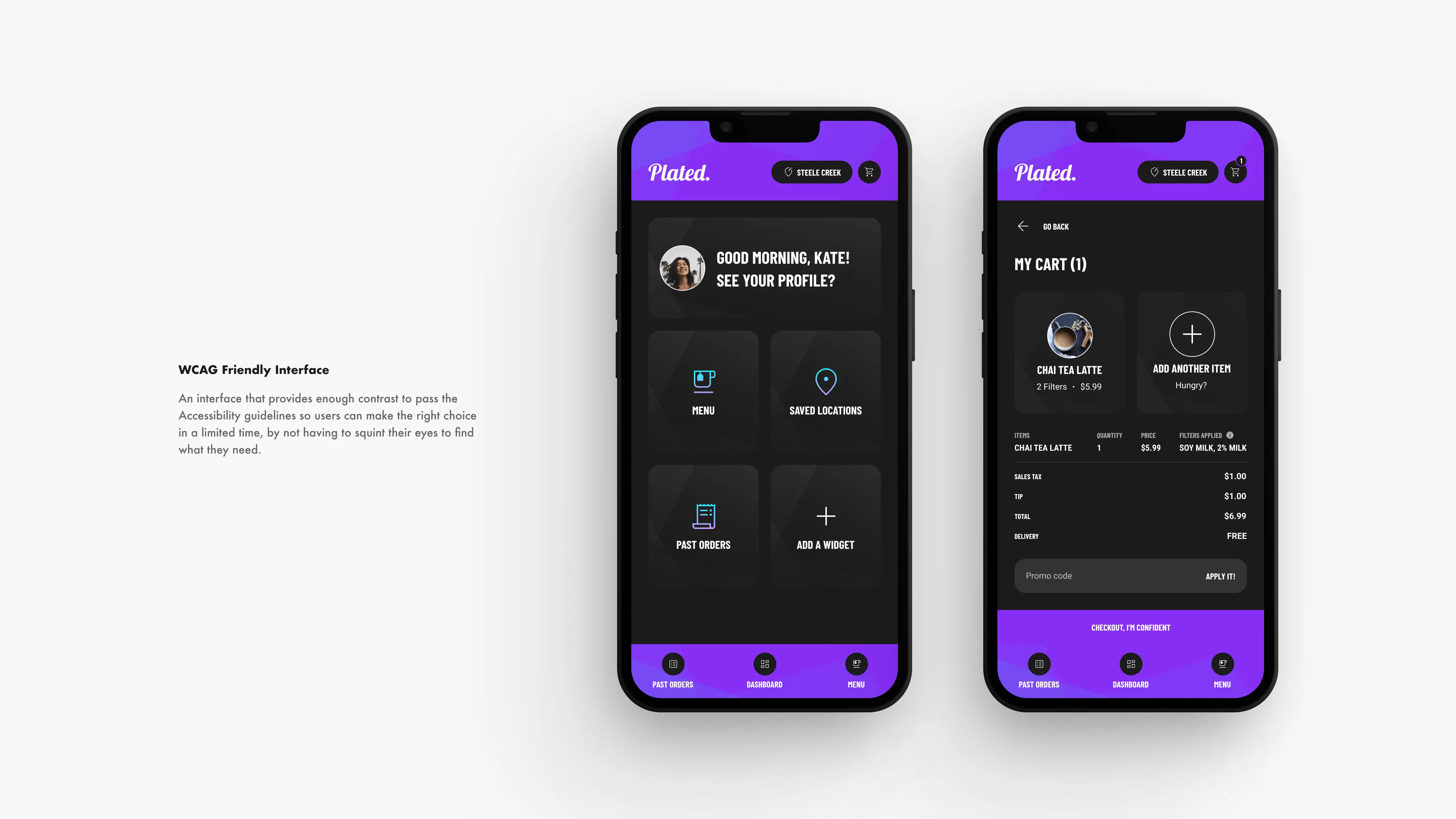
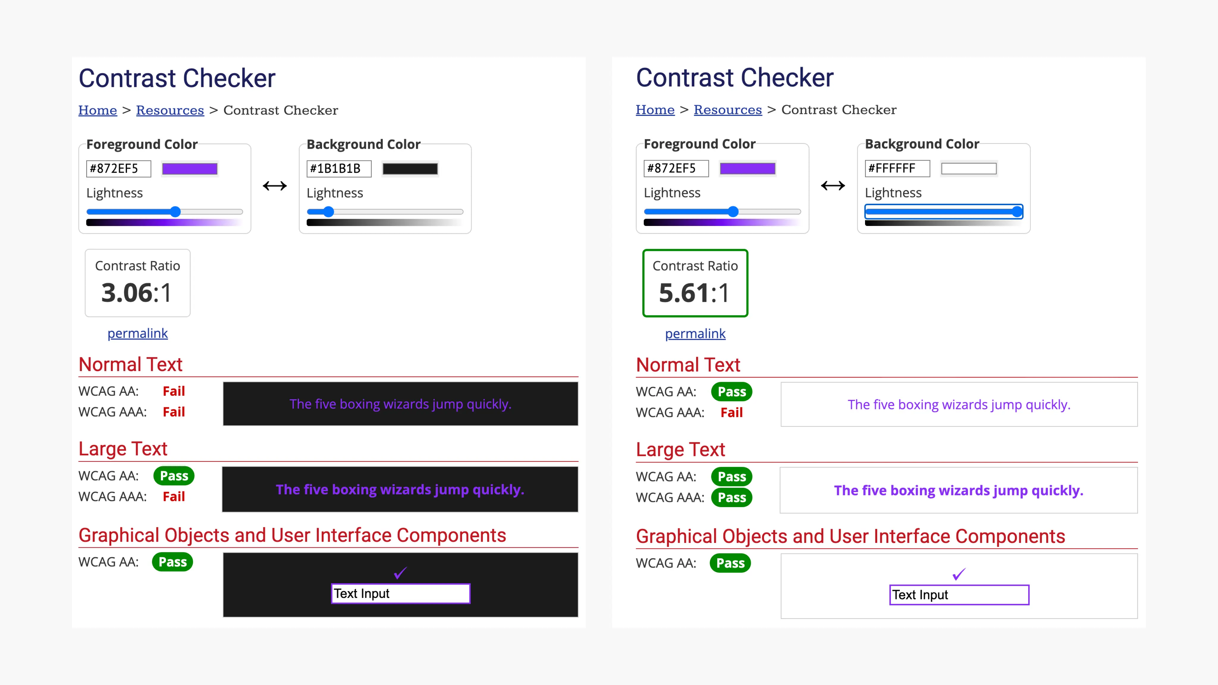
Accessibility Considerations
Made sure all the colors passed the AA WCAG test, to make sure the app is accessible to college students with visual strain from using computers constantly.
Utilized universal icons to make it accessible to new users, and used detailed imagery for menu items and icons to help all users better understand the designs.
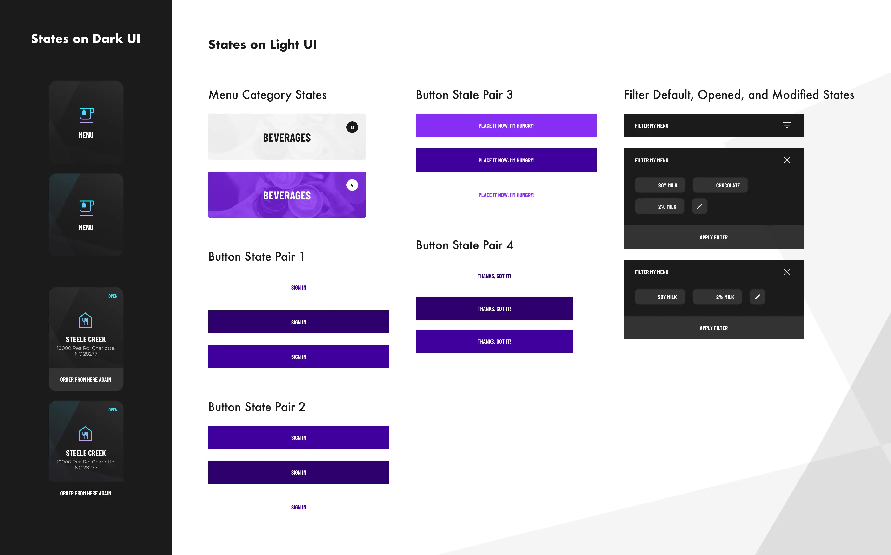
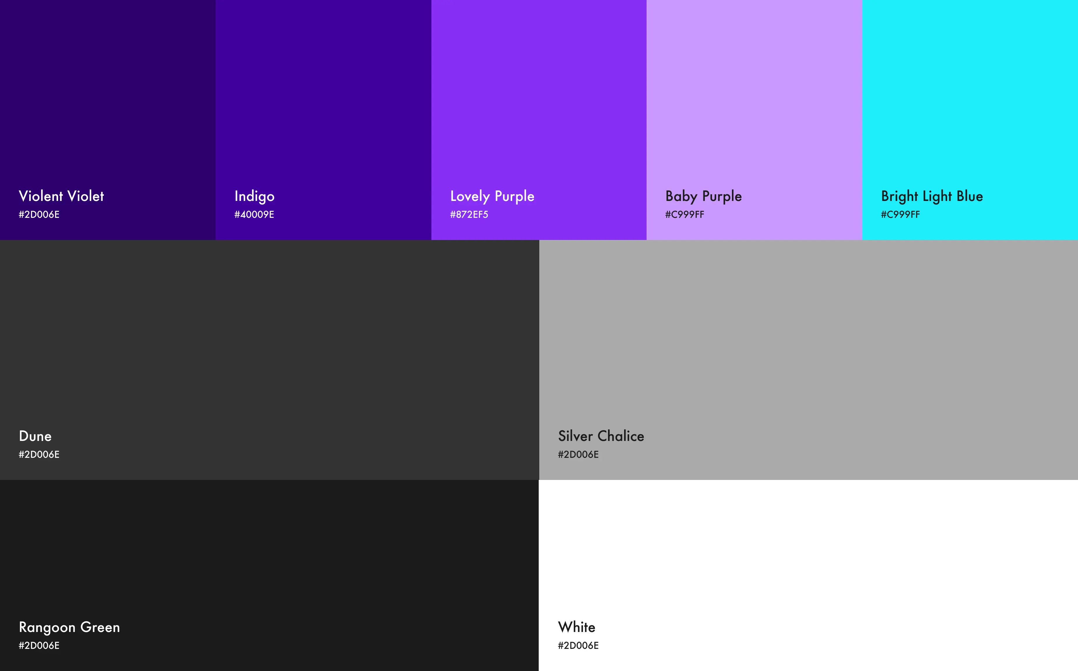
Stickersheet
For the app, I decided to go with a mix of a light and dark UI to bring contrast to my design while considering accessibility. I thought of using some purples, blues, and greens to make it a stress-free experience with cool colors.
Primarily, purple is a color that is associated with the feeling of security. Therefore I've used it to signify that Plated is a trustworthy app to use, especially for those with dietary concerns.
I've made sure all the colors passed my WebAIM accessibility test.
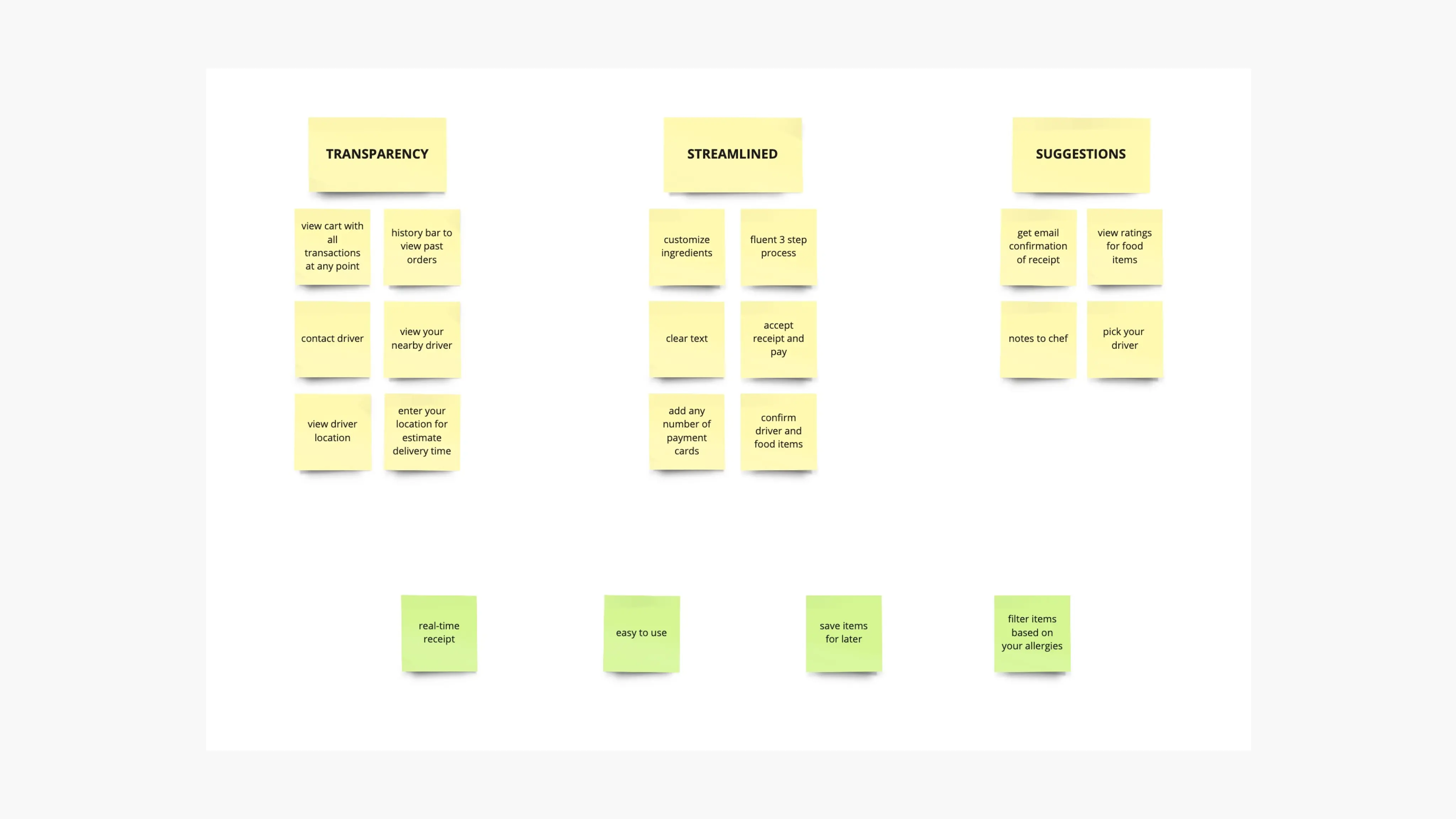
How should we measure success?
During the creation of the Plated app, I discovered that initial concepts for the app merely serve as a starting point. Usability analysis and peer input played a significant role in shaping every version of the app's layout.
Next Steps
Perform an additional set of usability tests to confirm if the challenges faced by users have been successfully resolved.
Carry out further user investigation to identify any emerging areas of concern.