
My Role
Solo UX designer designing an app for Plated from conception to delivery.
Scope
I was conducting interviews, paper and digital wireframing, low and high-fidelity prototyping, conducting usability studies, accounting for accessibility, and iterating on designs.
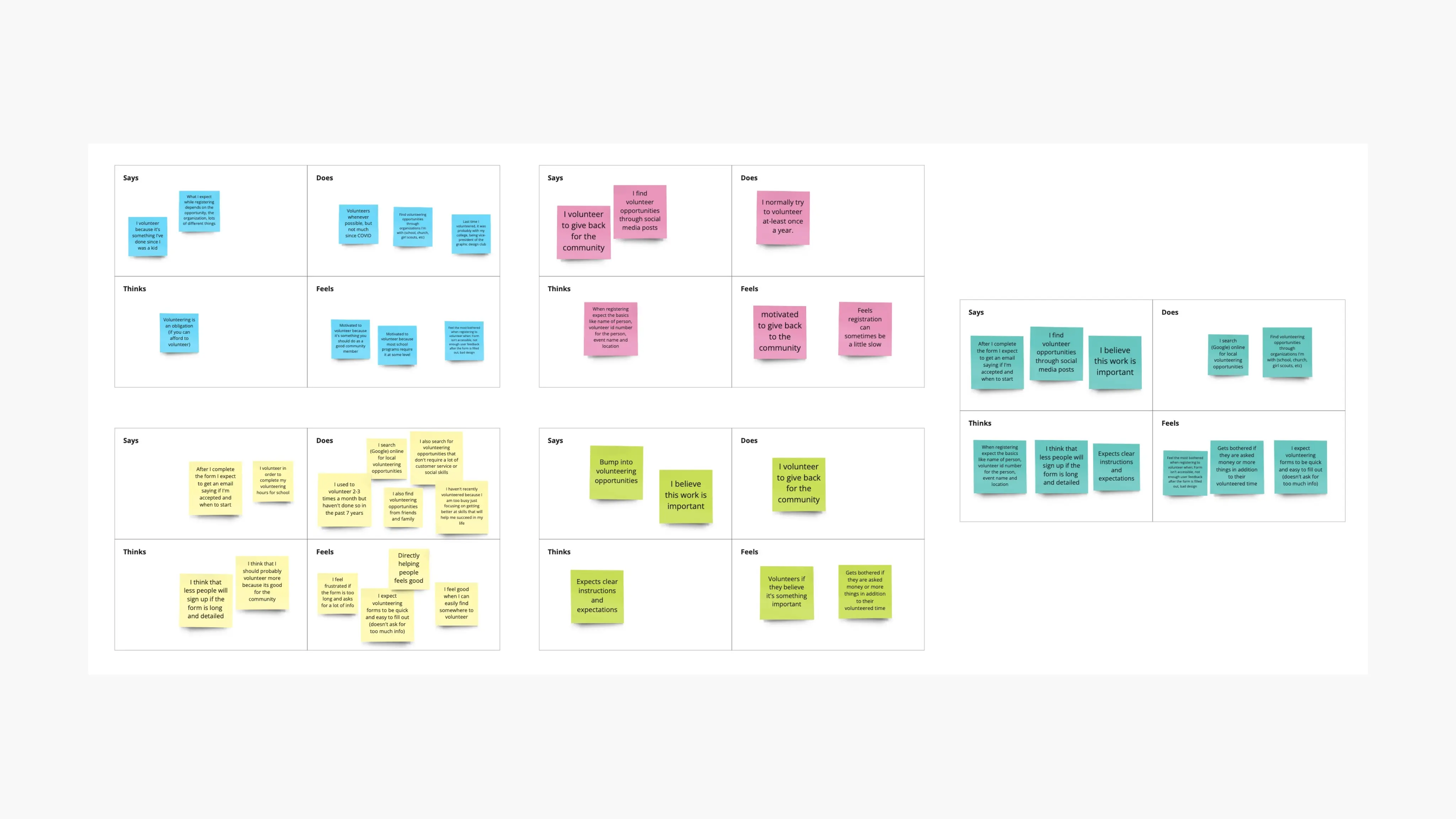
User Persona, Pain Points, & Journey Map
The main pain points I've discovered were:
Time: Volunteers want to identify where they could contribute based on their interests, to speed up the selection process.
IA: Volunteers completely ditch the volunteer registration process if they find that the process is too long.
Trust: Volunteers feel unsafe when they are asked for personal information or the steps to complete the process are unclear.
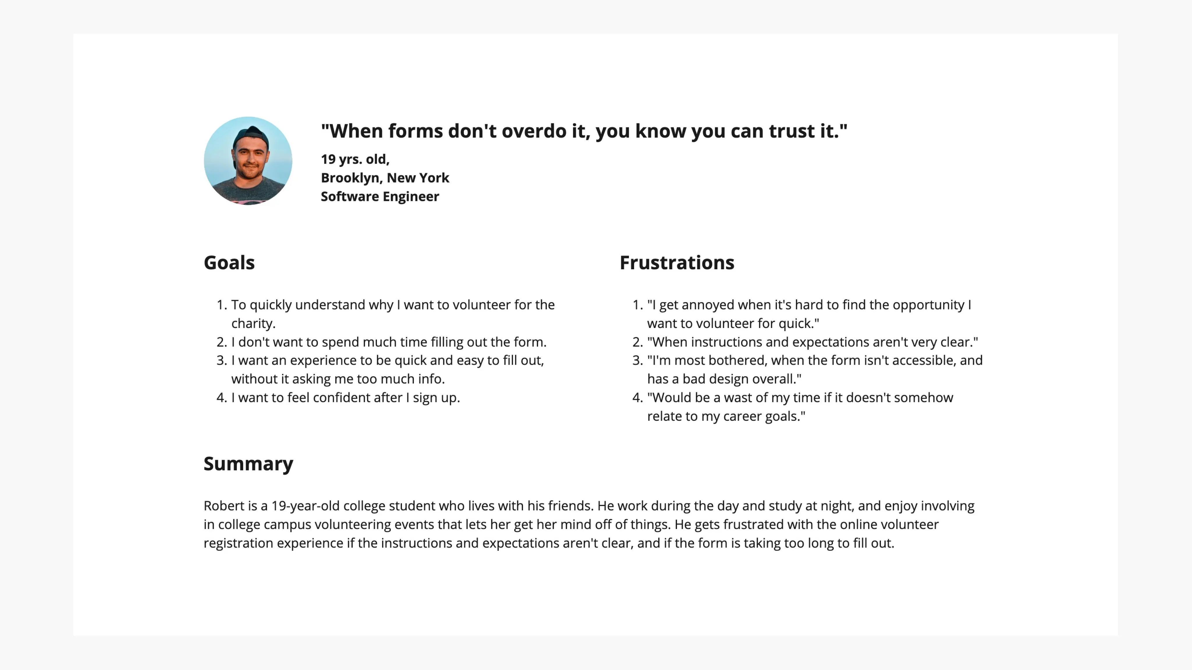
Robert's user journey map revealed how helpful it would be for users to have a faster ordering experience.
Overall, I came to understand that Robert is a busy professional who needs a an meaningful web experience because they want to feel happy after signing up.
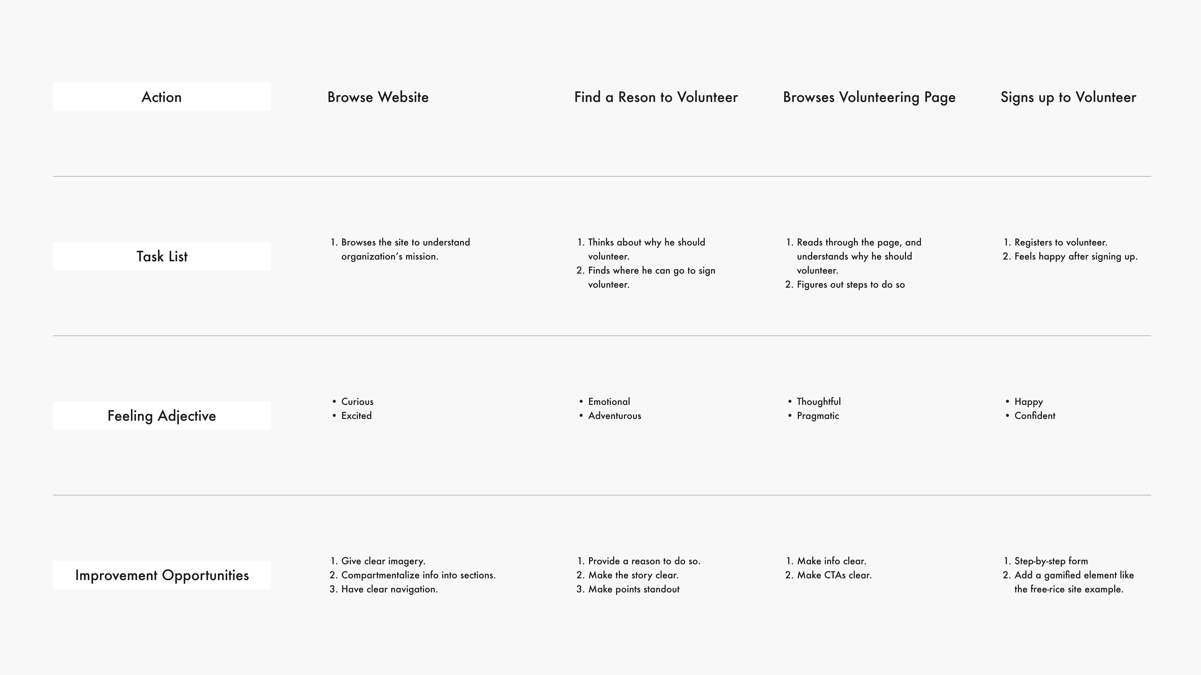
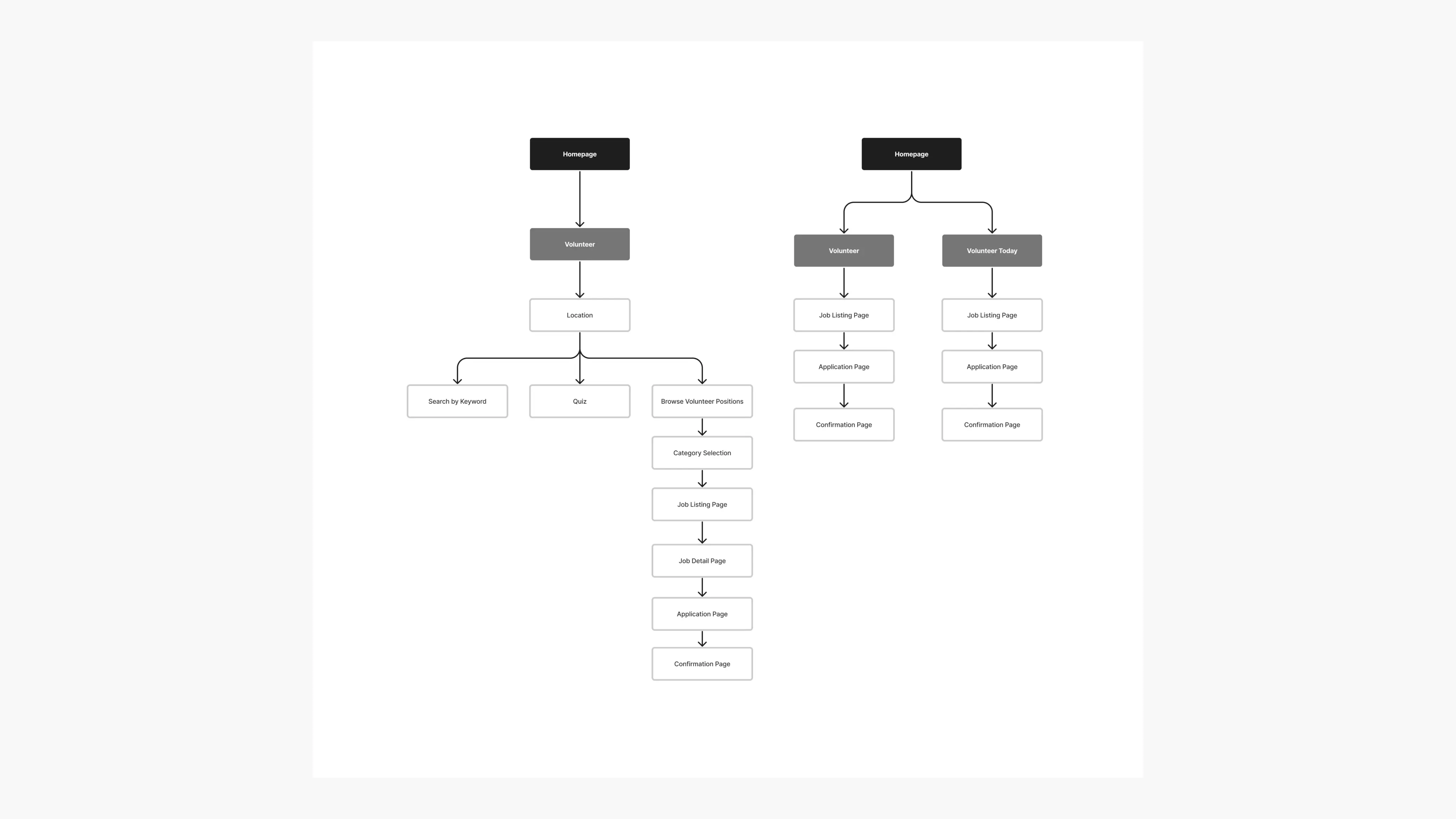
The user flow for volunteer registration
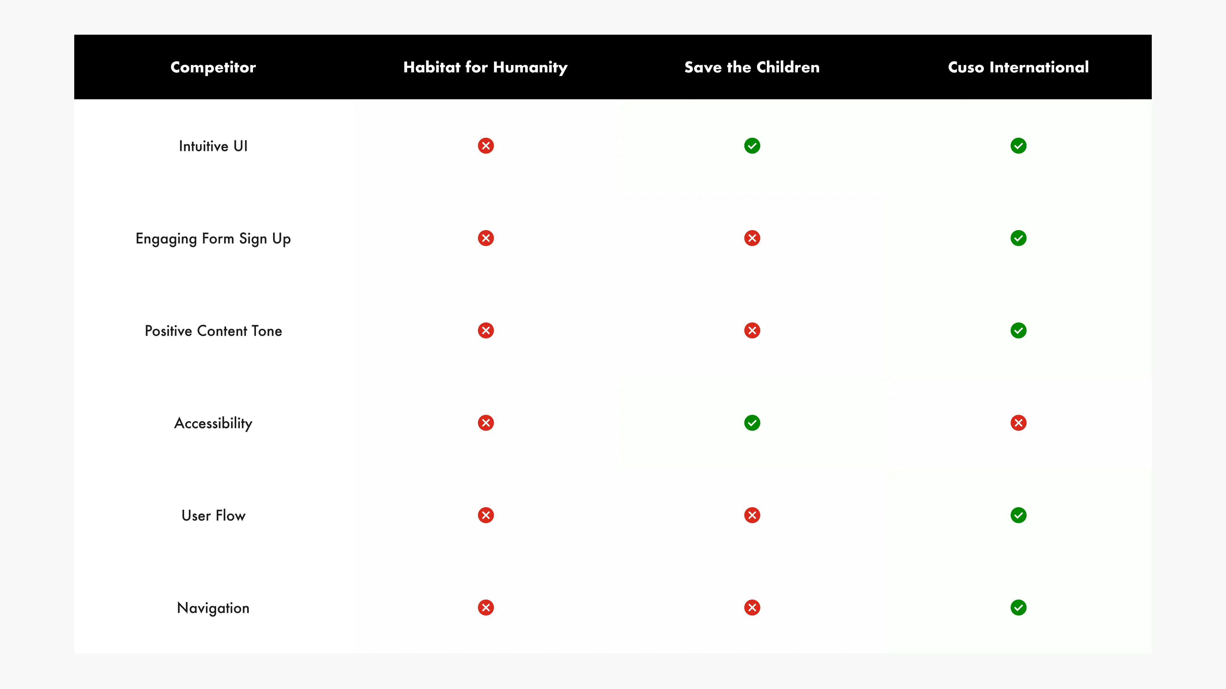
Competitive Audit
For the comparative analysis, I've selected Habitat for Humanity, Save the Children, and Cuso International, as they offer services akin to those found on this website.
Following the assessment of each competitor's offerings, I've charted the unique characteristics they leverage to promote their services.
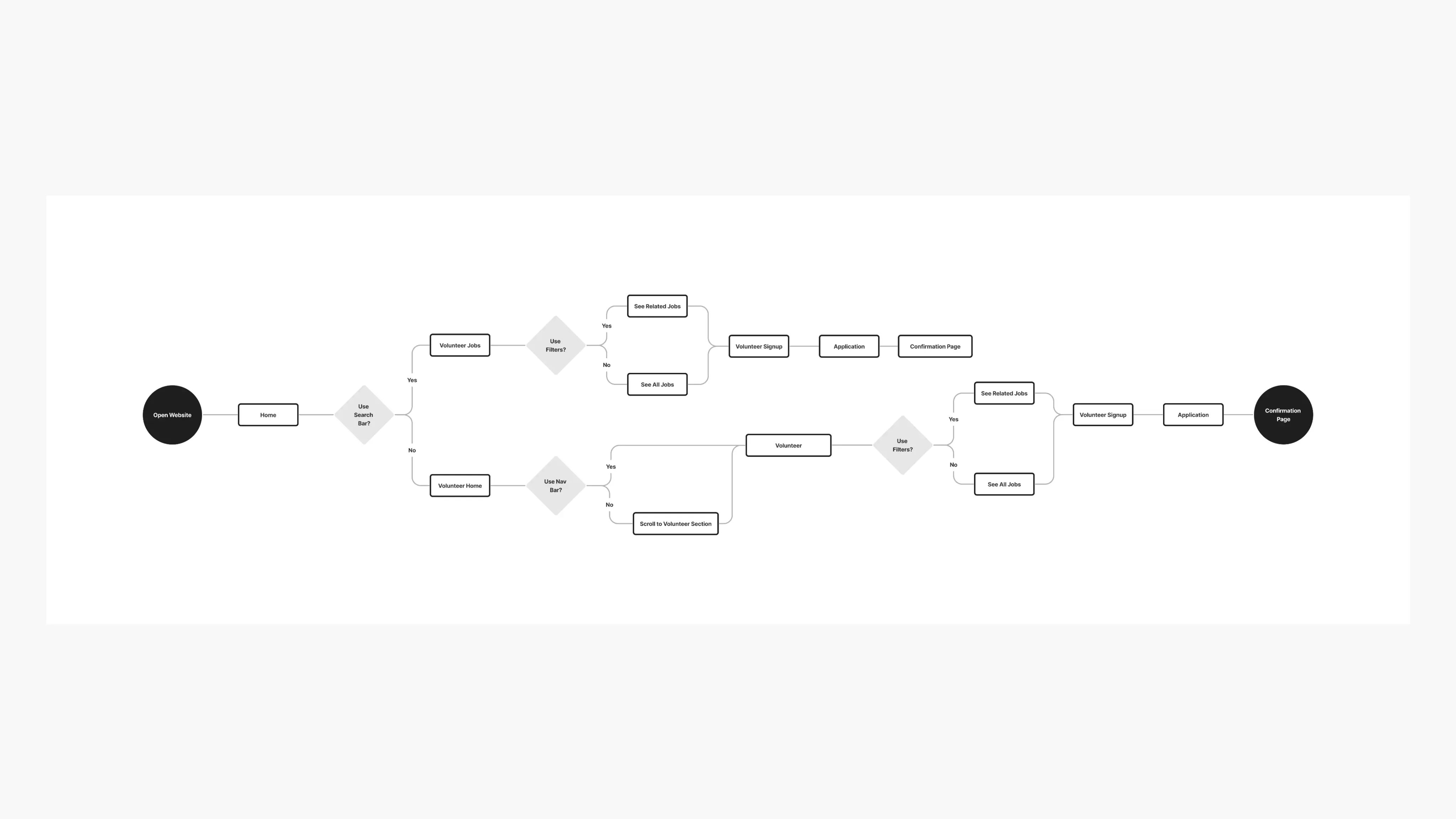
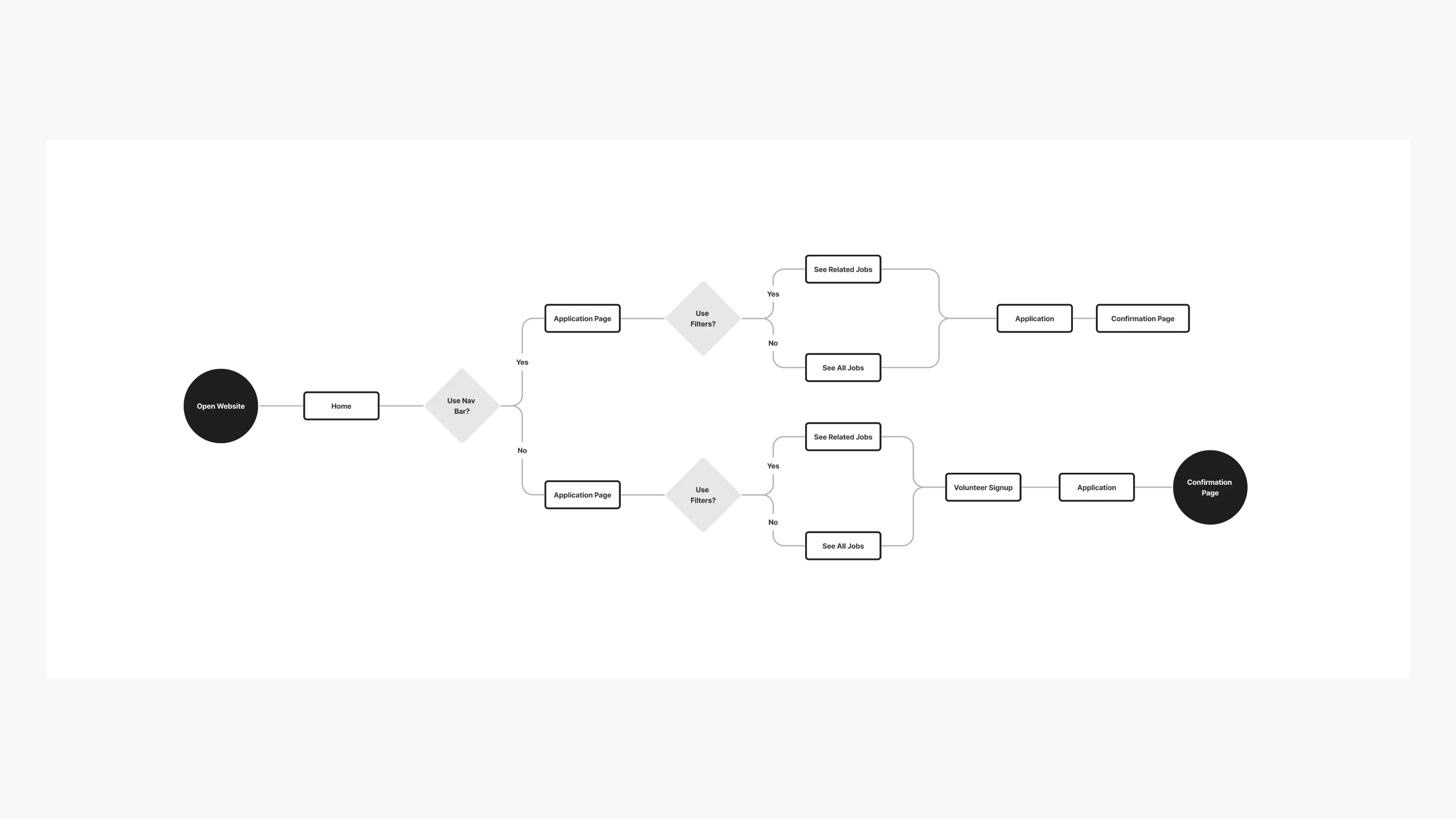
User Flow
Creating the user flow chart helped me understand how the user would navigate through my app.
Before Unmoderated Usability Study
After Unmoderated Usability Study
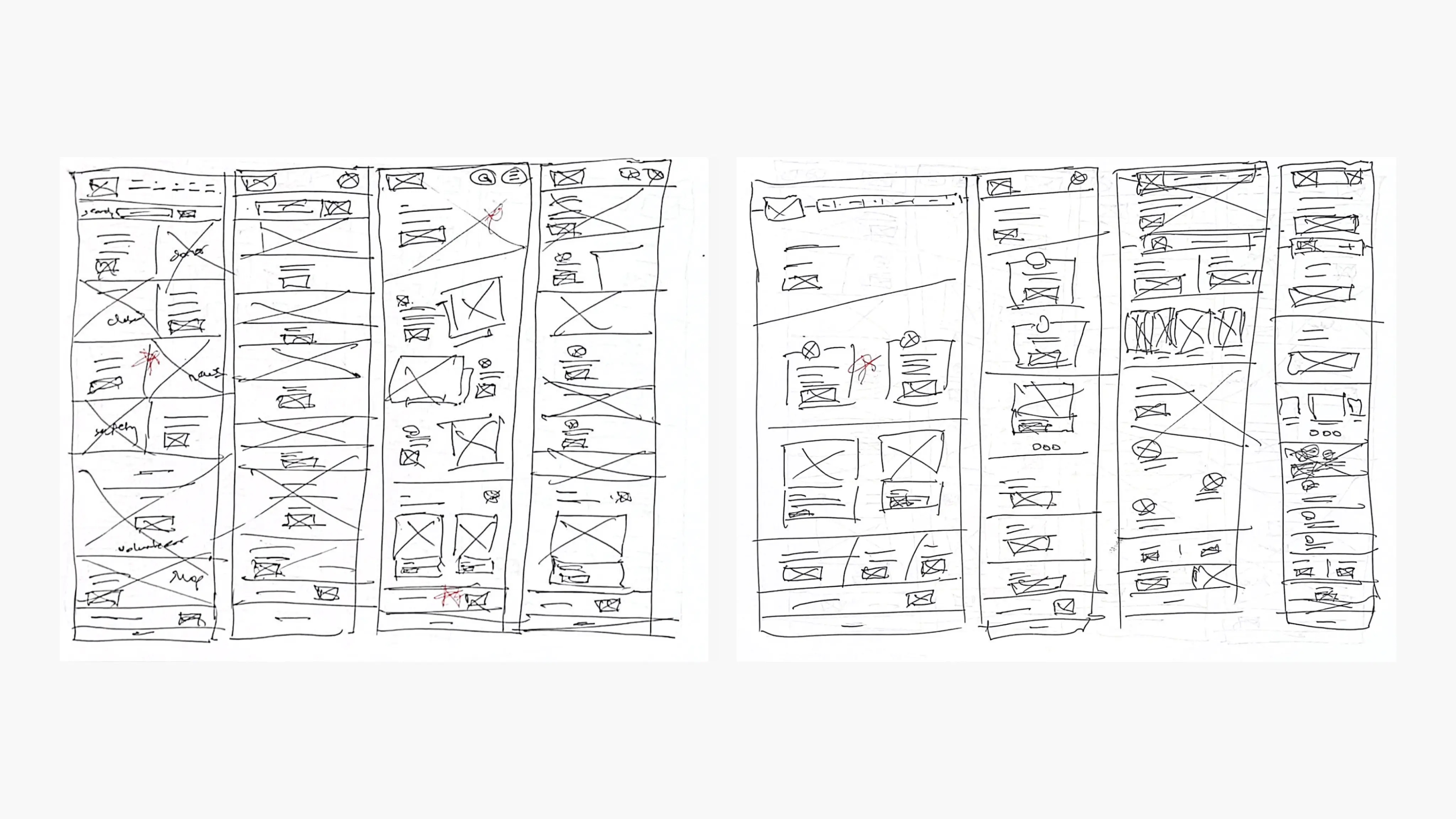
HMW's & Crazy 8's
I've utilized the How Might We exercise to brainstorm questions on how to make the user feel confident about volunteer registration. This helped me think about how I can structure the IA so it's not overwhelming and straightforward for the user.
Along with the HMWs, the Crazy 8's exercise helped me visualize ways a user might find intuitive engage with the registration
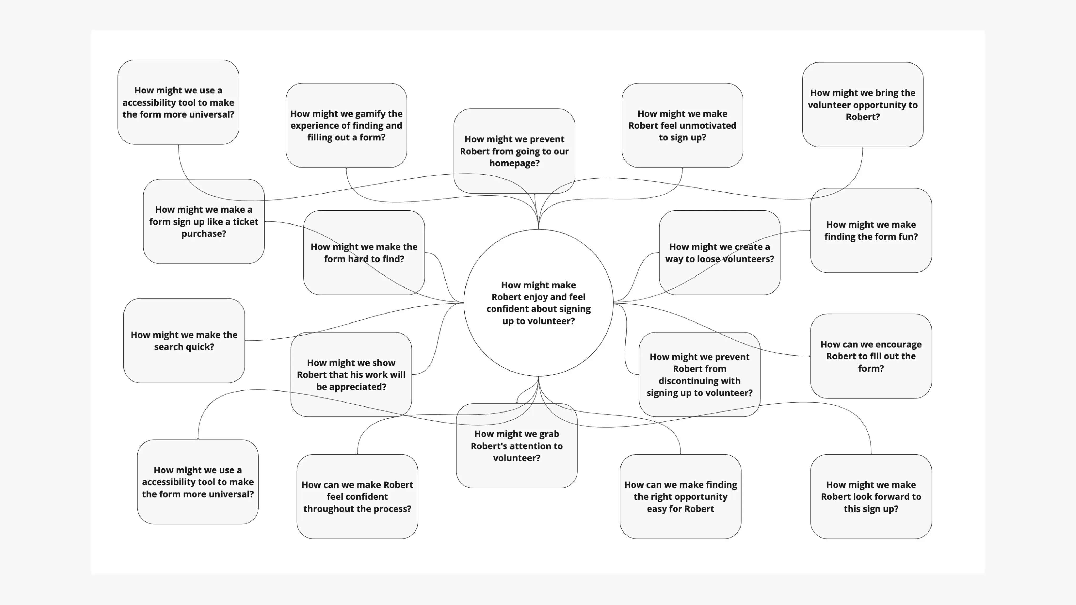
How Might We brainstorm
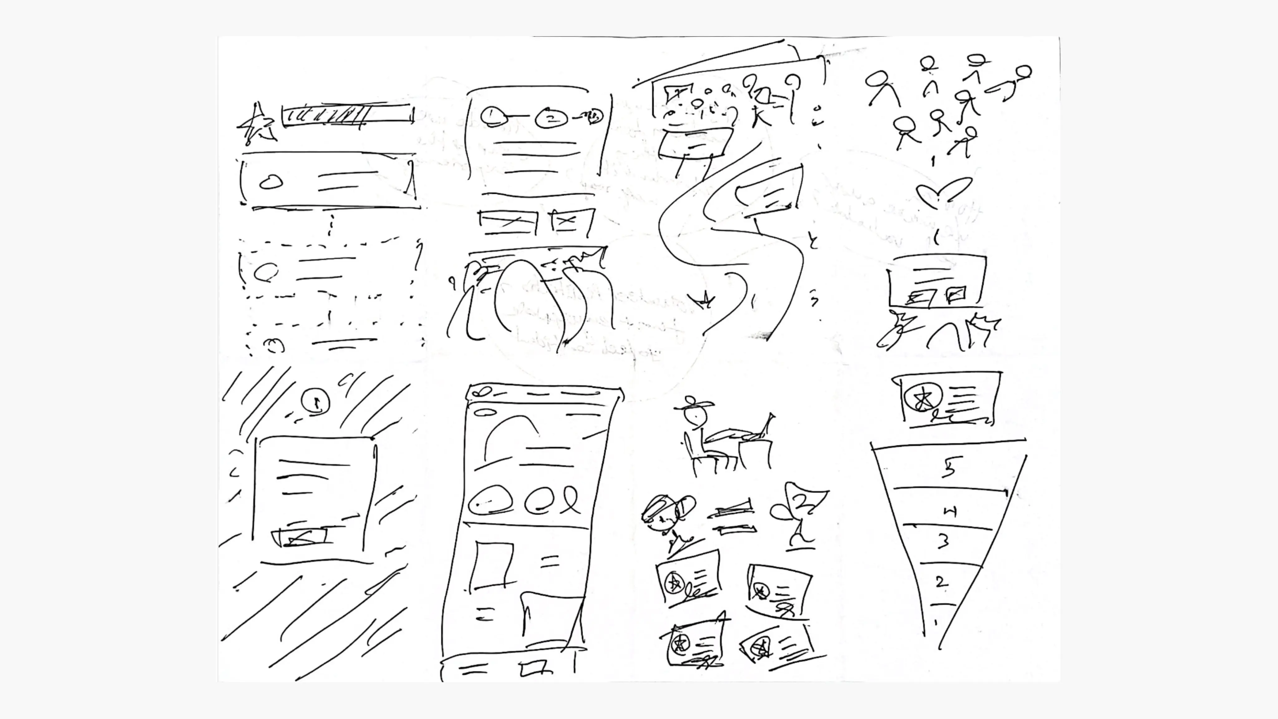
Crazy 8's done to gather ideas on how to make a user feel confident while registering to volunteer
Information Architecture
After understanding who would be using my app, and its purpose, I've carved out the structure for a mobile app sitemap that constitutes the high-level entry points. While doing so, I've learned that it is also important for me to keep only the essential content and eliminate the rest.
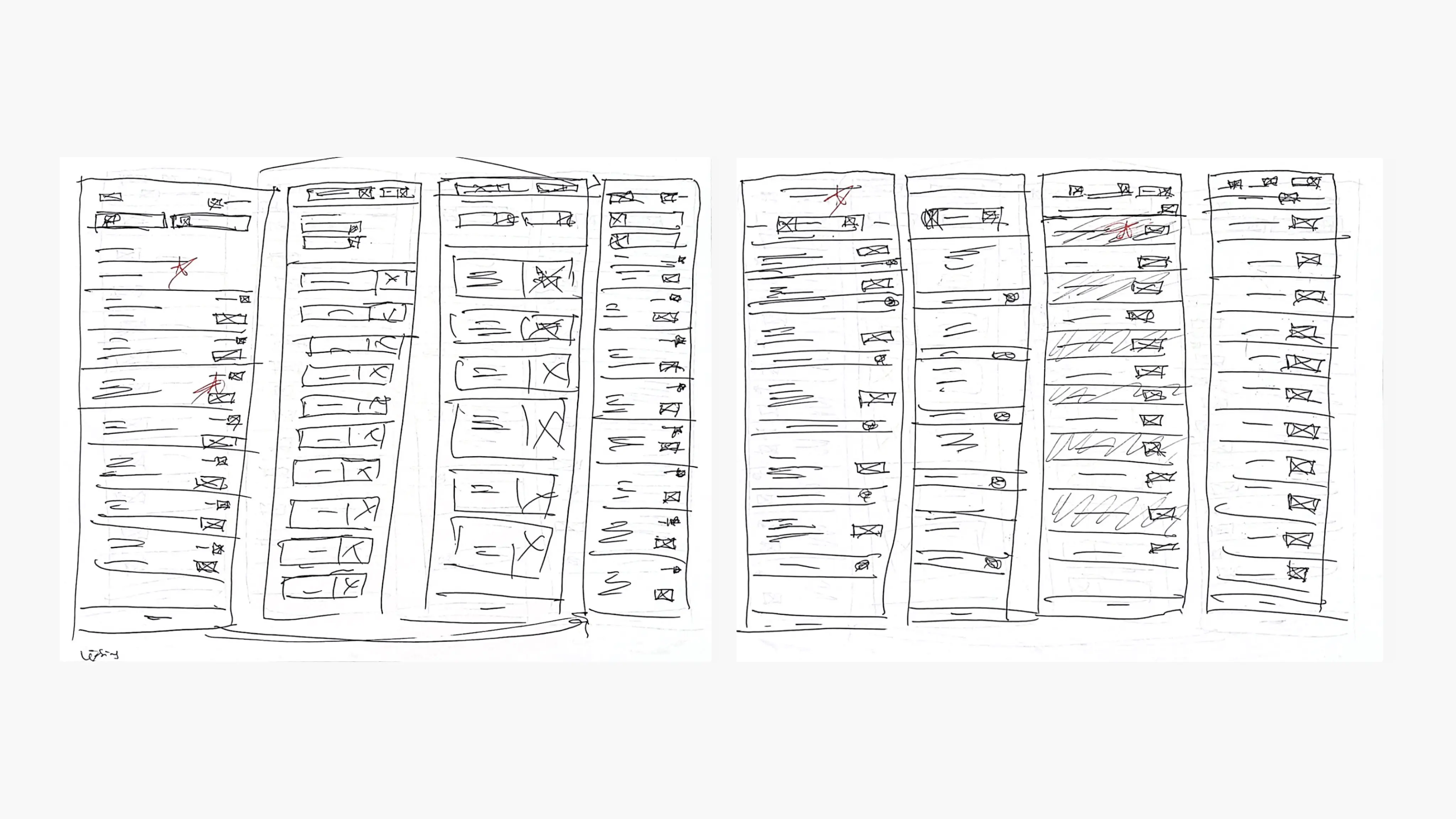
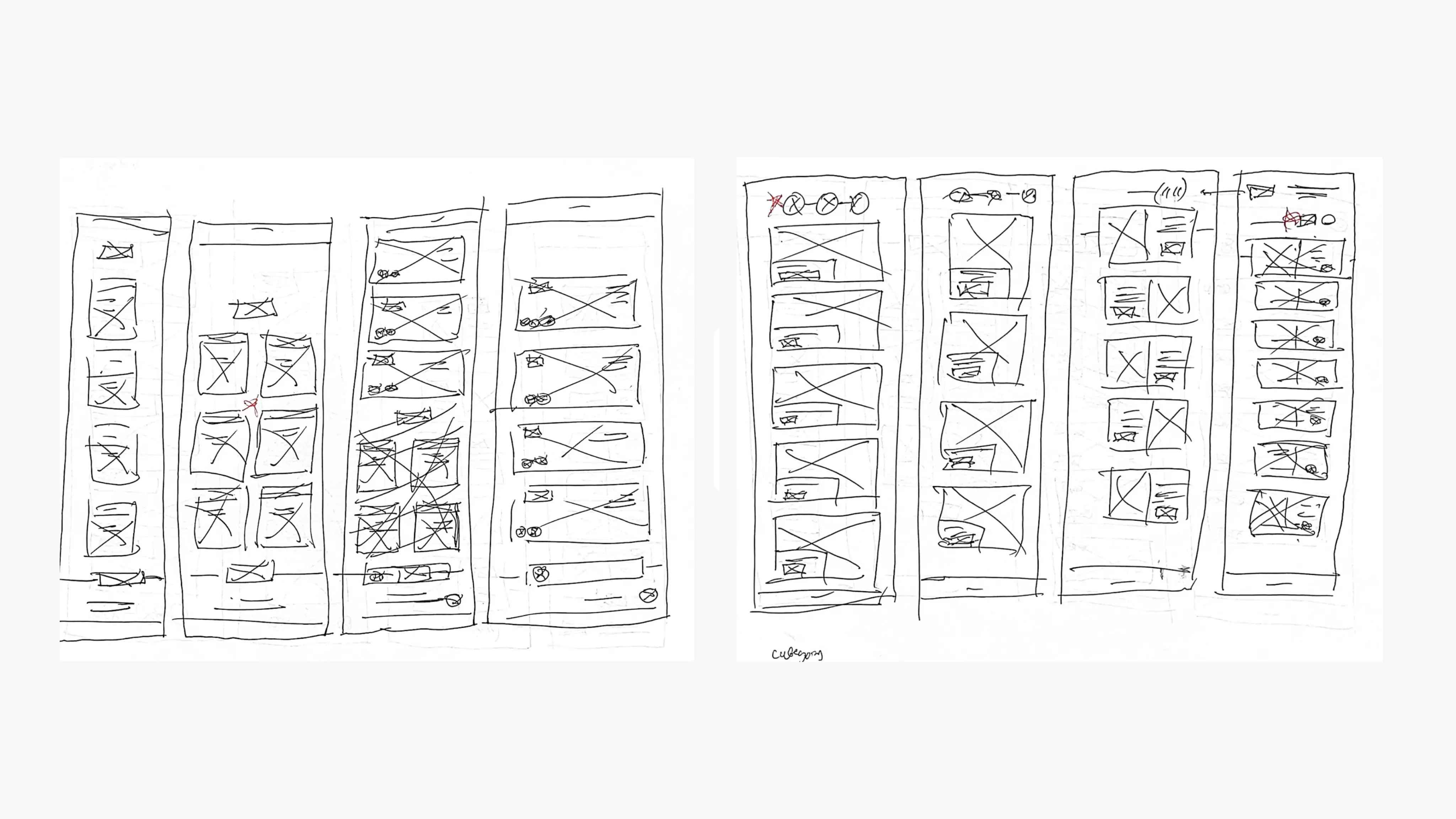
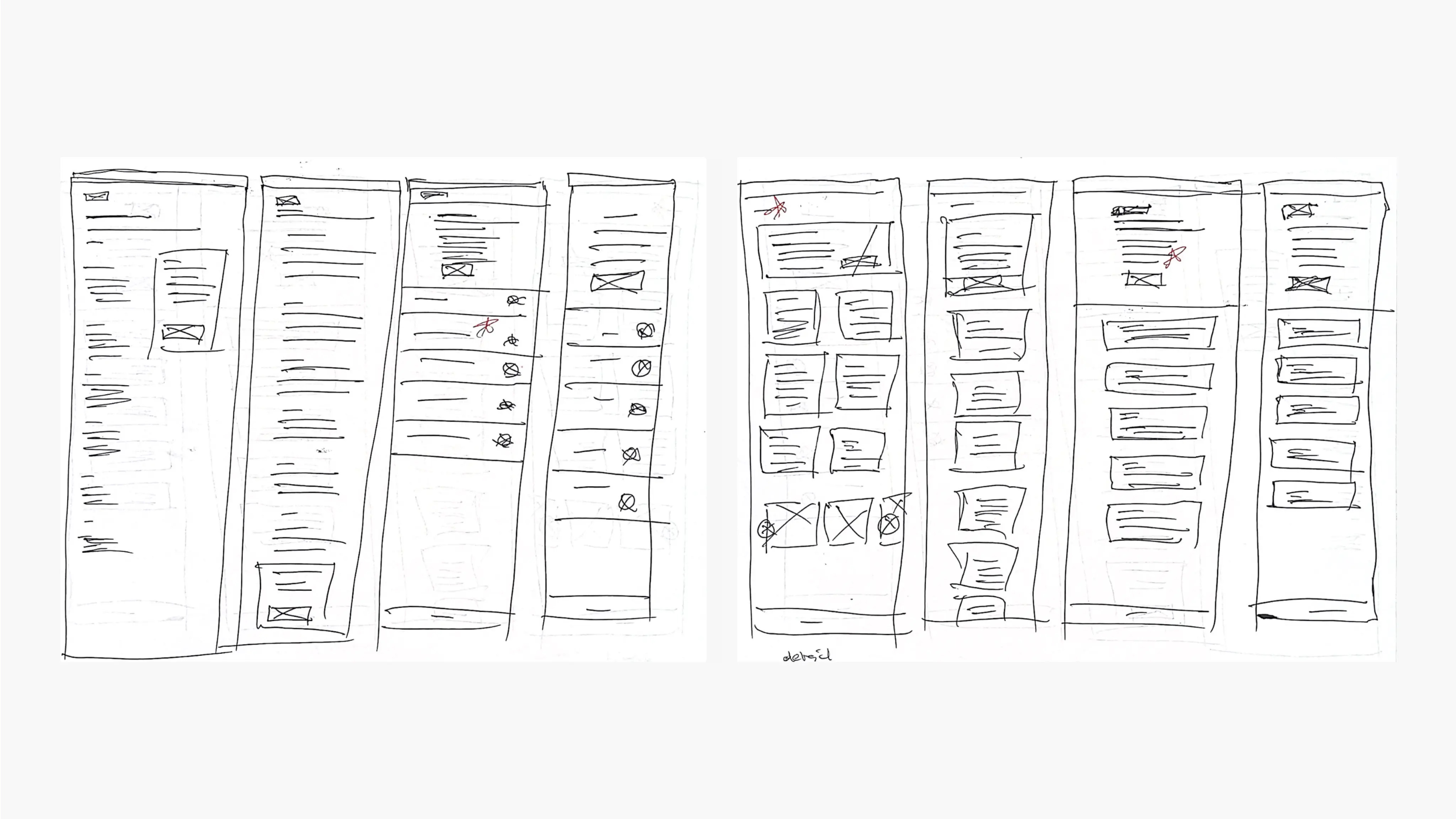
Paper Wireframes
Created concepts for every screen on paper guaranteed that the components transitioning into digital wireframes would effectively tackle the user pain points.
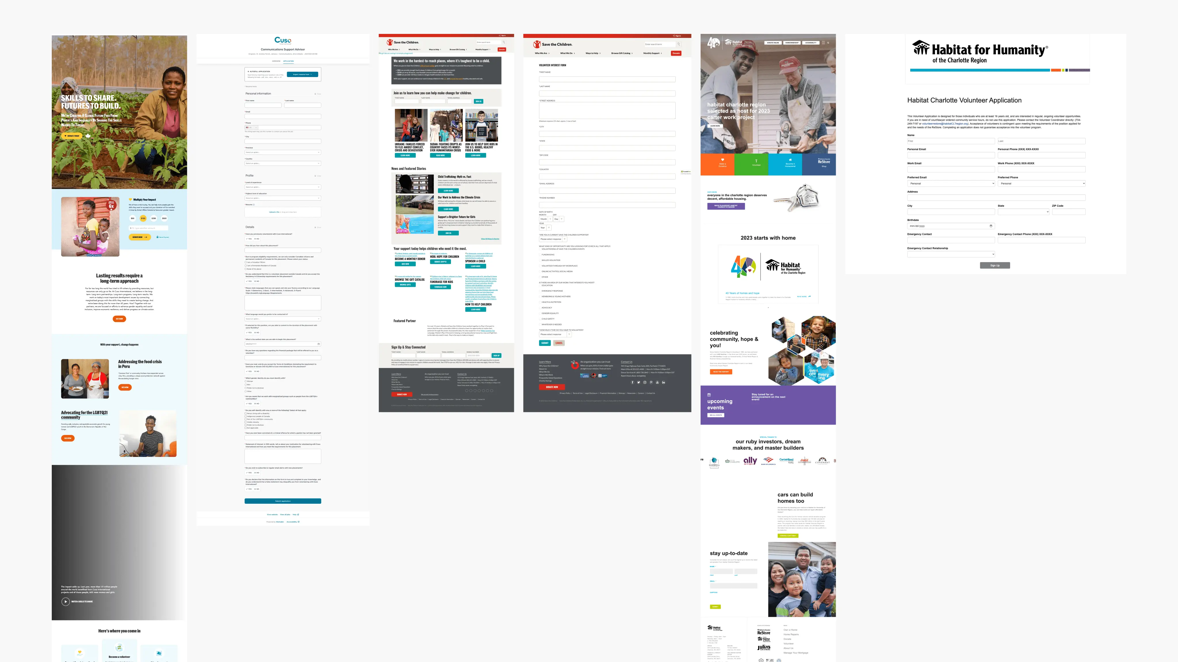
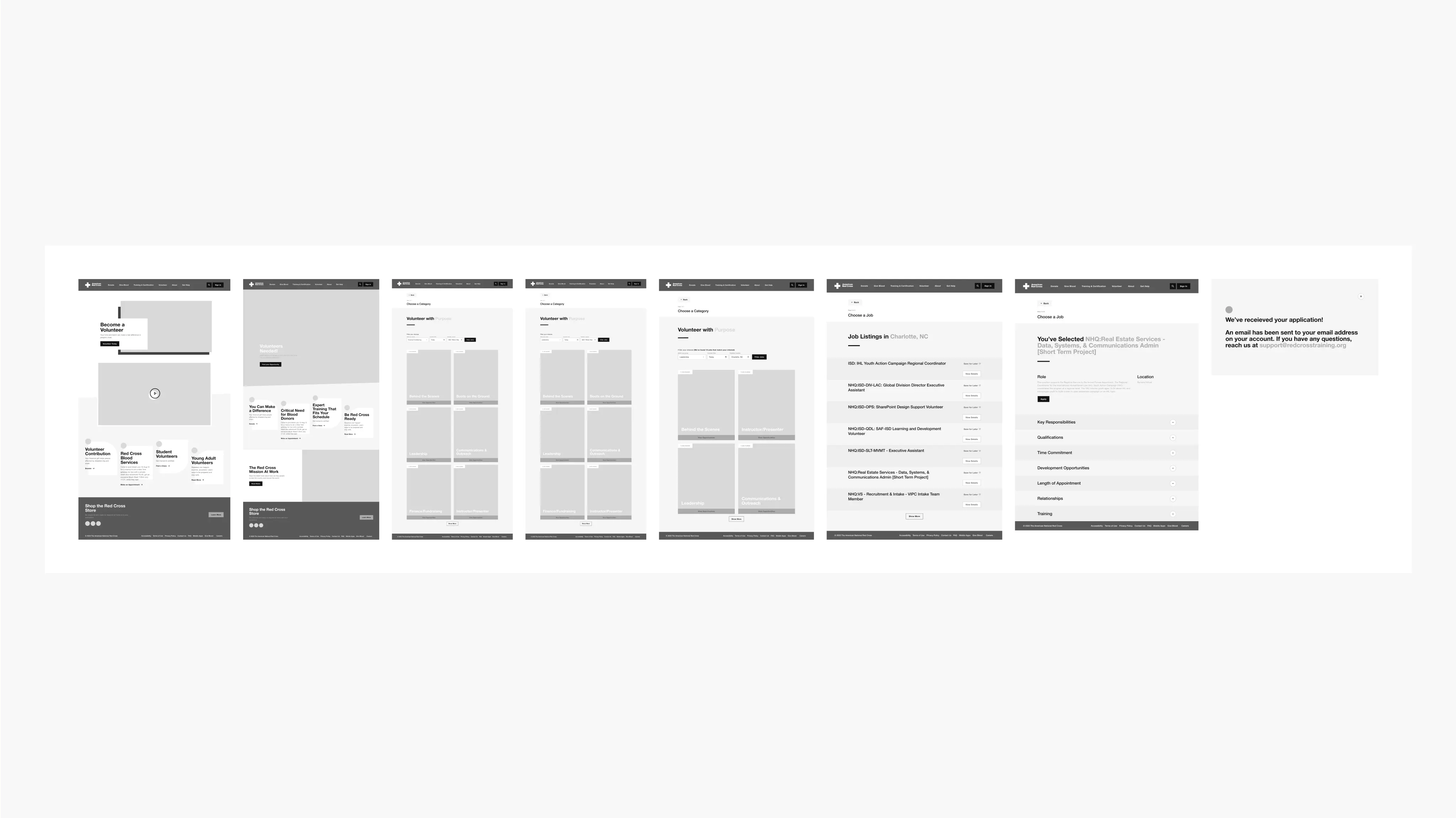
Screenshots of competitor sites
Homepage
Volunteer homepage
Job listing
Job category page
Job detail page
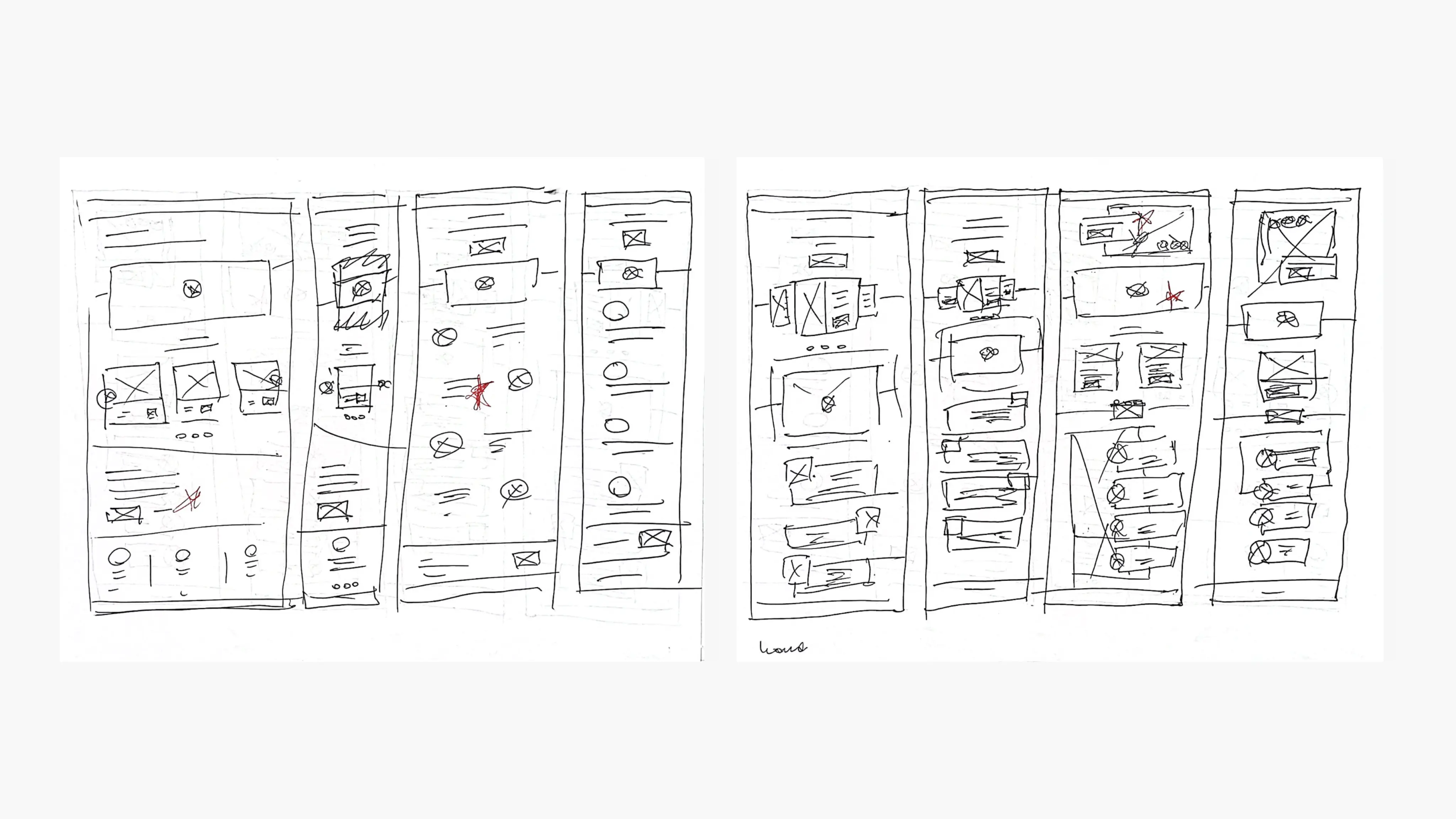
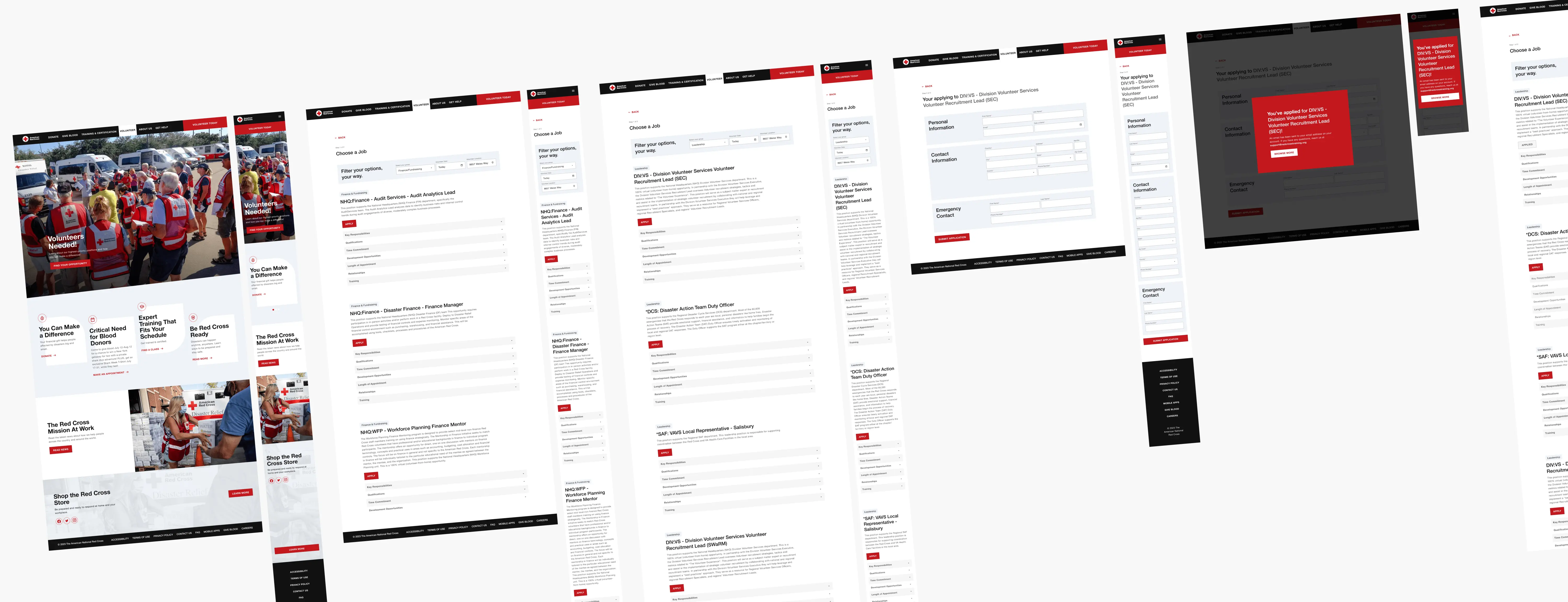
Digital Wireframes
As the initial design phase continued, I made sure to base screen designs on feedback and findings from user research.
During the process, I tried to break the steps into manageable portions to reduce the cognitive load, and utilized visual design principles, such as proximity, to place elements in a location where the user could understand clearly.
Using the completed set of digital wireframes, I created a low-fidelity prototype. The primary user flow I connected with was signing up to volunteer in digestible chunks, so the prototype could be used in a usability study.
Digital wireframes before usability study
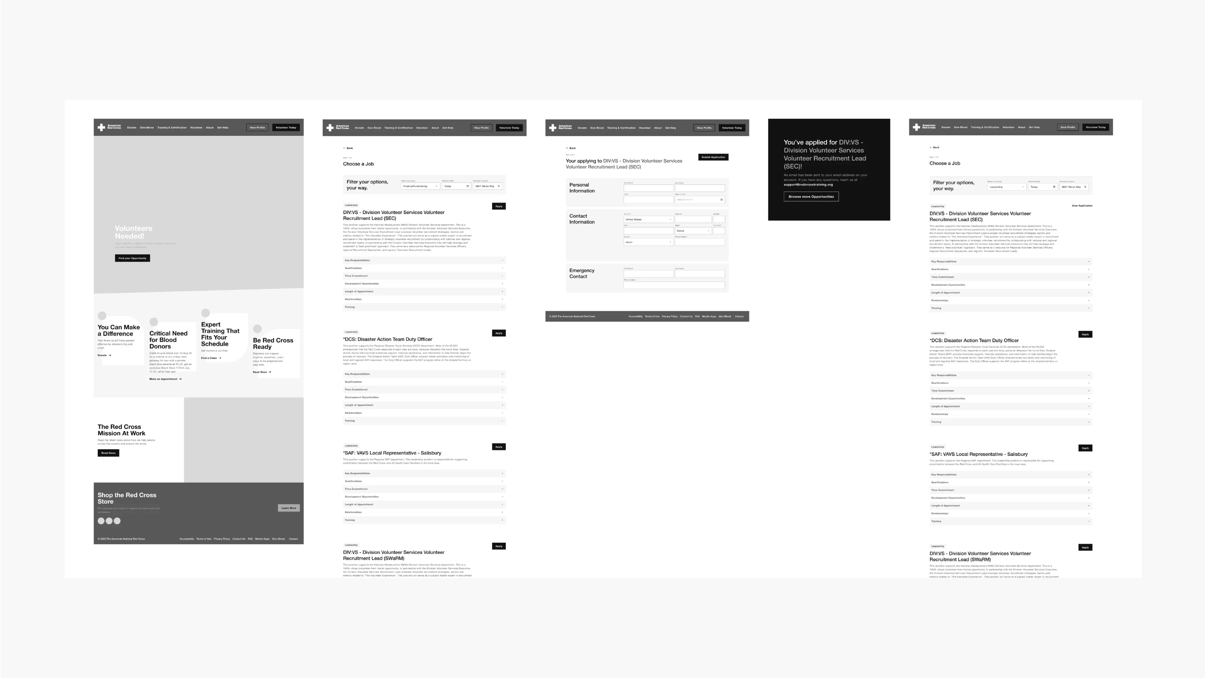
Digital wireframes after usability study
Affinity Map & Value Proposition
Initially, my users encountered difficulties during registration due to its lengthy nature and perceived redundancy in steps such as selecting job search categories.
After identifying the shortcomings in my designs, I've improved the UI for better comprehension and streamlined the process, enabling users to promptly identify their interests and complete registration.
Usability Testing
I conducted two rounds of usability studies. Findings from the first study helped guide the designs from wireframes to mockups. The second study used a high-fidelity prototype and revealed what aspects of the mockups needed refining.
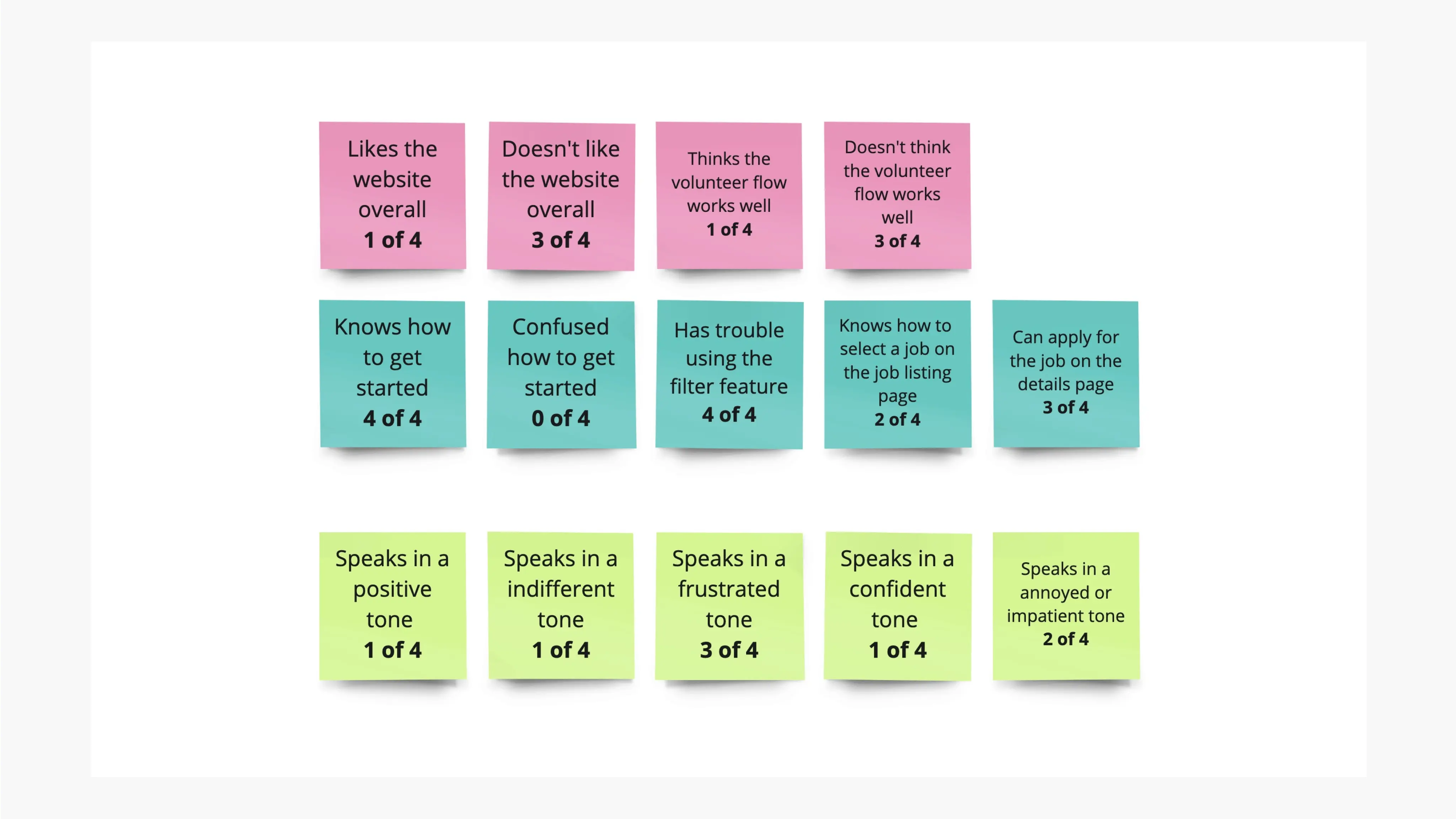
Round 1 Findings
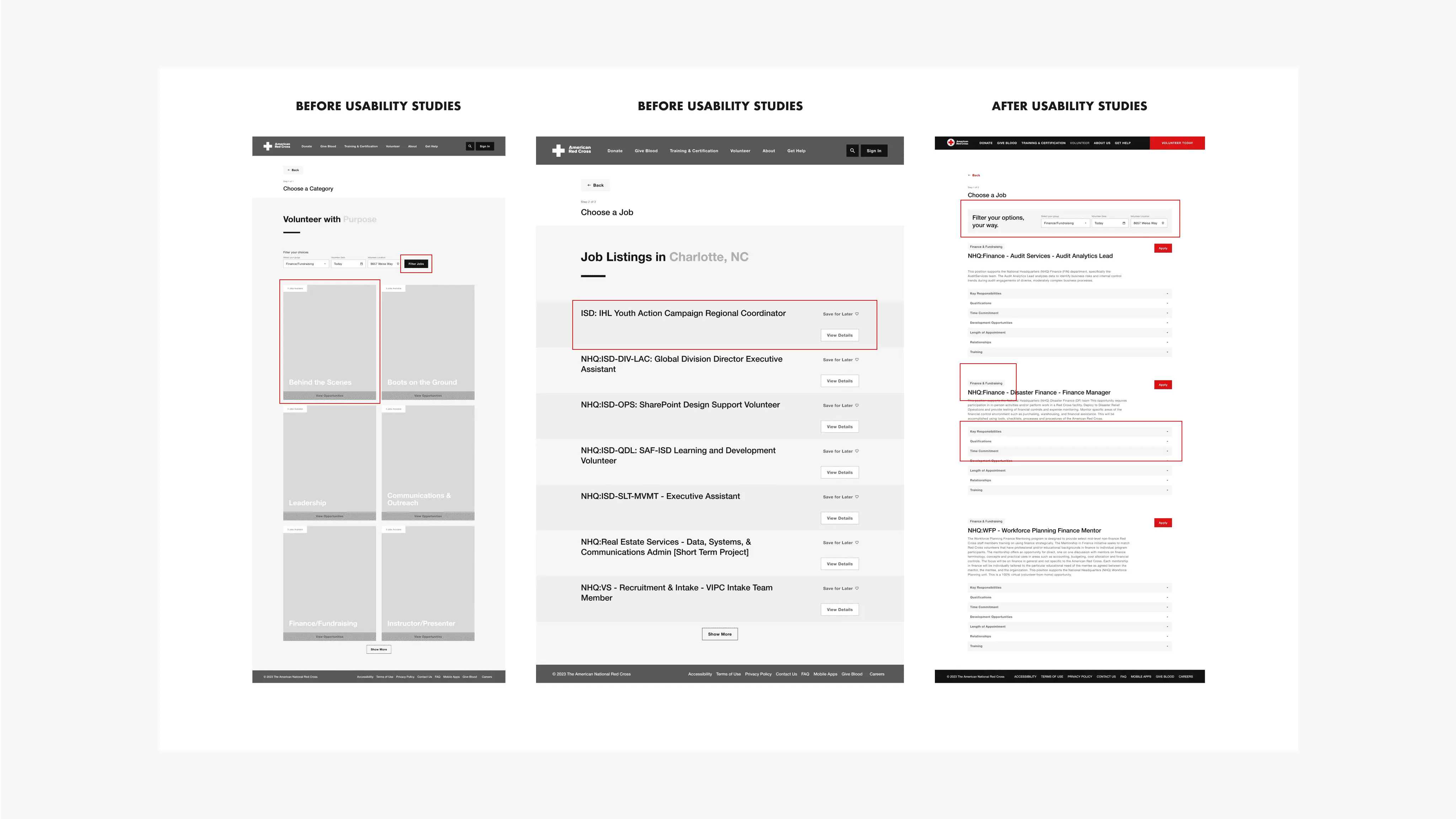
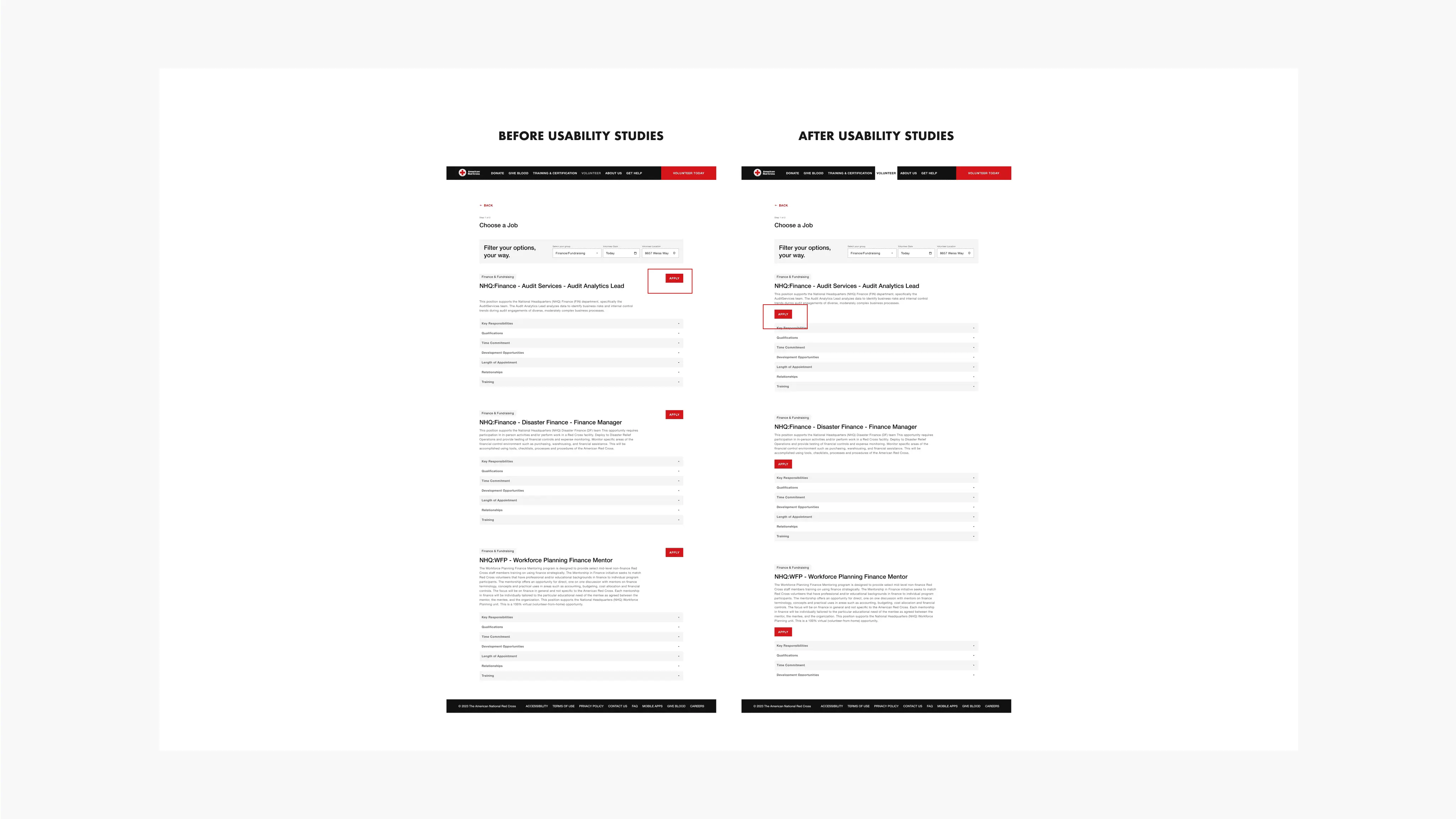
Based on the theme that users are annoyed by having to click filter twice for the categories and job listings, an insight is to have one page with job listings and allow the user to filter based on category
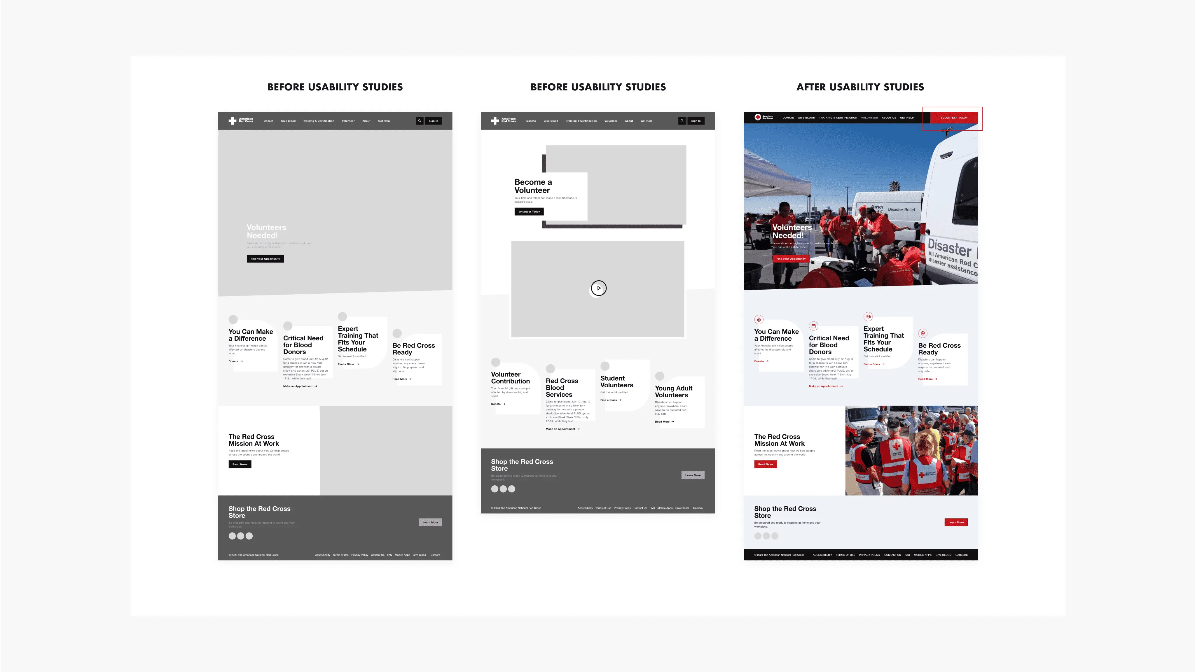
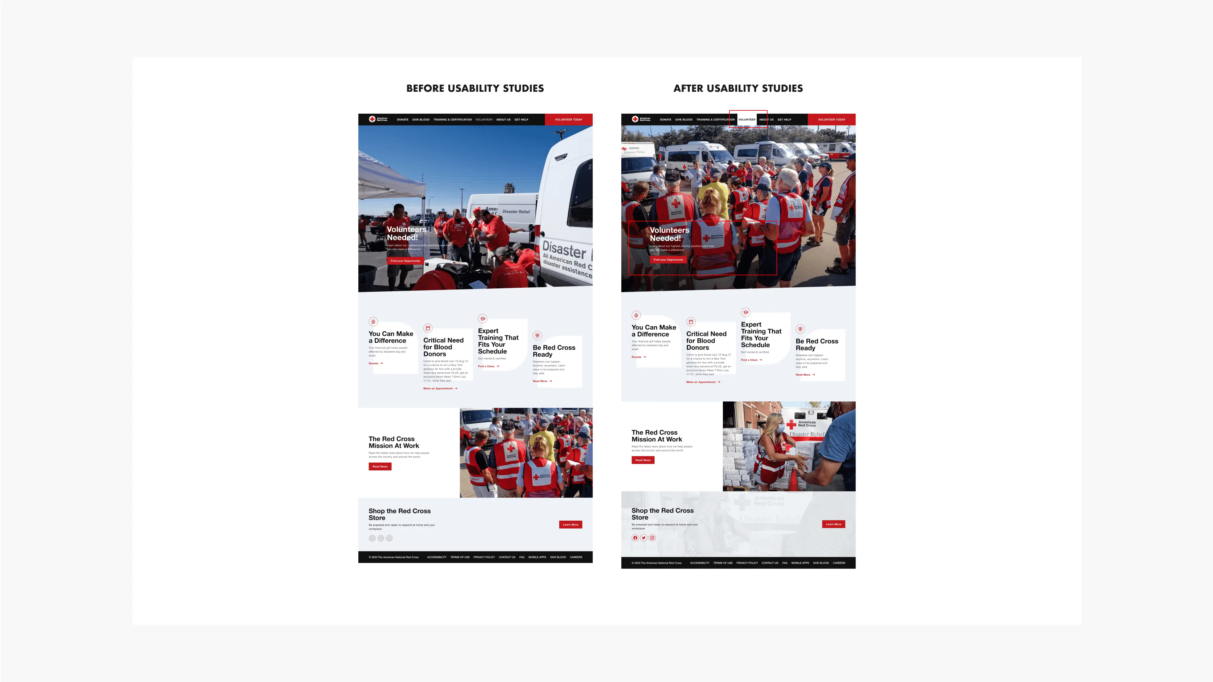
Based on the theme that users were frustrated with having to click twice to get to the volunteer page, an insight is to add a “volunteer today” button on the nav bar to provide quick access for daily users.
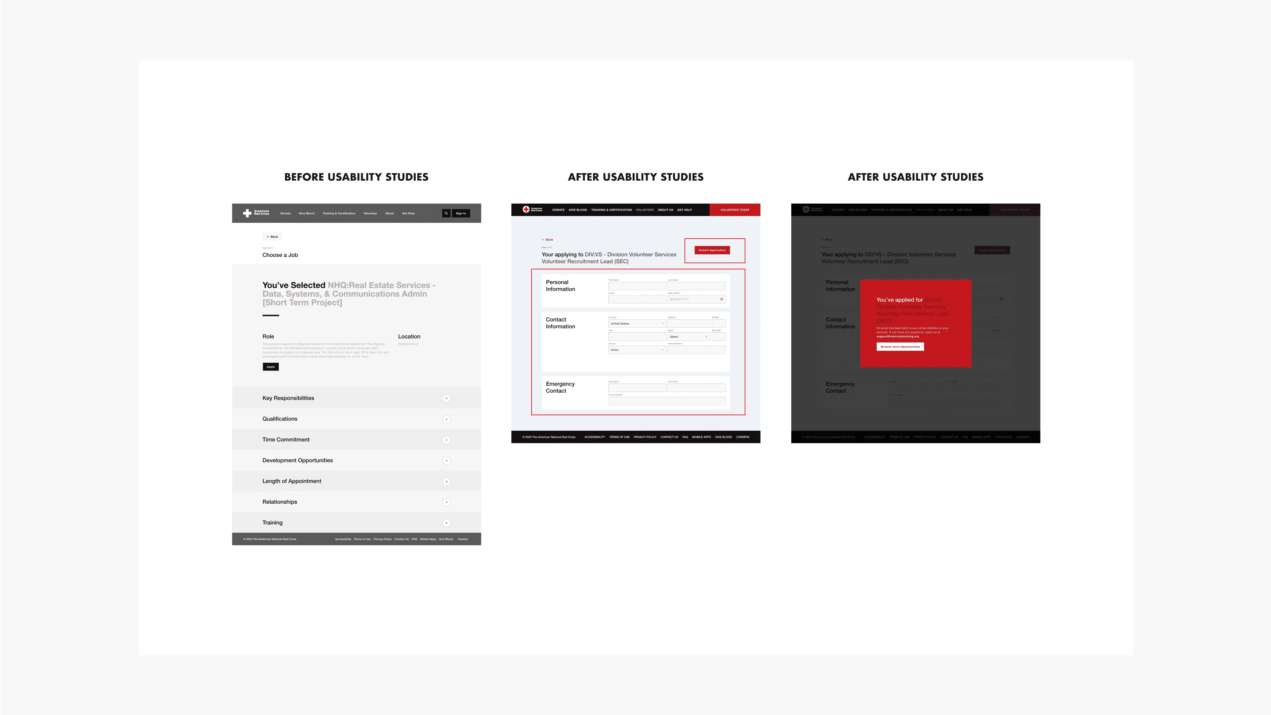
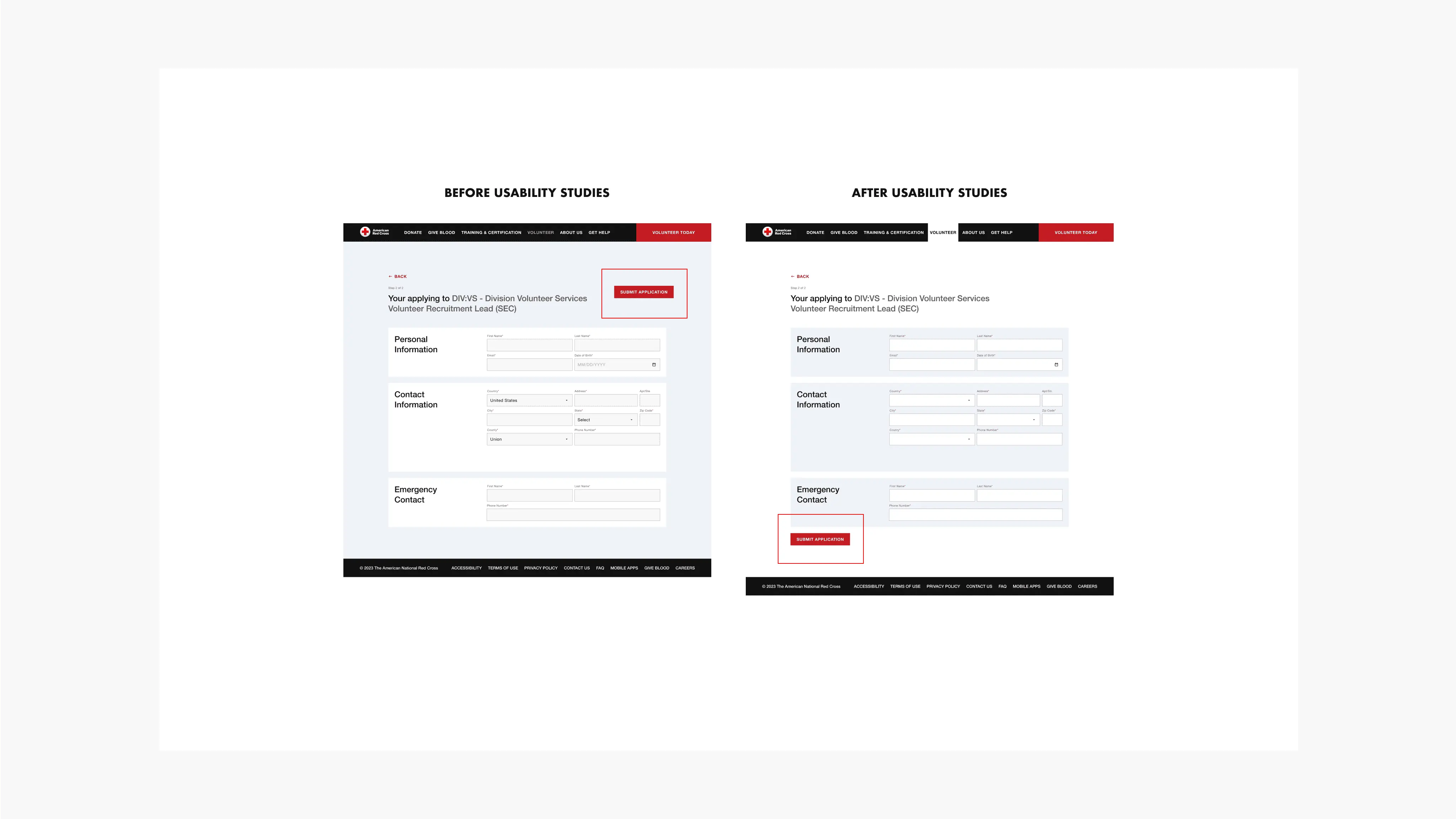
Based on the theme that users were pressured to apply on the details page, an insight is to make the wording friendlier.
Based on the theme that users were feeling hesitant after applying to a job by clicking on a button after reading the details an insight is to add a name and email form so users would feel they’ve secured their spot to volunteer.
Filter updates, and search bar updates.
Big Picture Storyboard
Big Picture Storyboard
Round 2 Findings
On the volunteer homepage, 4/4 of users expressed their concern about not being able to read the text in the hero section. So, I have included a gradient in the back to make it more accessible.
3/4 of my users suggested that having the submit button on the bottom of the jobs and the application form made it much easier for them to follow.
After conducting a unmoderated usability study on Maze, I've gathered some feedback on my designs. Based on the data I've rearranged the visual hierarchy of the entire website, more particularly the respective pages that needed work.
After assessing the heat map, I have moved the "apply" cta below the body text to make it easier for users to follow the text
Mockups
The final high-fidelity prototype presents an efficient user flow for finding the right opportunity quickly.
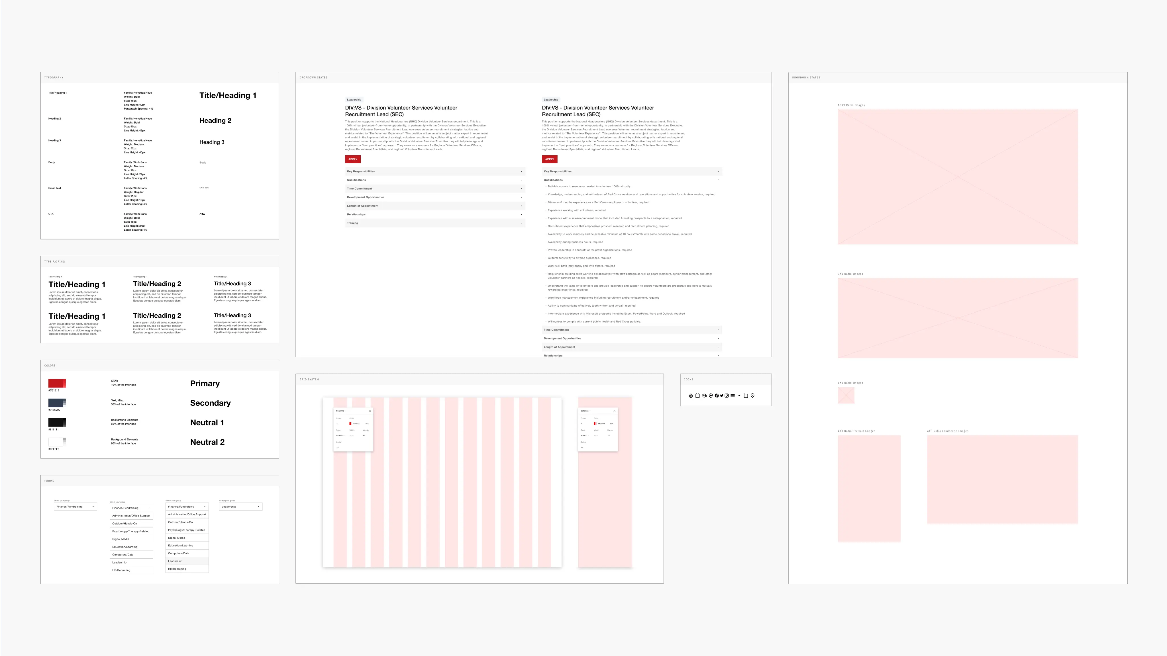
Design System
I opted to develop a design system that establishes the visual hierarchy and theme of the website. I also adjusted the colors on the Red Cross website slightly to enhance accessibility. Red symbolized urgency and attention, while a gentle blue communicated the site's trustworthiness.
How should we measure success?
Several crucial aspects to evaluate the revamped volunteer sign-up process for a position include determining if users are not just driven to complete the procedure but also discovering it user-friendly to browse and select the ideal role for themselves.
Next Steps
I'd think that conducting additional interviews to discover potential challenges users encounter during registration for volunteering with any group can enhance the website immensely.